Symbiotic Skincare
Biossance ︎ Rebranding 2019
Biossance is not another beauty brand that grew out of instagram. They’re a collective of biologists, scientists, and idealists who wanted better for human skin and the planet.
They asked our team at Wolff Olins for a repositioning and recommendations on brand identity. After research and audit, we started from the symbiotic relationship between human and nature. With putting on the natural products, you are surfacing your inner science.
They asked our team at Wolff Olins for a repositioning and recommendations on brand identity. After research and audit, we started from the symbiotic relationship between human and nature. With putting on the natural products, you are surfacing your inner science.
My Role
Concept Development
Graphic Design
Team
Forest Young Jane Brown
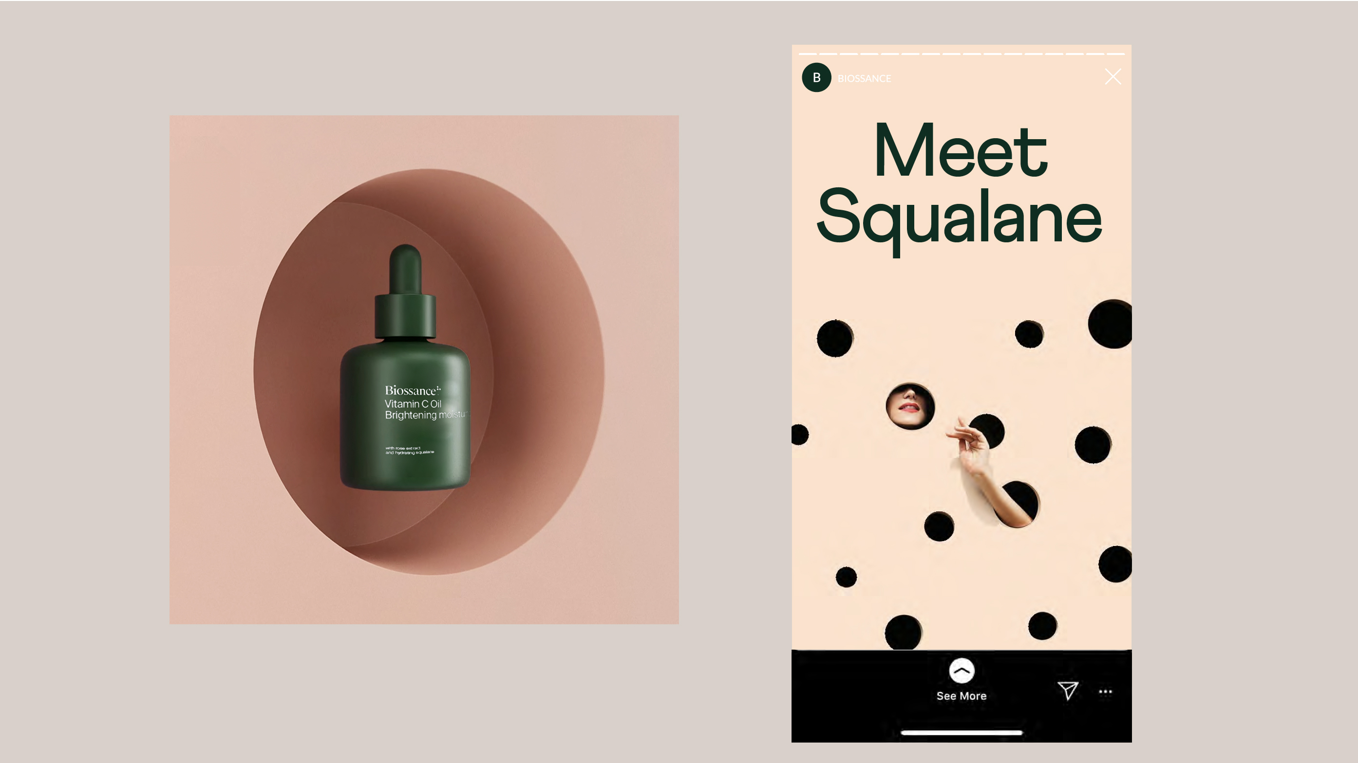
Images in the social section are reference images for concept presentation only.
Concept Development
Graphic Design
Team
Forest Young Jane Brown
Images in the social section are reference images for concept presentation only.
Current Brand Style
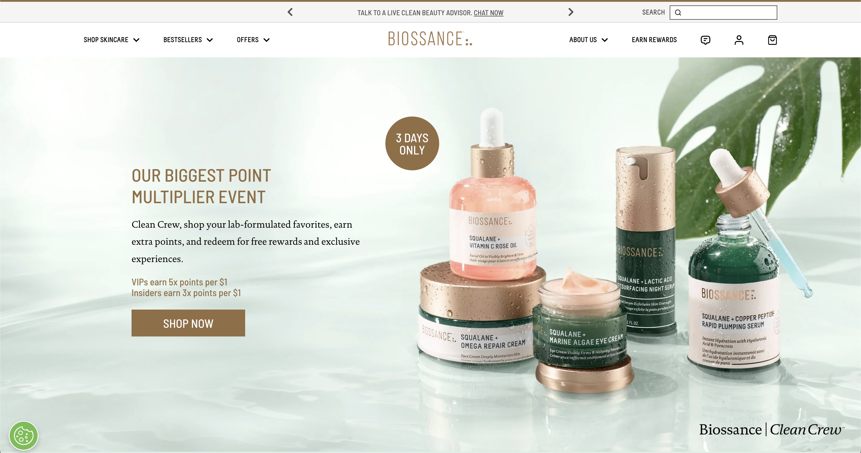
Retail & Brand Audit
We visited offline stores and compared the visual and packaging of competitor brands.
Also, by looking at each brand’s presence across platforms, we developed a clear positioning and image for Biossance.
We visited offline stores and compared the visual and packaging of competitor brands.
Also, by looking at each brand’s presence across platforms, we developed a clear positioning and image for Biossance.


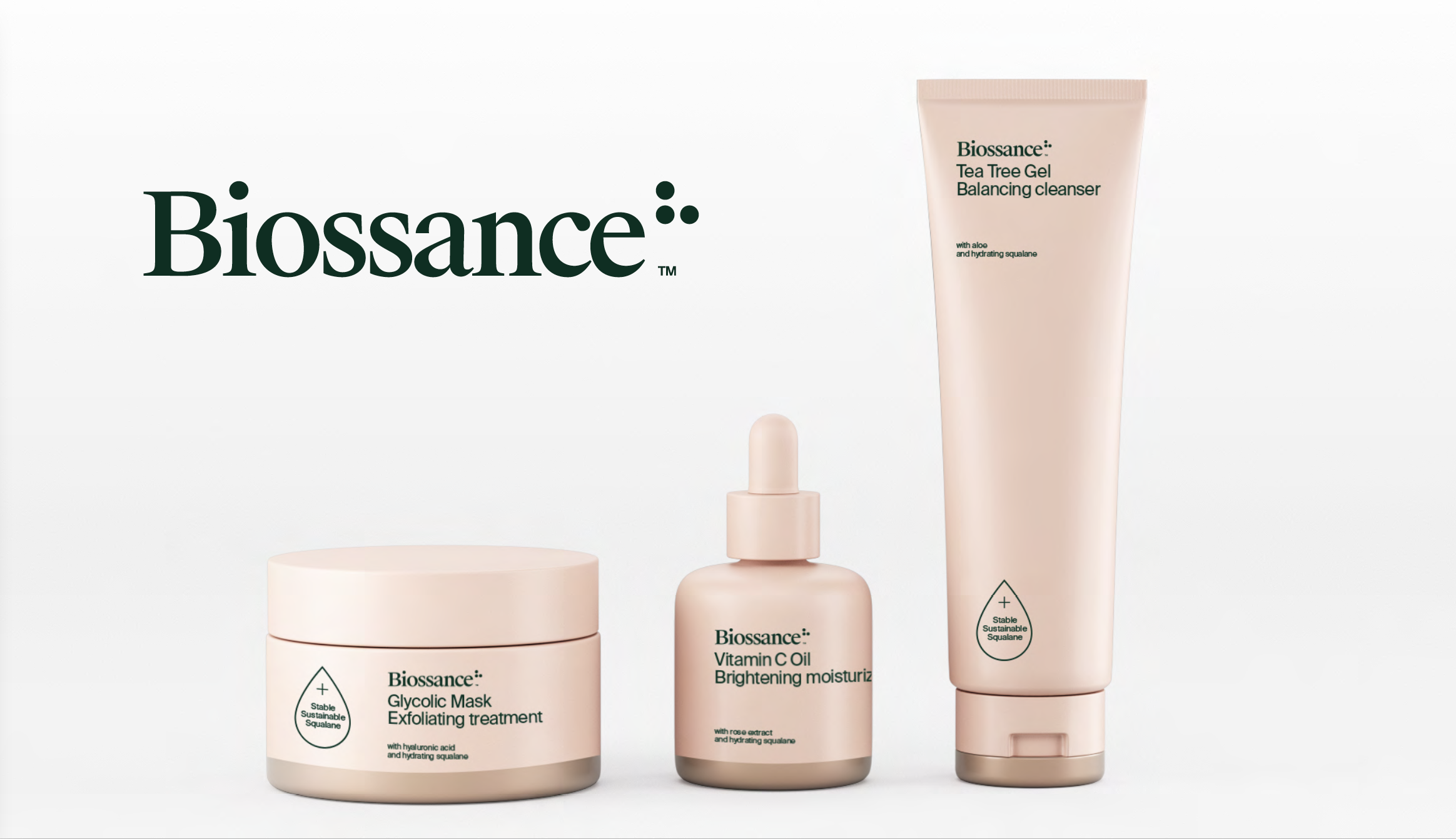
New Identity / Logo
Keeping the three dots as natural ingredients, we suggest to move to title case instead of all caps. It increases legibility and creates more friendly tone.
As a brand, Biossance is intuitive, brave, generous and curious. The organic circle shapes and serif font creates a sense of daring and wonder. The typeface Suisse is supporting the most amount of languages.

New Identity / Packaging Principles
Super natural
ie. Copper as accent and grounded form factors to signal an effective yet transcendental product experience
Warm science
ie. Vibrant green punctuated with intimate blush tone to convey friendly authority
Elevated clean
ie. Pared-back packaging and silk screen printing impart a distinctive and prescient take on sustainability and clean beauty
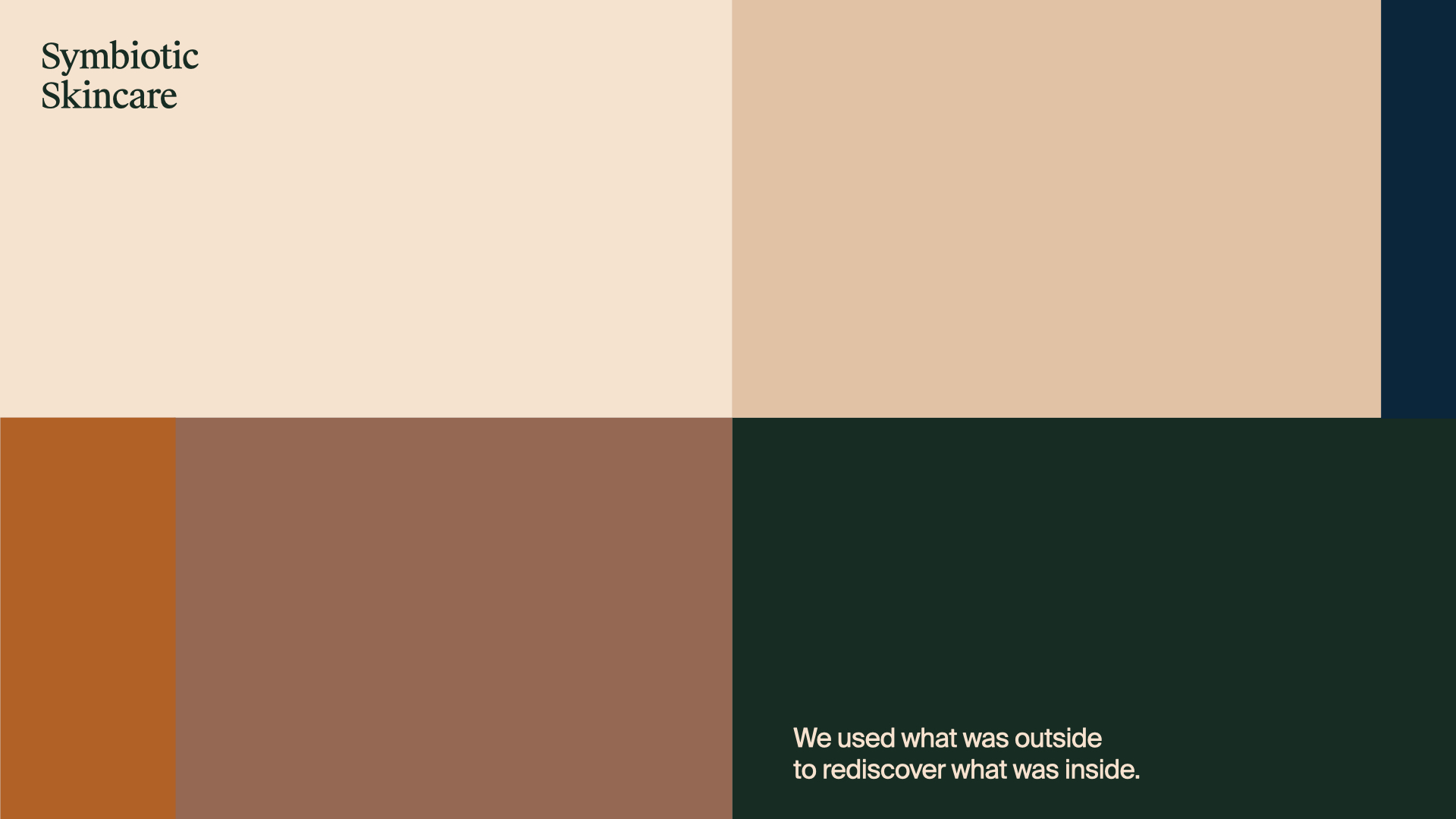
New Identity / Palette & Social
When defining colors, we considered materials and textures on top of existing palette.
The warm copper color complements with the beige tone. Orange highlights. Dark blue and green keep a nice contrast with the neutrals.
When defining colors, we considered materials and textures on top of existing palette.
The warm copper color complements with the beige tone. Orange highlights. Dark blue and green keep a nice contrast with the neutrals.