DIGITAL TRANSFORMATION
WITH A HUMAN TOUCH
Yuma | Branding
With a mission of creating digital transformations that genuinely resonate with people, Yuma is a business group with four companies in the Benelux.
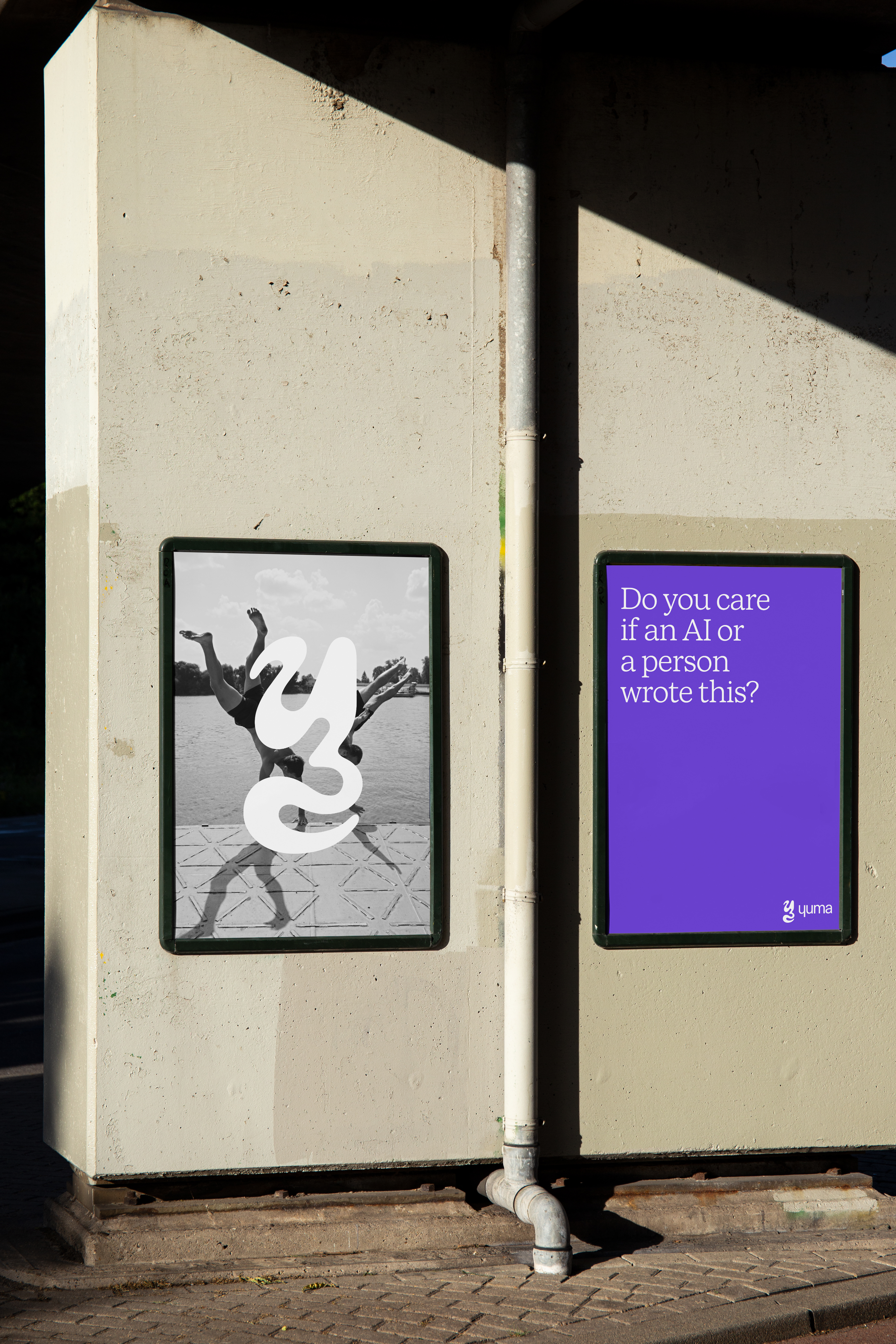
The identity is inspired by the fluidity of transformations and the warmth of human touch.
The identity is inspired by the fluidity of transformations and the warmth of human touch.
My Role
Brand Design
Web Design
Design Team
Alicia Castro
Eddy Wegman
Robin Budy
Brand Design
Web Design
Design Team
Alicia Castro
Eddy Wegman
Robin Budy
01
Exploration
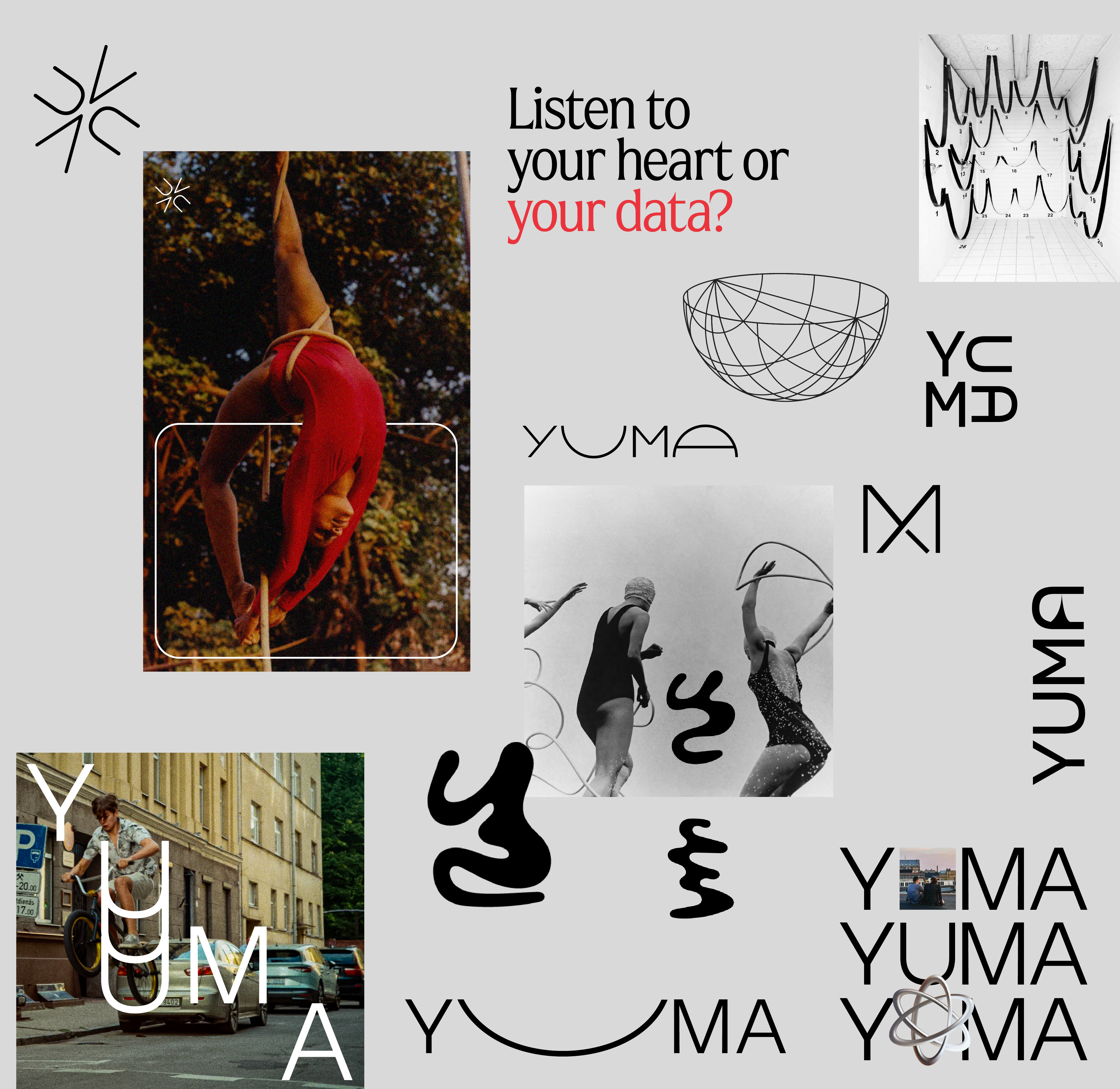
How much human element we’d like to include in the high fidelity digital world?
What other aspects we’d like to convey? Connection? Expression?
02
Logo
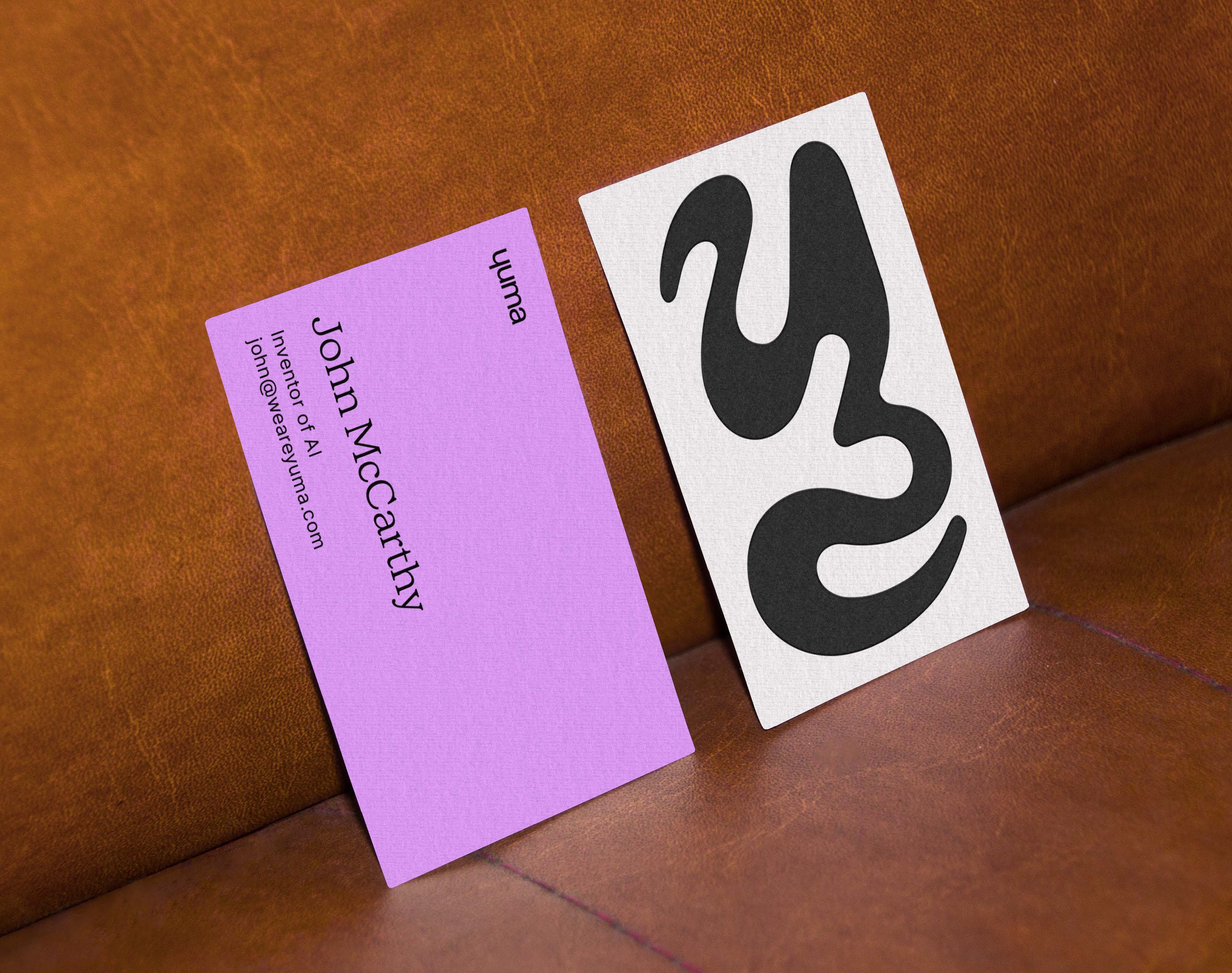
The fluid shape in the icon represents Yuma’s humanistic approach to transformation. The logotype is inspired by the word ‘human’ and responds to the curvy mark.


03
Typography
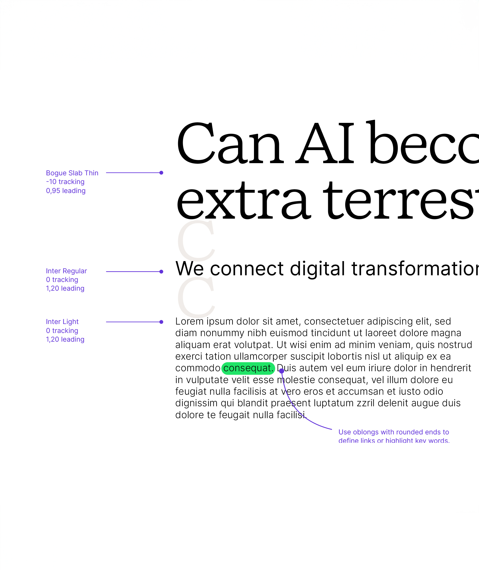
We chose Bogue Slab Thin for headlines. Designed by Melvastype, featuring many fine details, the soft forms gives it a friendly and approachable character with a hint of humanistic feeling. It’s the quiet confidence Yuma presents.
Our secondary typeface is Inter. It is used across all body copy when we need to be clearer and digestible versus expressive.
04
Photography
The style is genuine and profound. Drawing upon the raw, instantaneous essence of street photography. It possesses elements akin to photojournalism, seeking to encapsulate moments in their most authentic and human form.
Navigating between the micro and macro perspectives, our images seamlessly transitioning between intimate, small-scale scenes and sweeping, abstract overviews.


05


 .
. 


