DIAWEI APP ︎Amsterdam UMC + SensorLab
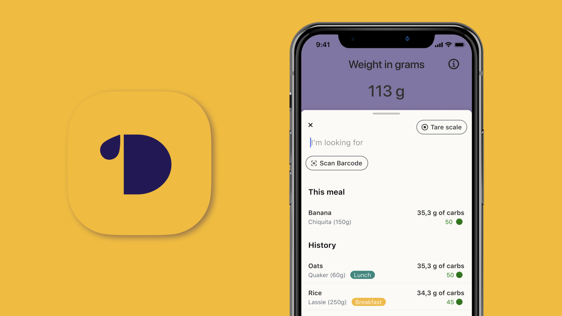
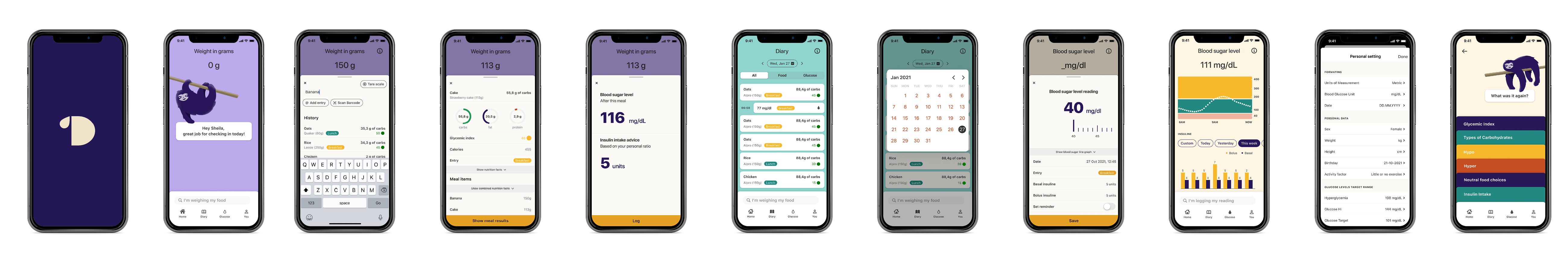
Diawei is a mobile application that helps newly diagnosed pre-teens/teens to learn documenting and analysing their carbohydrate intake more precisely and get advice on the intake of insulin amounts.
ROLE
User Research
UX Design
Art Direction
User Research
UX Design
Art Direction
TEAM
Benjamin Priego Walter Project Manager + Researcher
Milena Schwill Visual Designer
Flavio Valcarce Chavez Product Designer
Benjamin Priego Walter Project Manager + Researcher
Milena Schwill Visual Designer
Flavio Valcarce Chavez Product Designer
TIME
One month
One month
CHALLENGE
Existed prototype
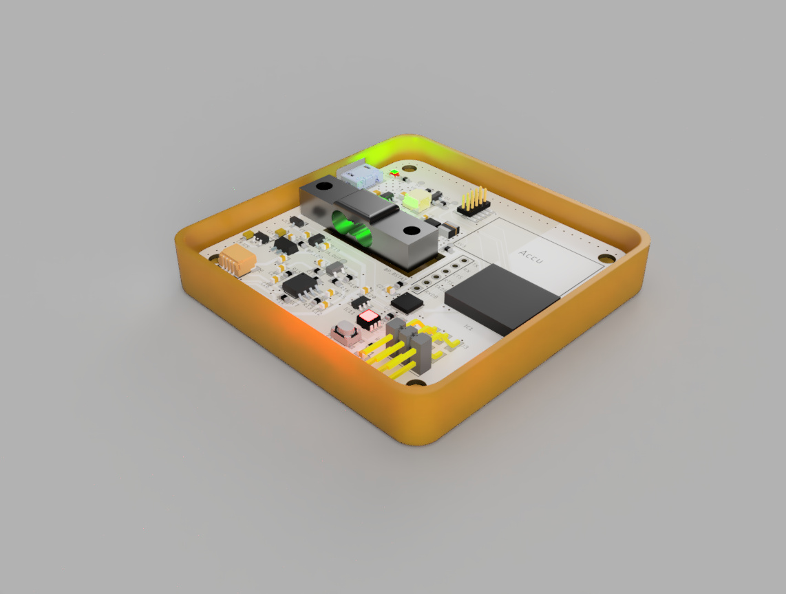
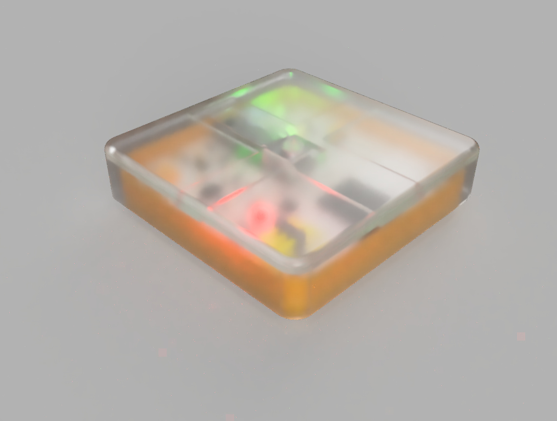
The engineer team of SensorLab had created a prototype before. The goal is sharing data from this one with the app.
The engineer team of SensorLab had created a prototype before. The goal is sharing data from this one with the app.
Consulting with experts
We talked with experts in diabetes and obtained professional suggestions for content in the app.
We talked with experts in diabetes and obtained professional suggestions for content in the app.
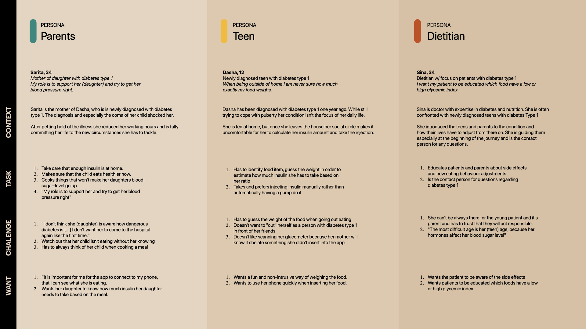
Persona building
After literature review and user interview, we built three types of persona that would help us understand the needs of users.
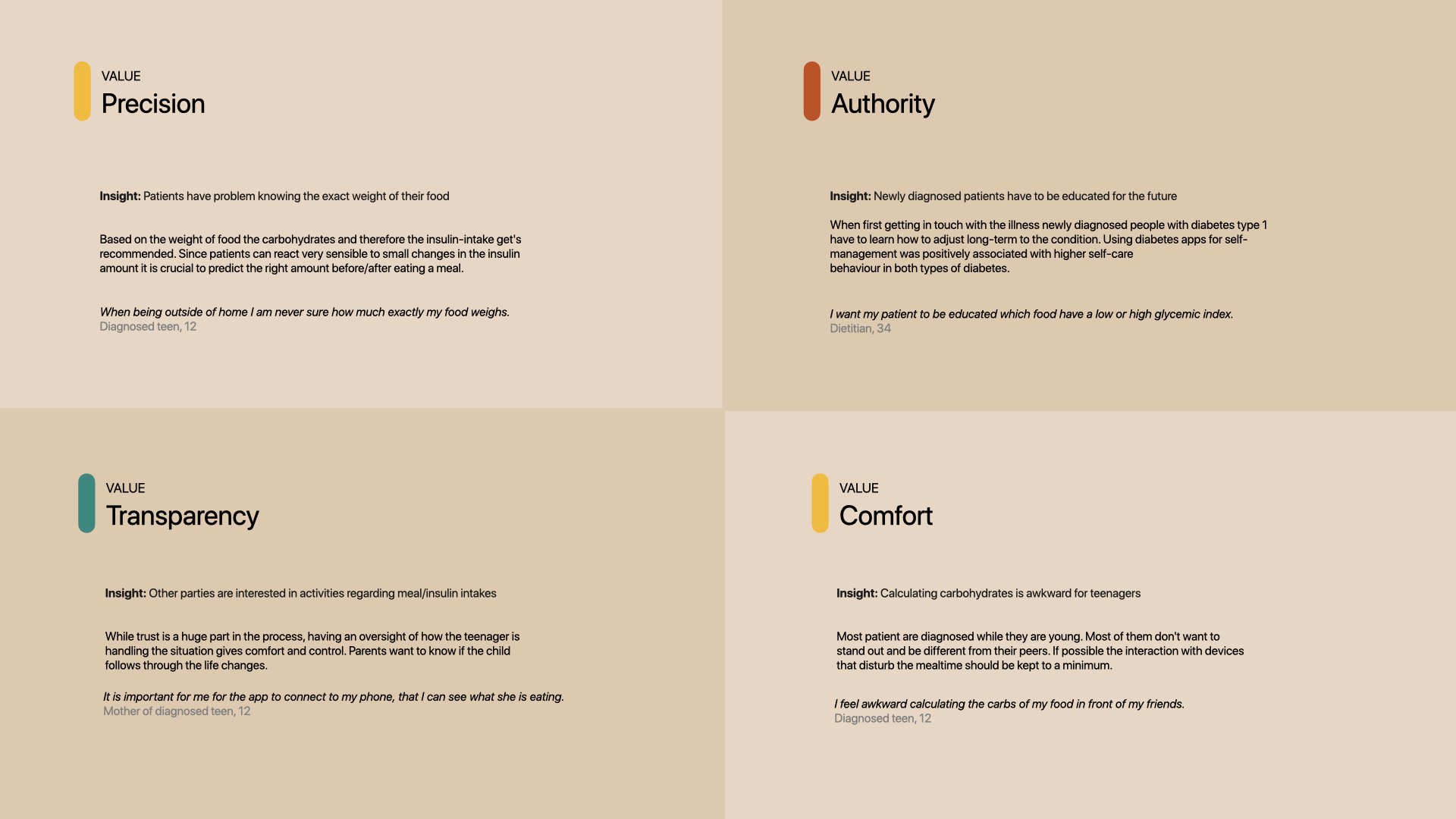
Then we picked insights, analysed each each and concluded into four core value that will influence further design decisions.
After literature review and user interview, we built three types of persona that would help us understand the needs of users.
Then we picked insights, analysed each each and concluded into four core value that will influence further design decisions.
PRODUCT
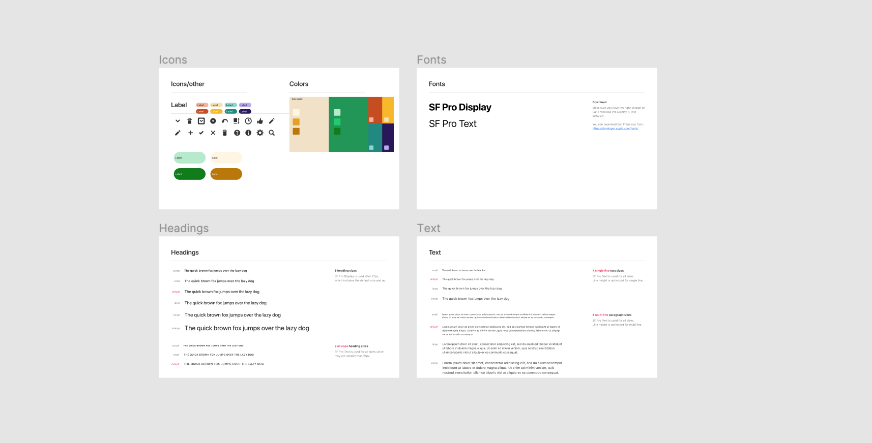
Building visual system
Since the app’s a new product, we created an identity and a visual system for the interface.
Building visual system
Since the app’s a new product, we created an identity and a visual system for the interface.
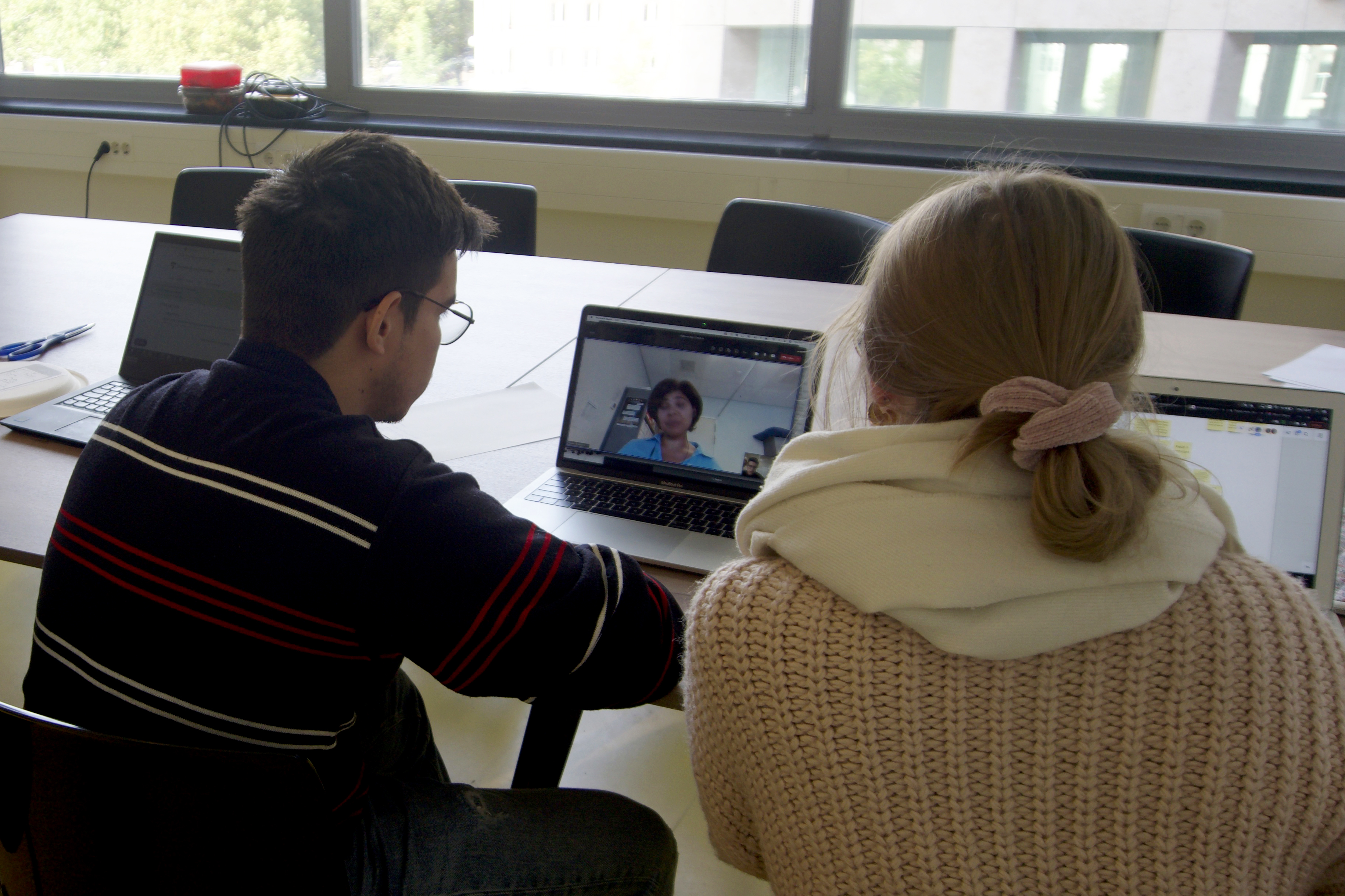
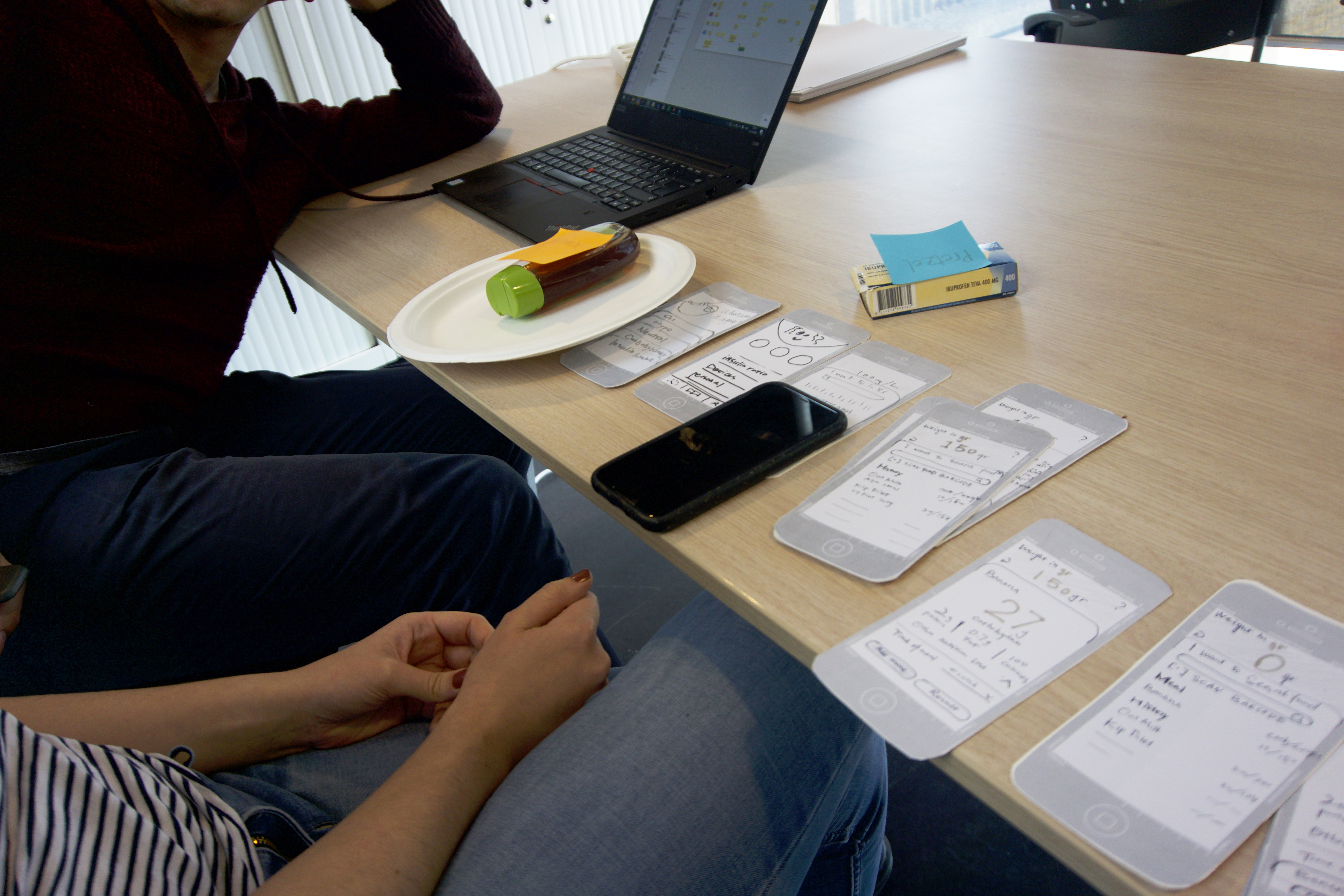
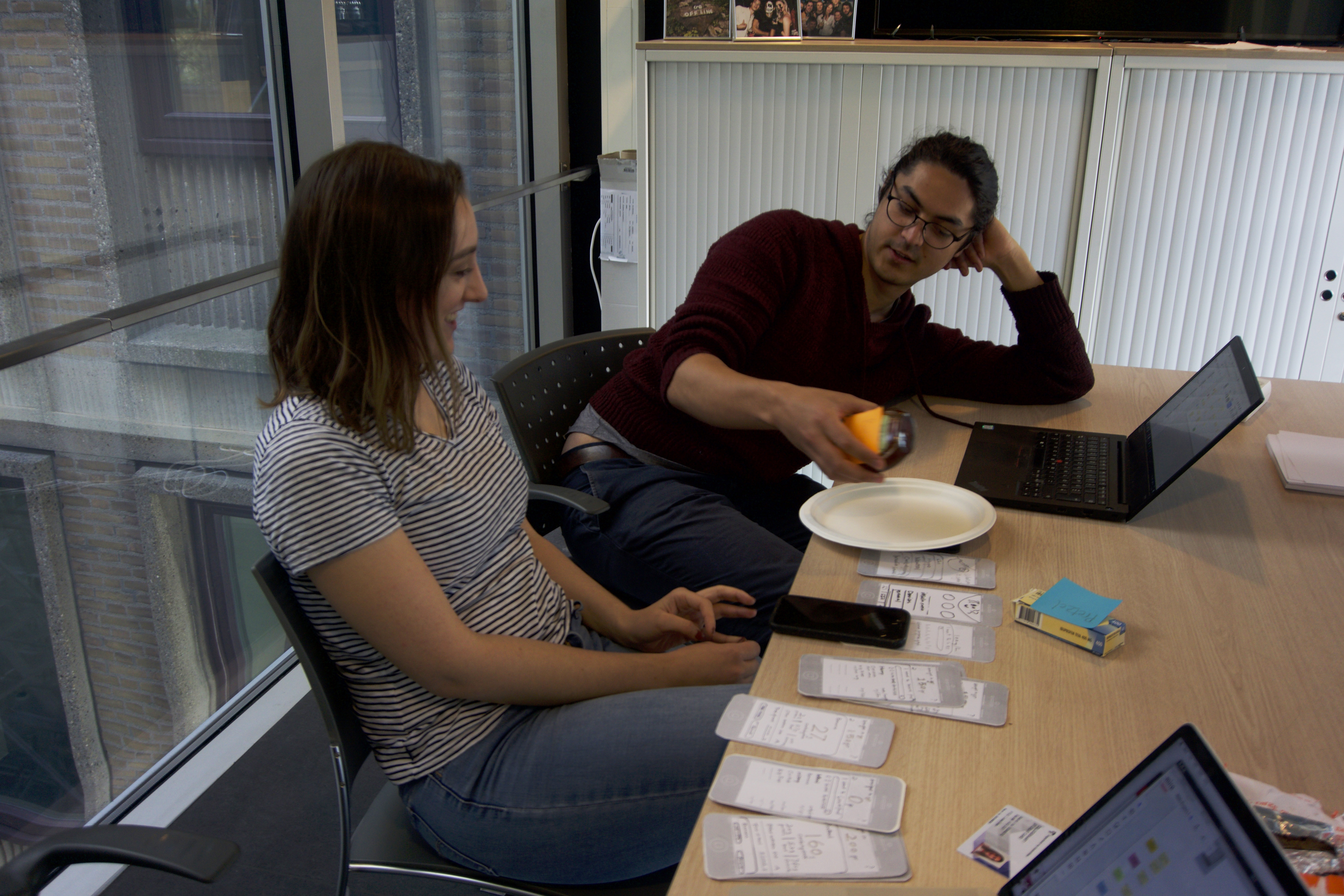
Testing with audience
We initially created paper wireframes and quickly understood people’s reactions.
We initially created paper wireframes and quickly understood people’s reactions.
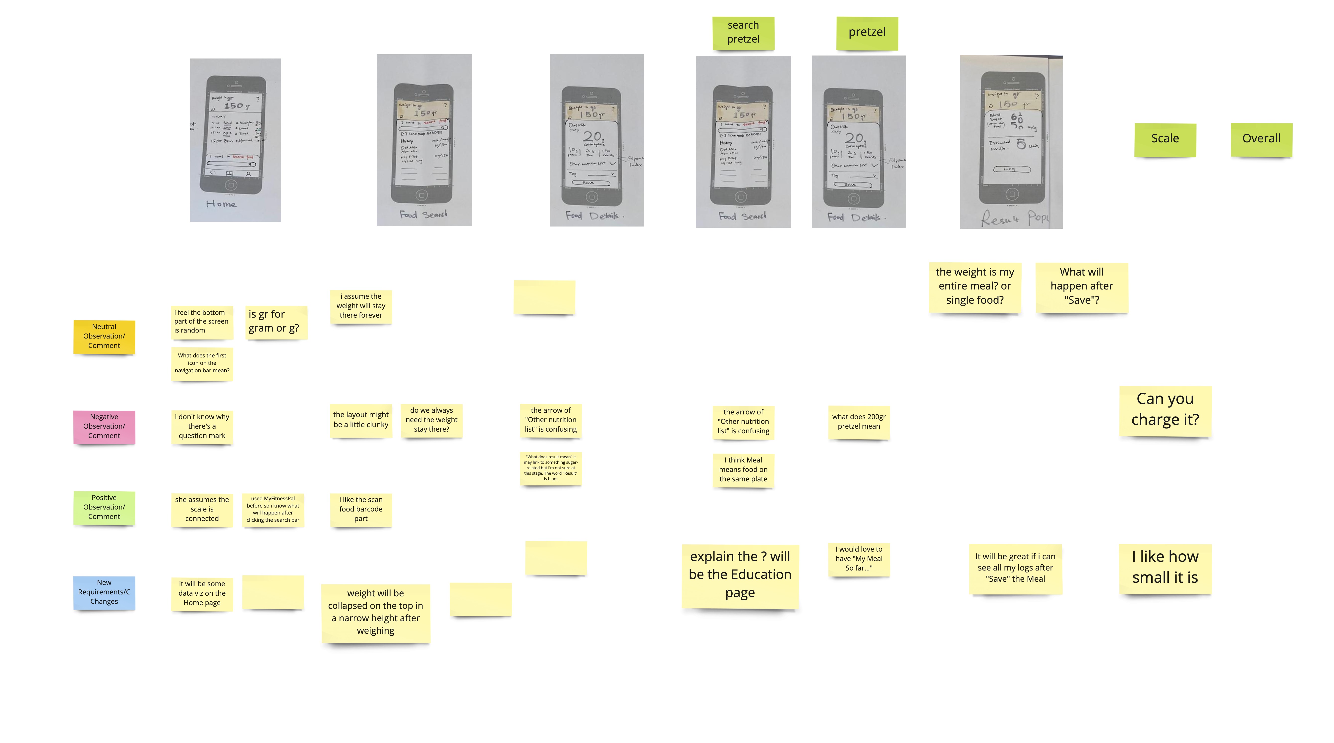
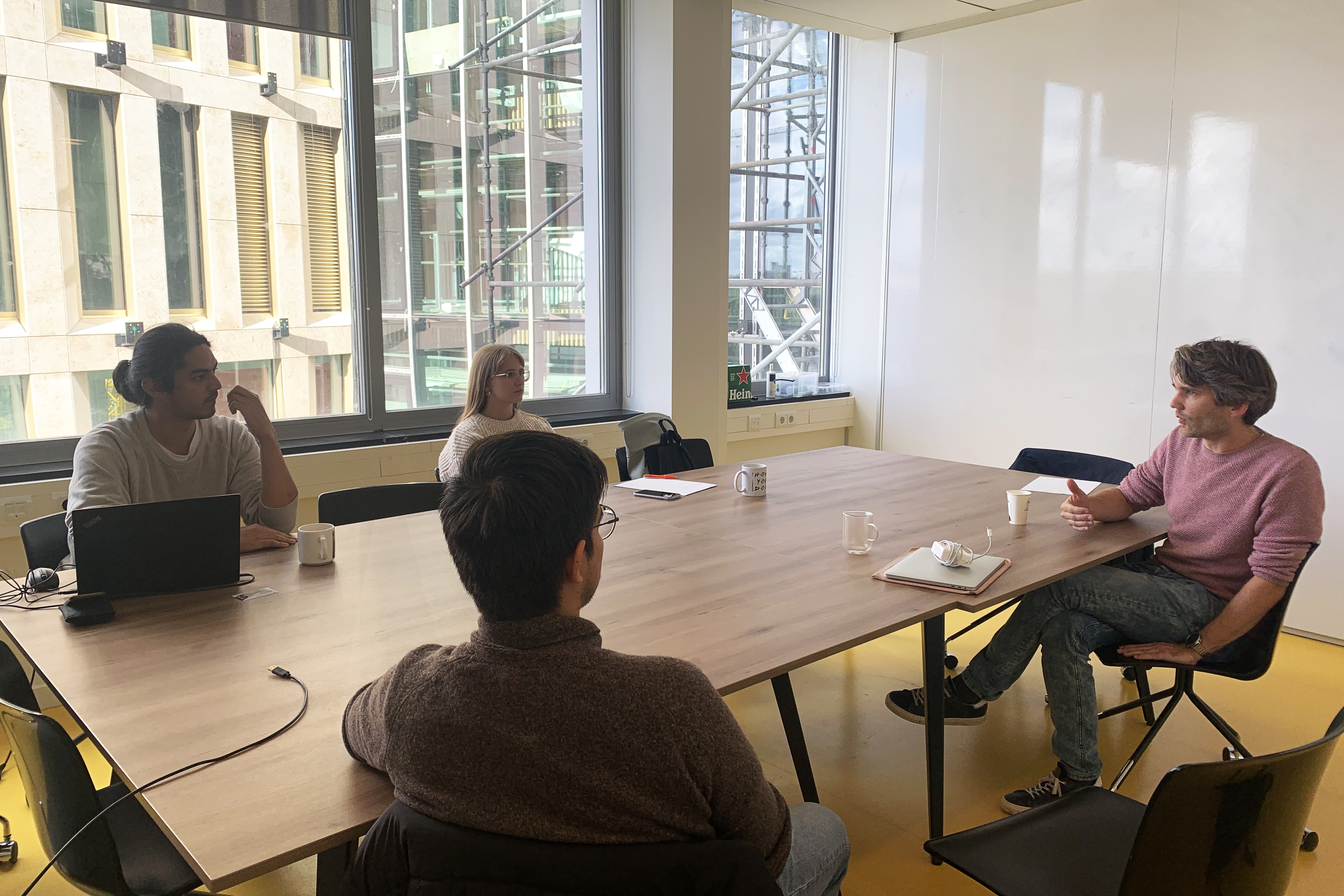
Design interface with constant refinement
We moved the design to digital and revised based on feedbacks from users and designers.
We moved the design to digital and revised based on feedbacks from users and designers.

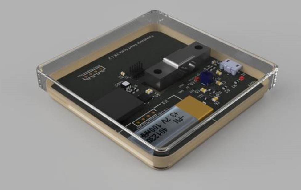
Refine the scale
The engineer team updated the design and created a new version of scale. They are also integrating the app to this project.
The engineer team updated the design and created a new version of scale. They are also integrating the app to this project.
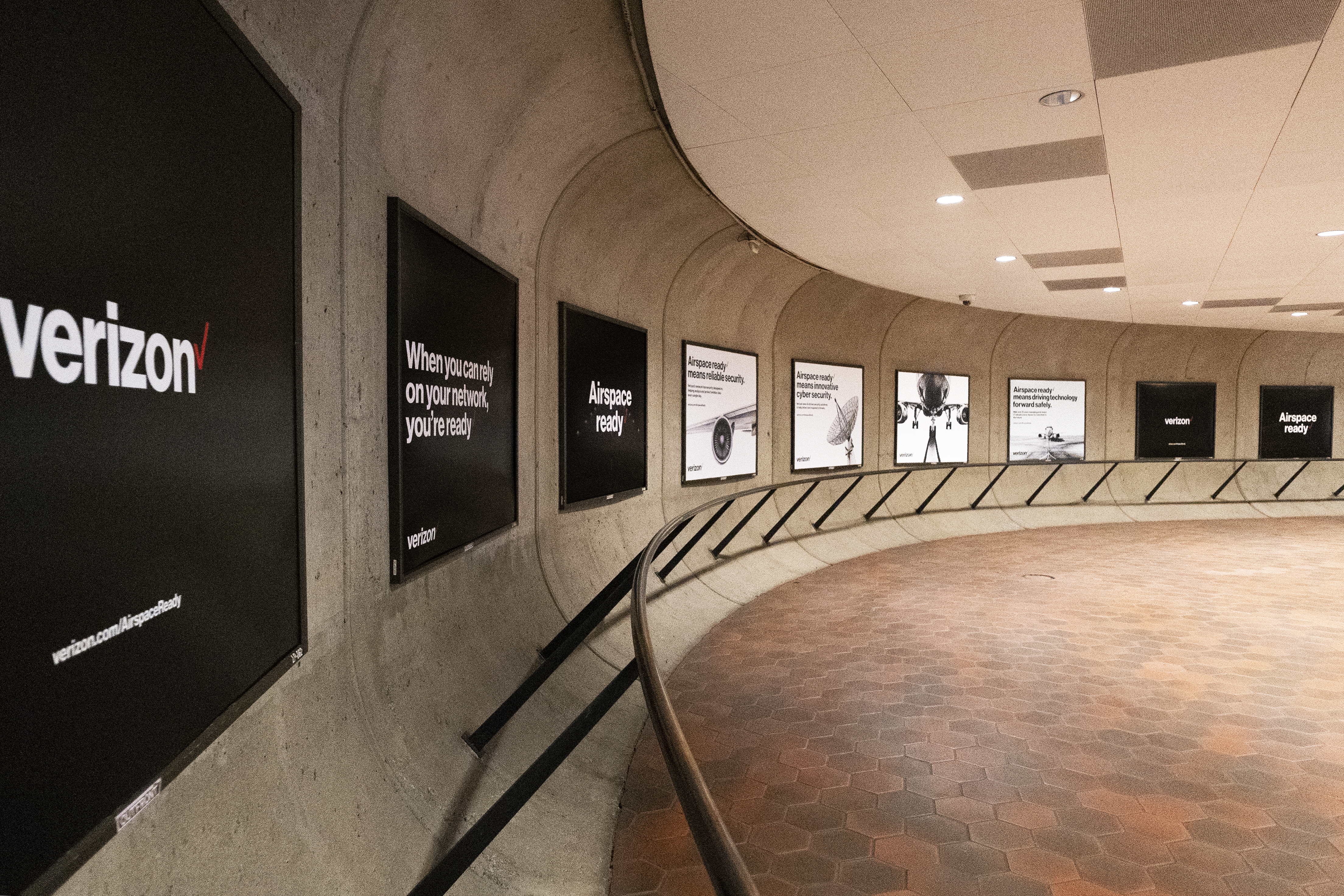
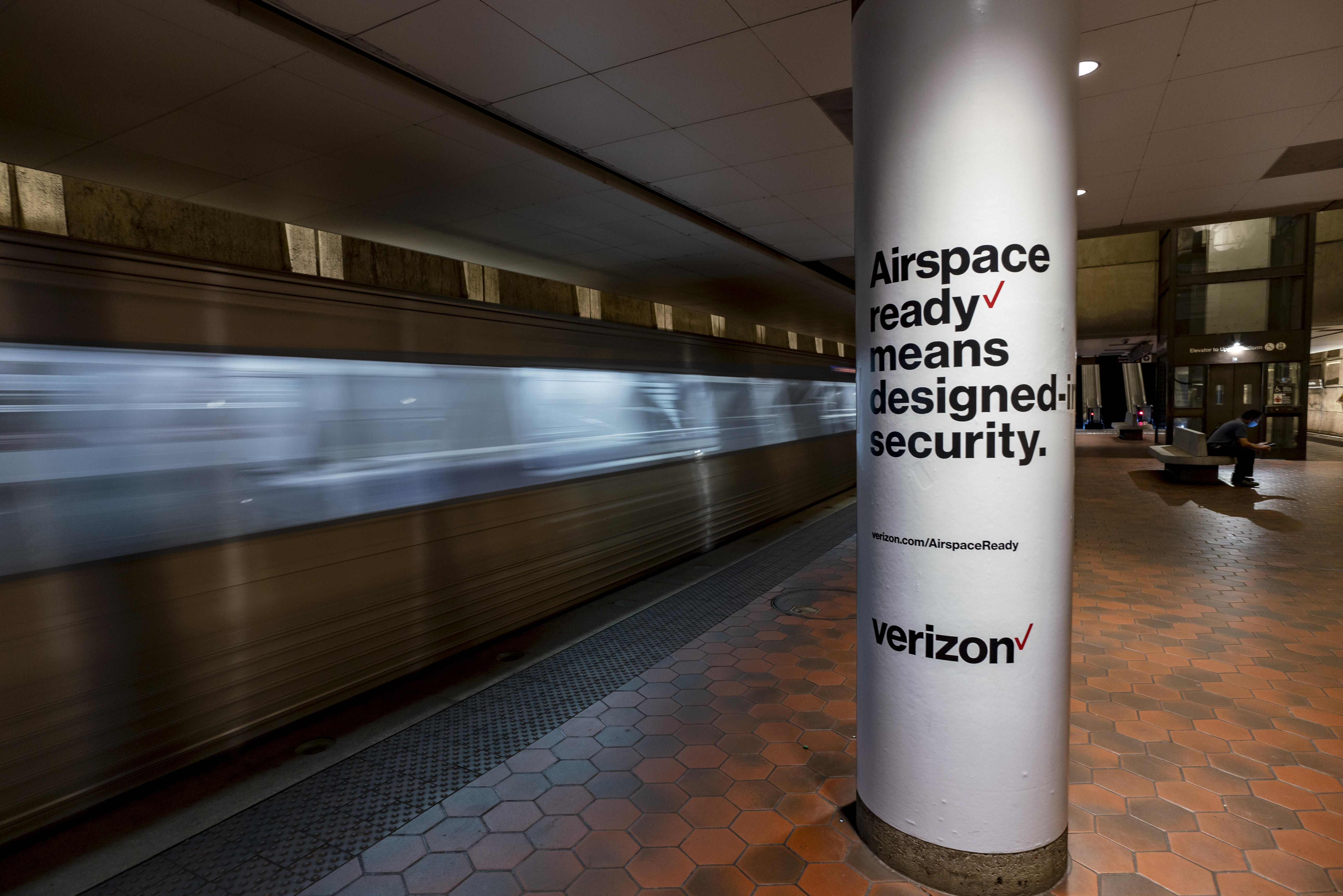
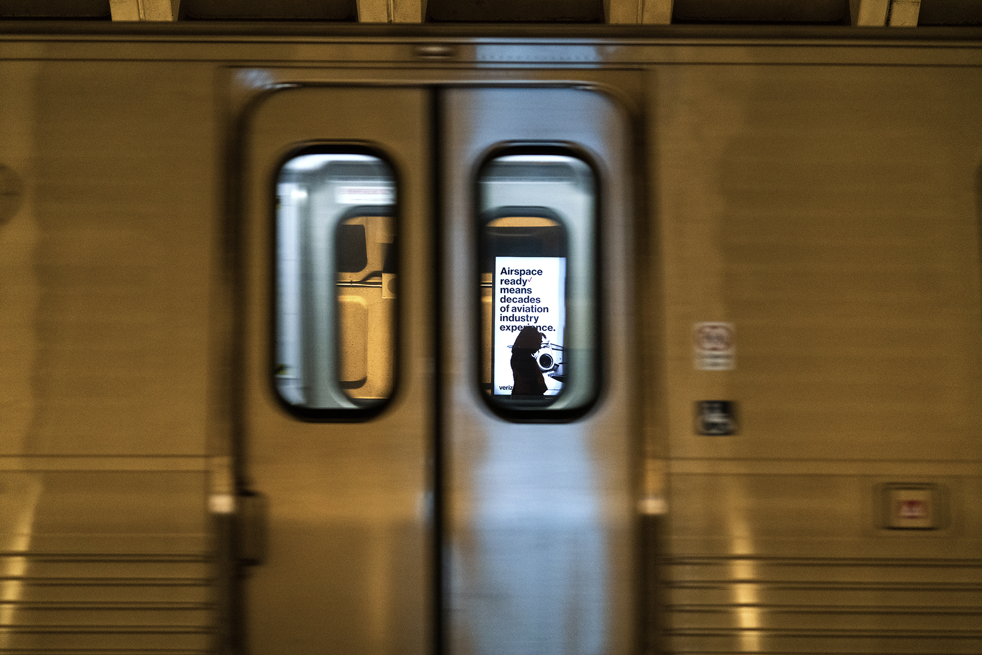
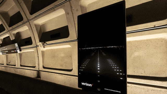
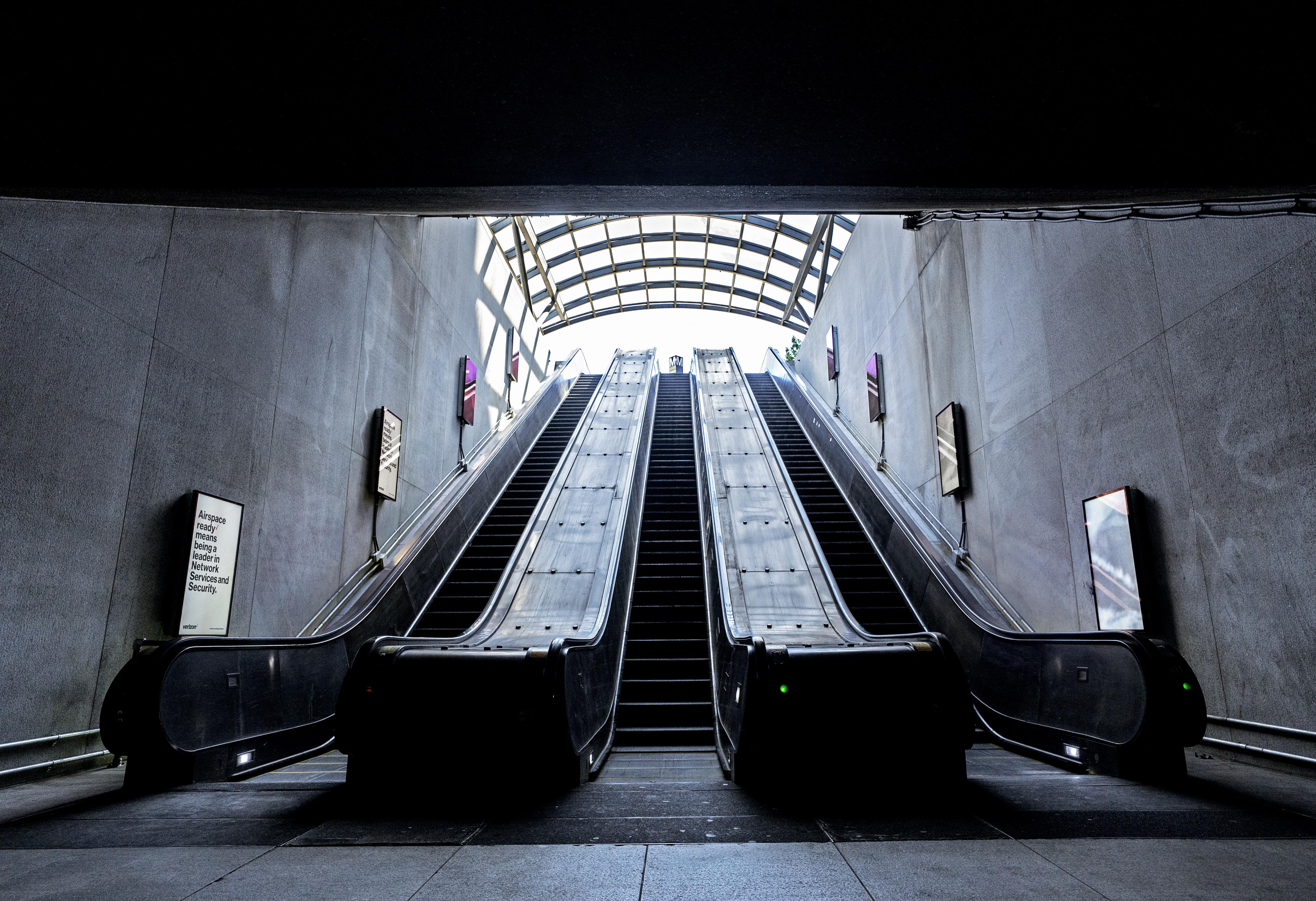
AIRSPACE READY
Verizon | Campaign
Verizon's most reliable network connects everything from the ground to space. We took over the L'Enfant Plaza Station in Washington DC, next to the FAA (Federal Aviation Administration) building, with 120+ units. Over 1,000,000 commuters took a visual journey through the airspace.
My Role
Experience Design
Graphic Design
Motion Direction
Team
Camilla Kristiansen
Graham Clifford
Emely Perez
Joan Heo
Animation
CHRLX
Experience Design
Graphic Design
Motion Direction
Team
Camilla Kristiansen
Graham Clifford
Emely Perez
Joan Heo
Animation
CHRLX
01
Process
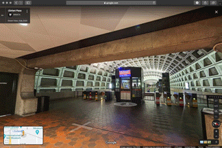
Due to COVID, we couldn’t visit the station in person. So we decided to navigate through on Google Map’s street view and see the relationships between each units. By dividing the station into zones, it’s easier to craft a brand story for every commuter.
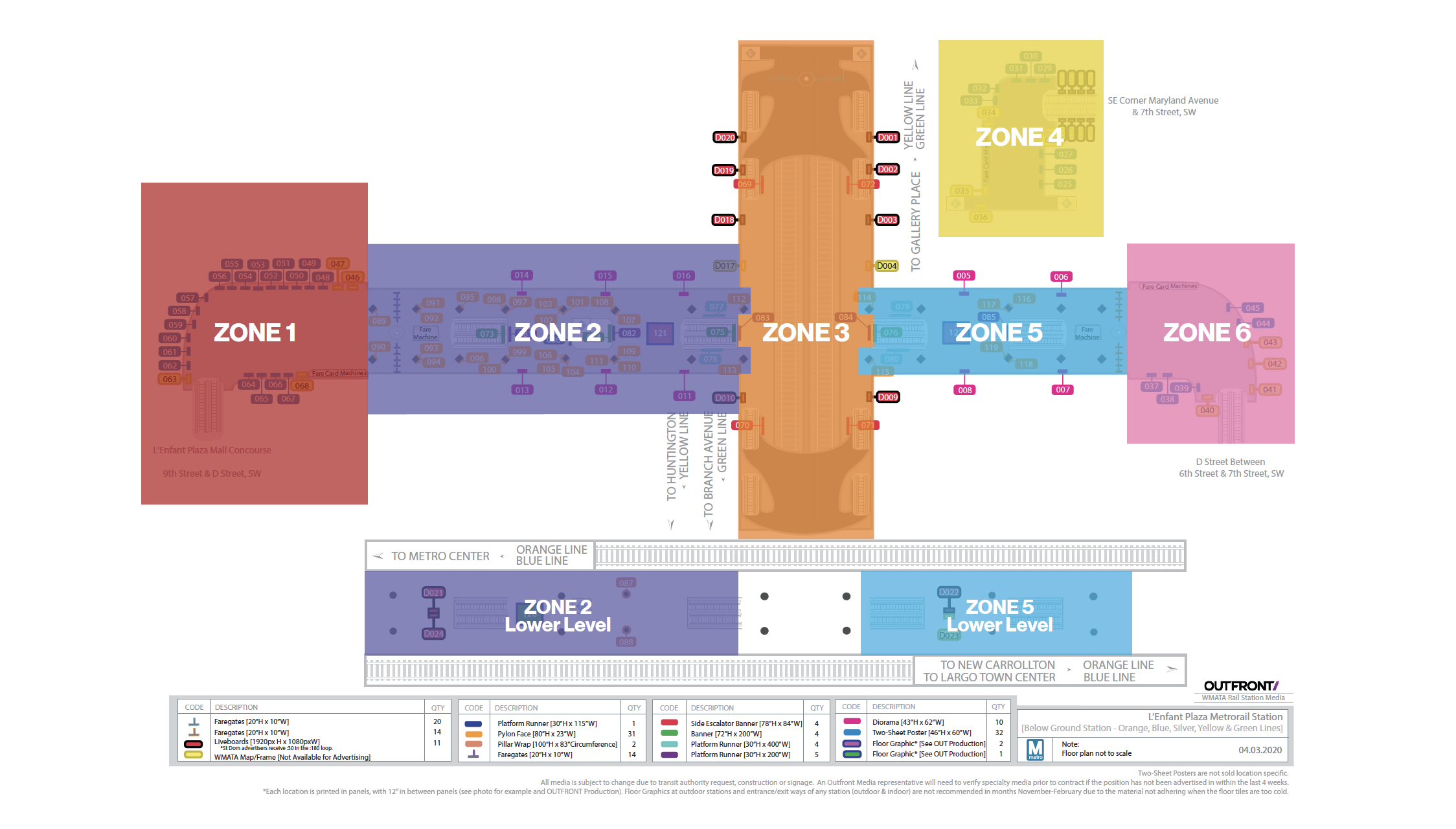


Since it was unsafe to launch a photo shoot anywhere in the country during COVID, we repurposed stock images while adhering to the brand style for Verizon Business.


02
System
Every one of the 120+ units will serve a purpose, such as explaining why Verizon is an excellent partner for future aviation or reinforcing branding.
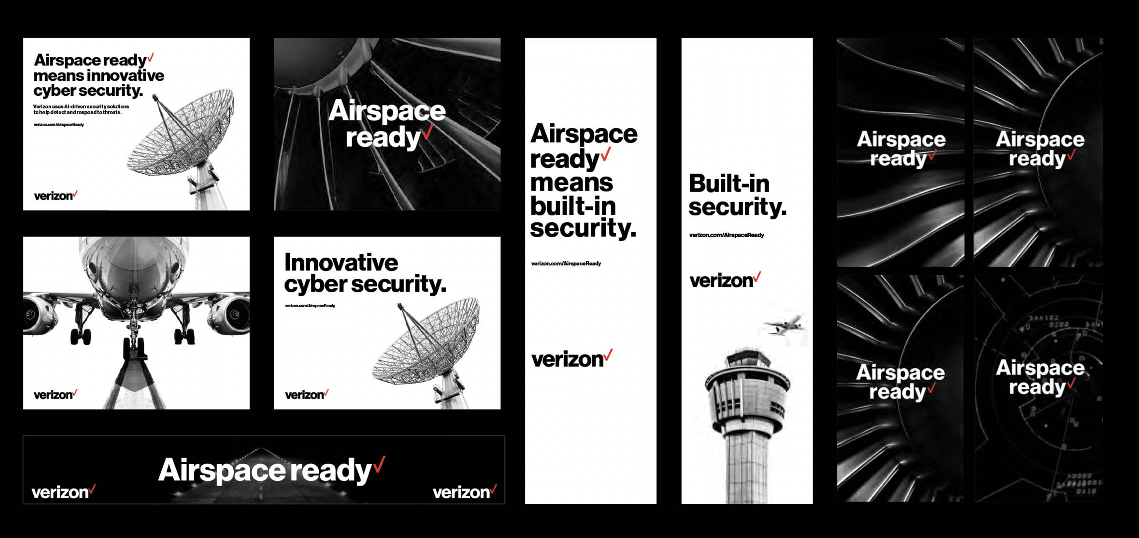
03
Campaign
We've given careful consideration to the placement of each unit ranging from static to motion graphics, taking into account walking direction, entrances and exits, and areas where commuters're more likely to be waiting than walking.

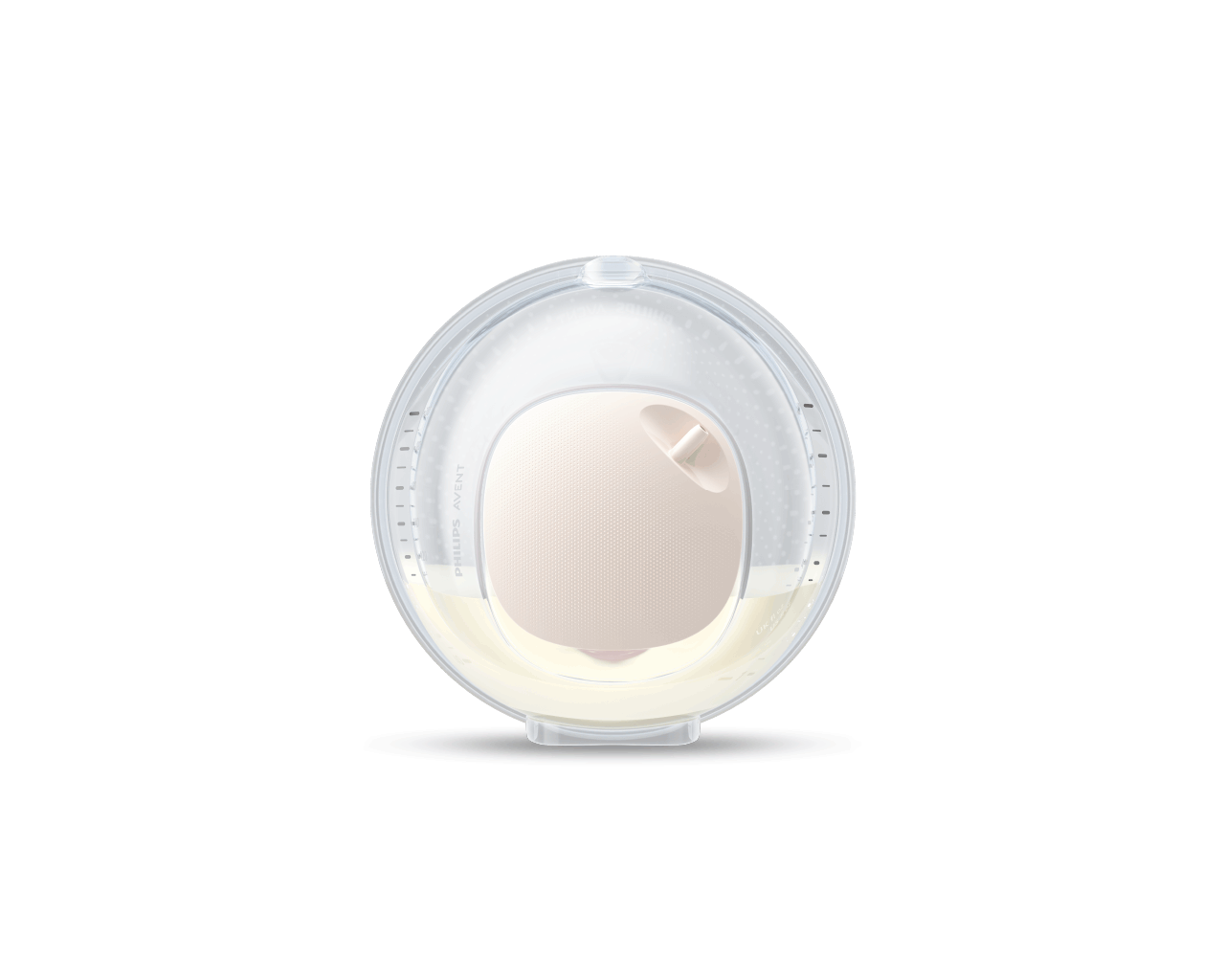
Share the Care
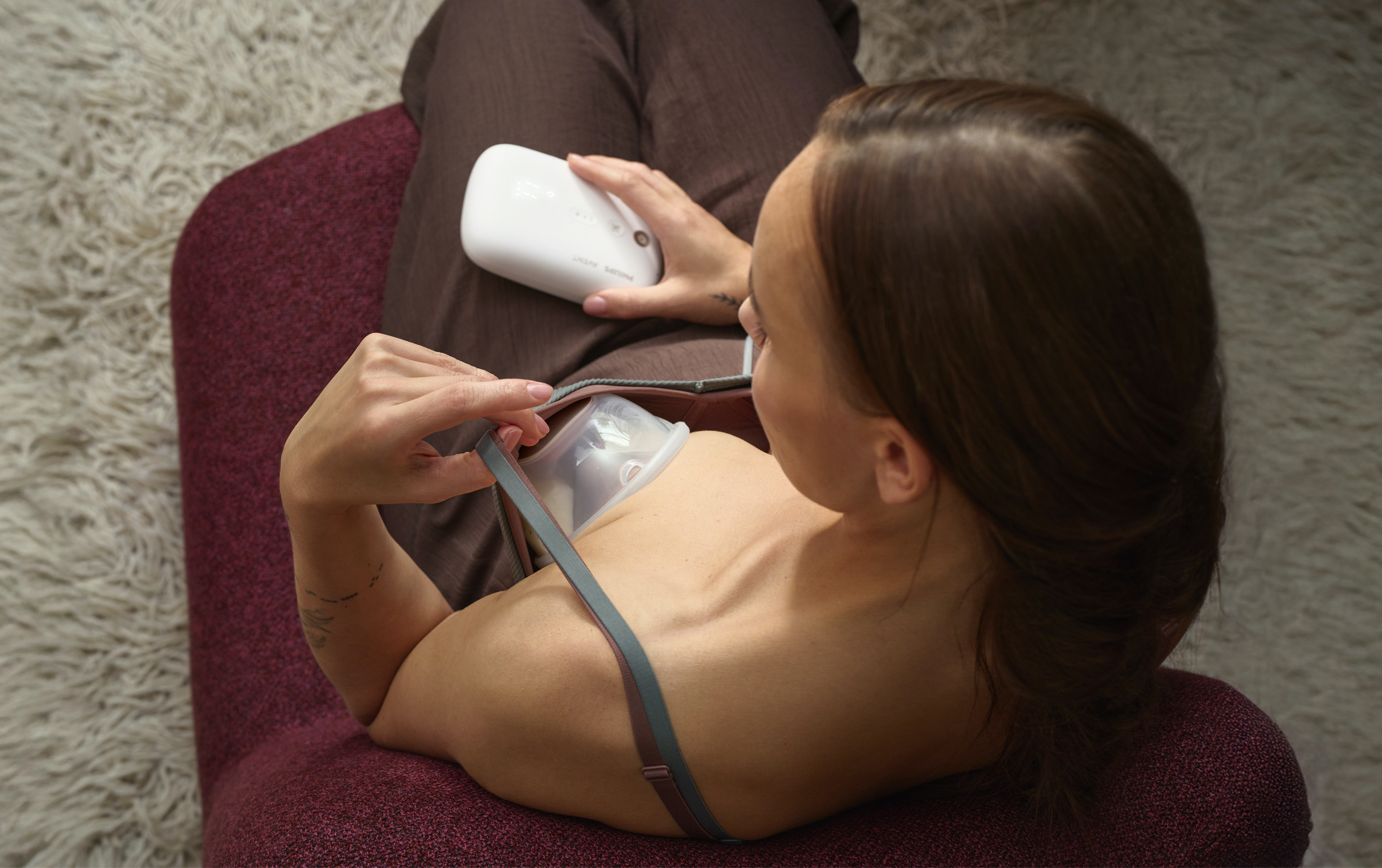
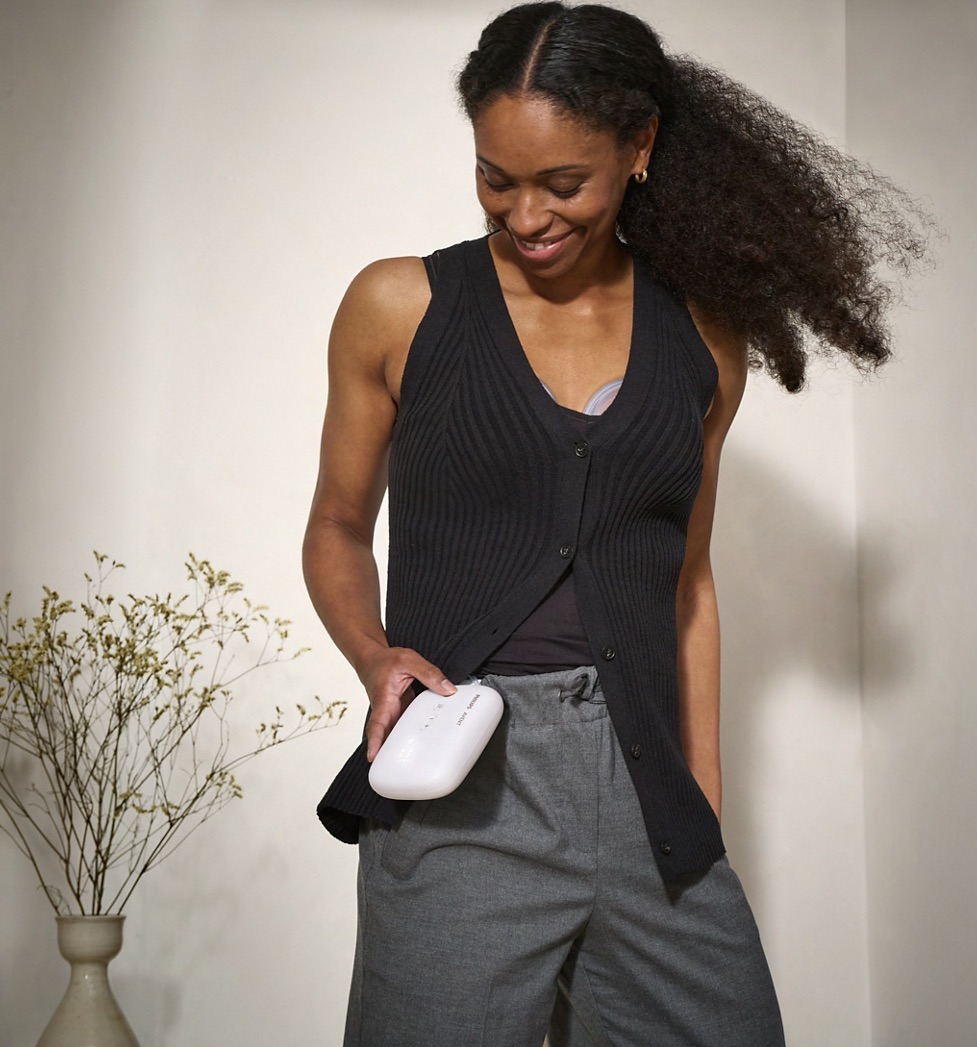
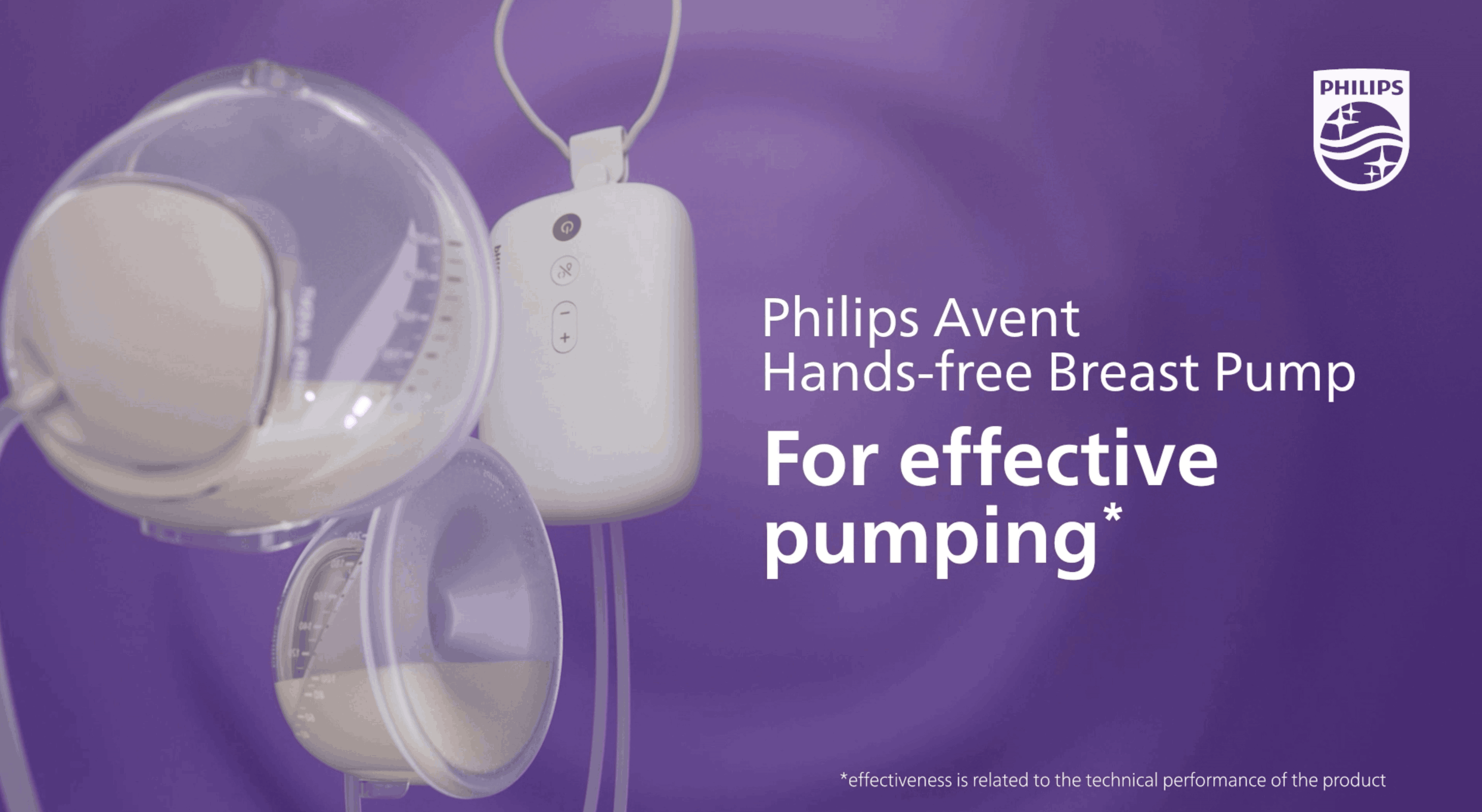
Philips Avent | Product Launch
85% of moms want a hands-free pump that doesn’t compromise on comfort or power.
With Philips Avent, we’re launching a next-generation breast pump that delivers both high efficiency and exceptional comfort.
Working alongside a cross-functional team and our external partners, I contributed to the customer journey design, packaging, 360° campaign, e-commerce touchpoints, and experience measurement. The work was also consolidated into a toolkit to support implementation across global markets.
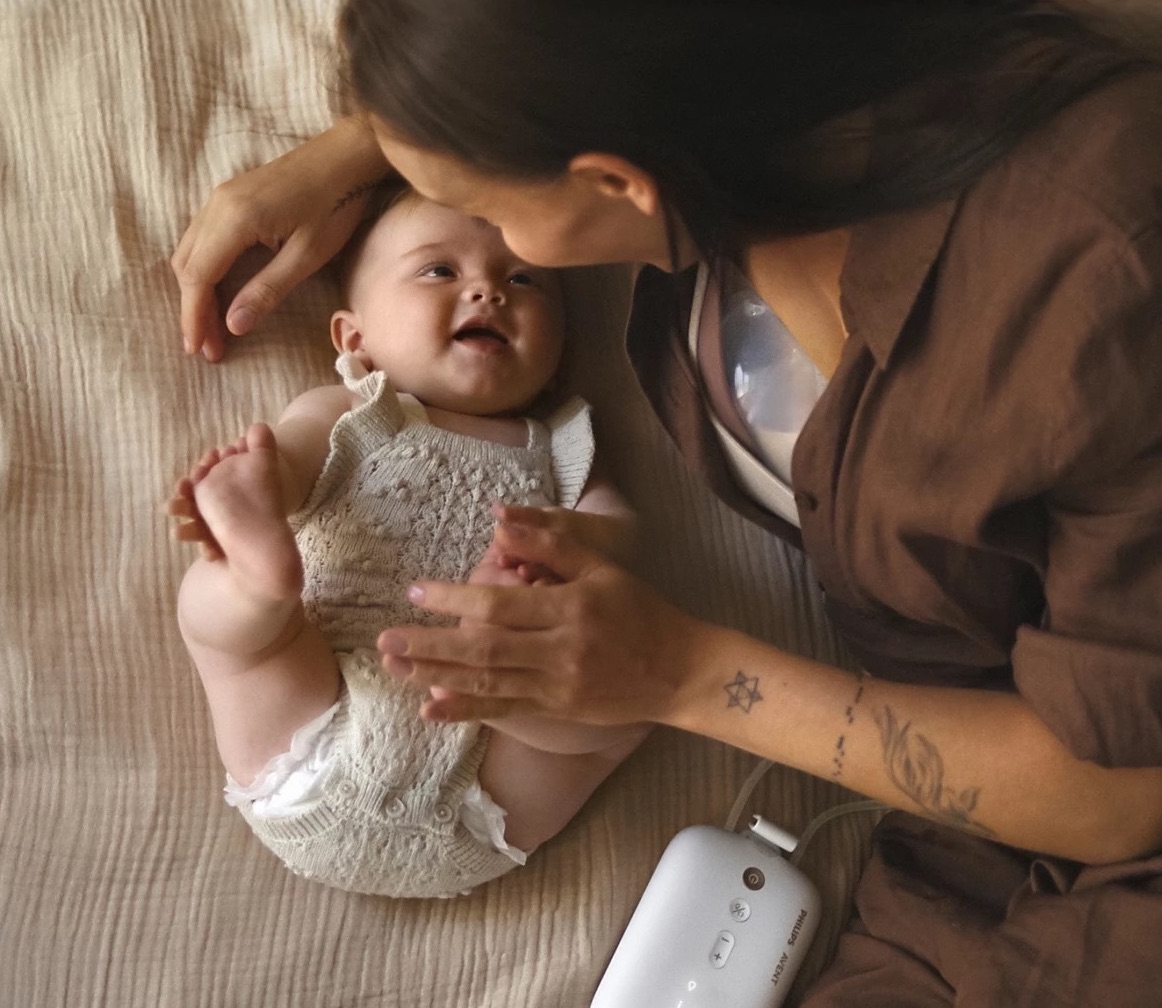
With this product, we continue to encourage partners, family members, and the wider support network to step in. It’s freeing up time for moms to prioritize their own needs.
With Philips Avent, we’re launching a next-generation breast pump that delivers both high efficiency and exceptional comfort.
Working alongside a cross-functional team and our external partners, I contributed to the customer journey design, packaging, 360° campaign, e-commerce touchpoints, and experience measurement. The work was also consolidated into a toolkit to support implementation across global markets.
With this product, we continue to encourage partners, family members, and the wider support network to step in. It’s freeing up time for moms to prioritize their own needs.
My Role
Experience Design
Art Direction
Graphic Design
Digital Design
Team
Mitchell Shernoff
Kris Frank
Jeannette Weber
Cassia Giancola
Chantal Hazelaar
Josine Brokken
Production
Wenneker
Lukkien
LePub-Publicis
Experience Design
Art Direction
Graphic Design
Digital Design
Team
Mitchell Shernoff
Kris Frank
Jeannette Weber
Cassia Giancola
Chantal Hazelaar
Josine Brokken
Production
Wenneker
Lukkien
LePub-Publicis
01
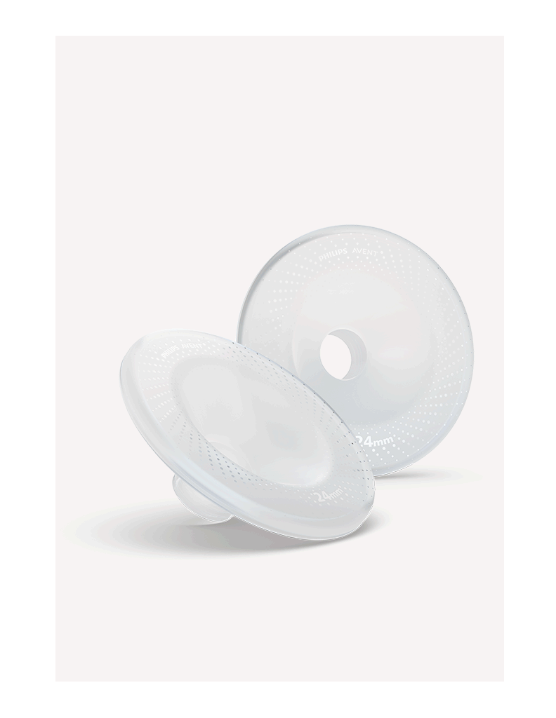
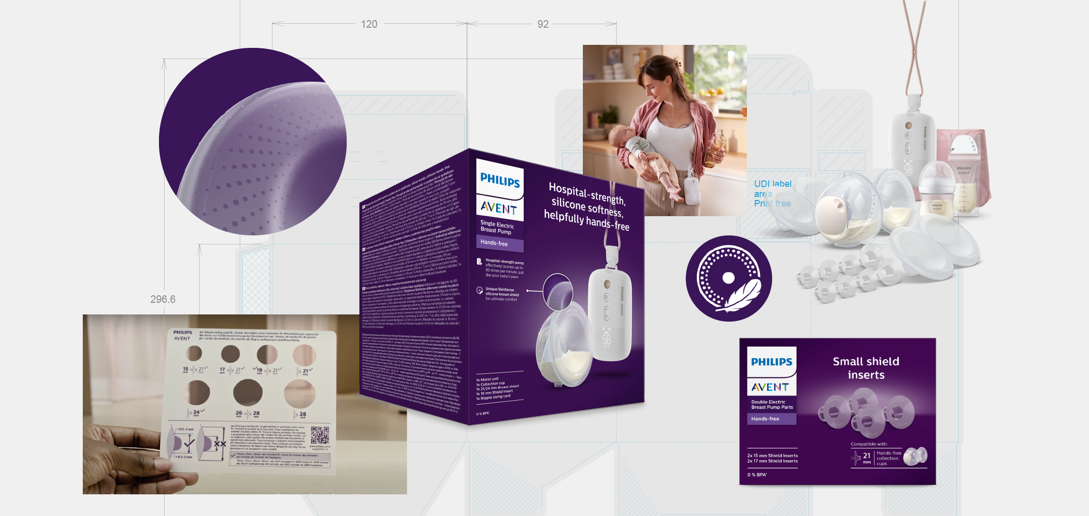
Product design
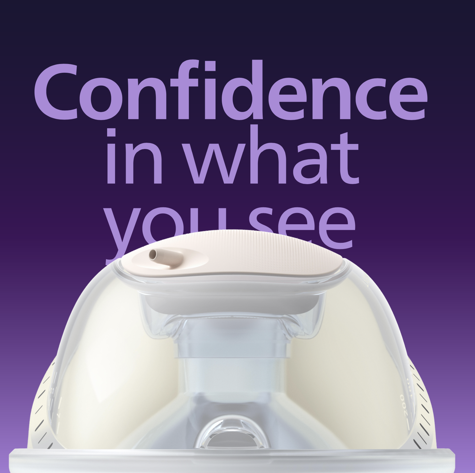
Compared to existing breast pumps on the market, our advantage lies in three areas: A more powerful motor unit; Skin-friendly silicone materials for maximum comfort; Transparent design elements for peace of mind


02
Packaging
Together with our trusted partner Point 6 UK, we developed a packaging system tailored for global markets. In addition to a well-considered messaging hierarchy, we created technical icons and partnered with production house Lukkien for a dedicated photo shoot. Each pump pack includes a nipple sizing card to help moms measure correctly and ensure maximum comfort.

03
Photography and videography
Soft, emotional, and honest.
The photo and video direction aligns with our brand principles while emphasizing the core benefits of the product. We collaborated with Wenneker to bring this vision to life. We produced campaign key visuals, educational videos, product advertising, and premium product imagery.
The photo and video direction aligns with our brand principles while emphasizing the core benefits of the product. We collaborated with Wenneker to bring this vision to life. We produced campaign key visuals, educational videos, product advertising, and premium product imagery.


We built a 360° campaign inspired by our brand promise: “Share the Care.”
Here’s one of the videos and visual assets created for e-commerce platforms such as Amazon and bol.com.
Here’s one of the videos and visual assets created for e-commerce platforms such as Amazon and bol.com.
04
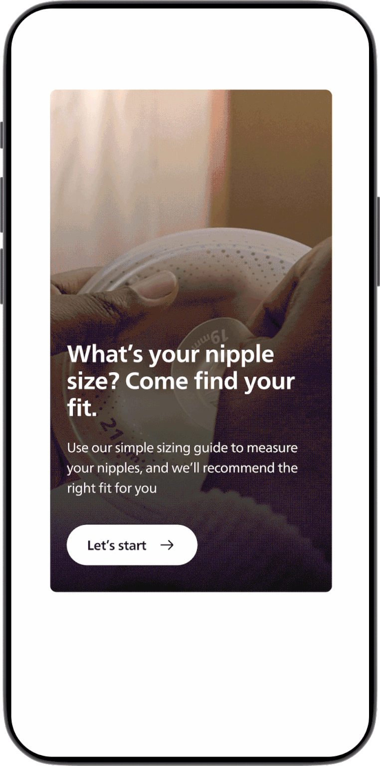
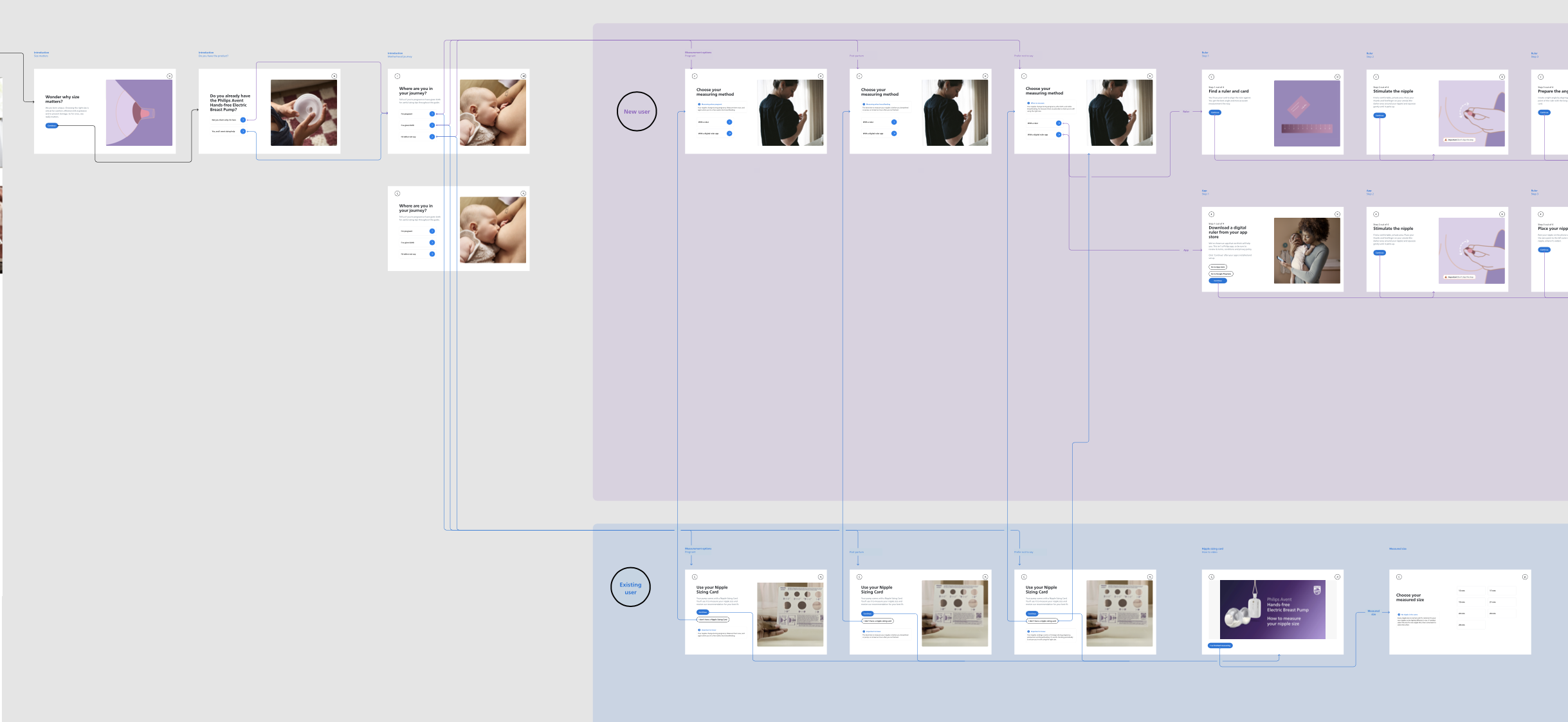
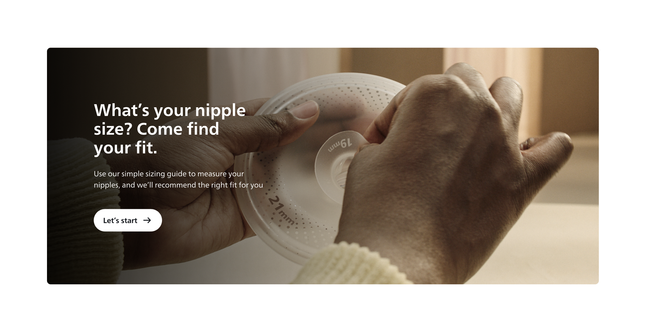
Nipple Sizing Journey
Since the pump comes in multiple sizes, helping moms find the right fit is essential for a truly comfortable experience.
Although including a nipple-sizing card in the packaging was helpful, we found that moms feel more confident and supported when they know their size before purchase.
Although including a nipple-sizing card in the packaging was helpful, we found that moms feel more confident and supported when they know their size before purchase.


After identifying this need, we mapped out a dedicated micro-journey focused on size measurement. We prototyped several solutions, conducted rounds of user testing, and worked with our digital development team to create an online sizing tool that supports moms early in their journey.
It’s been rewarding to see the product receive strong reviews across platforms. We also developed a measurement matrix to evaluate both the sizing experience and overall customer experience for this product.
It’s been rewarding to see the product receive strong reviews across platforms. We also developed a measurement matrix to evaluate both the sizing experience and overall customer experience for this product.
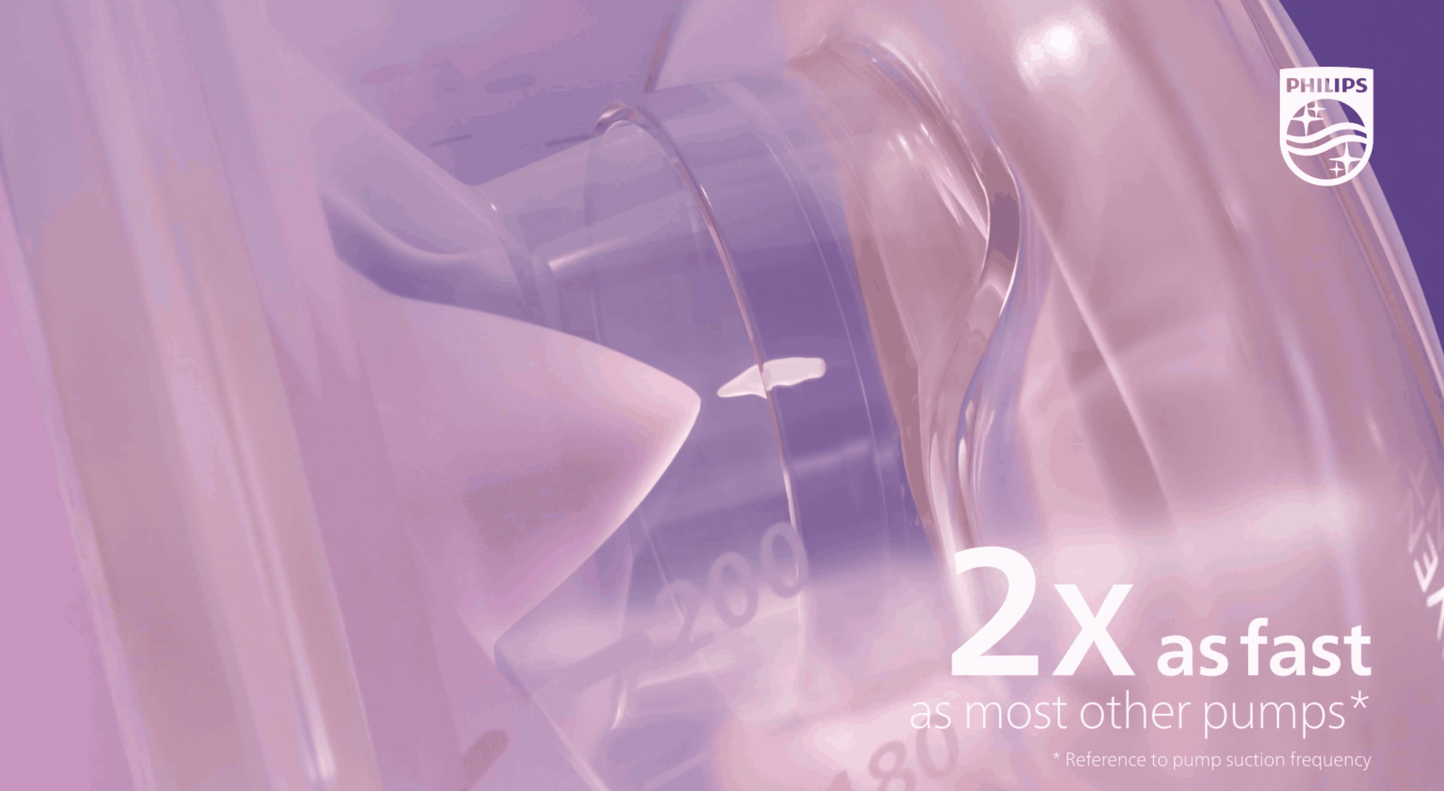
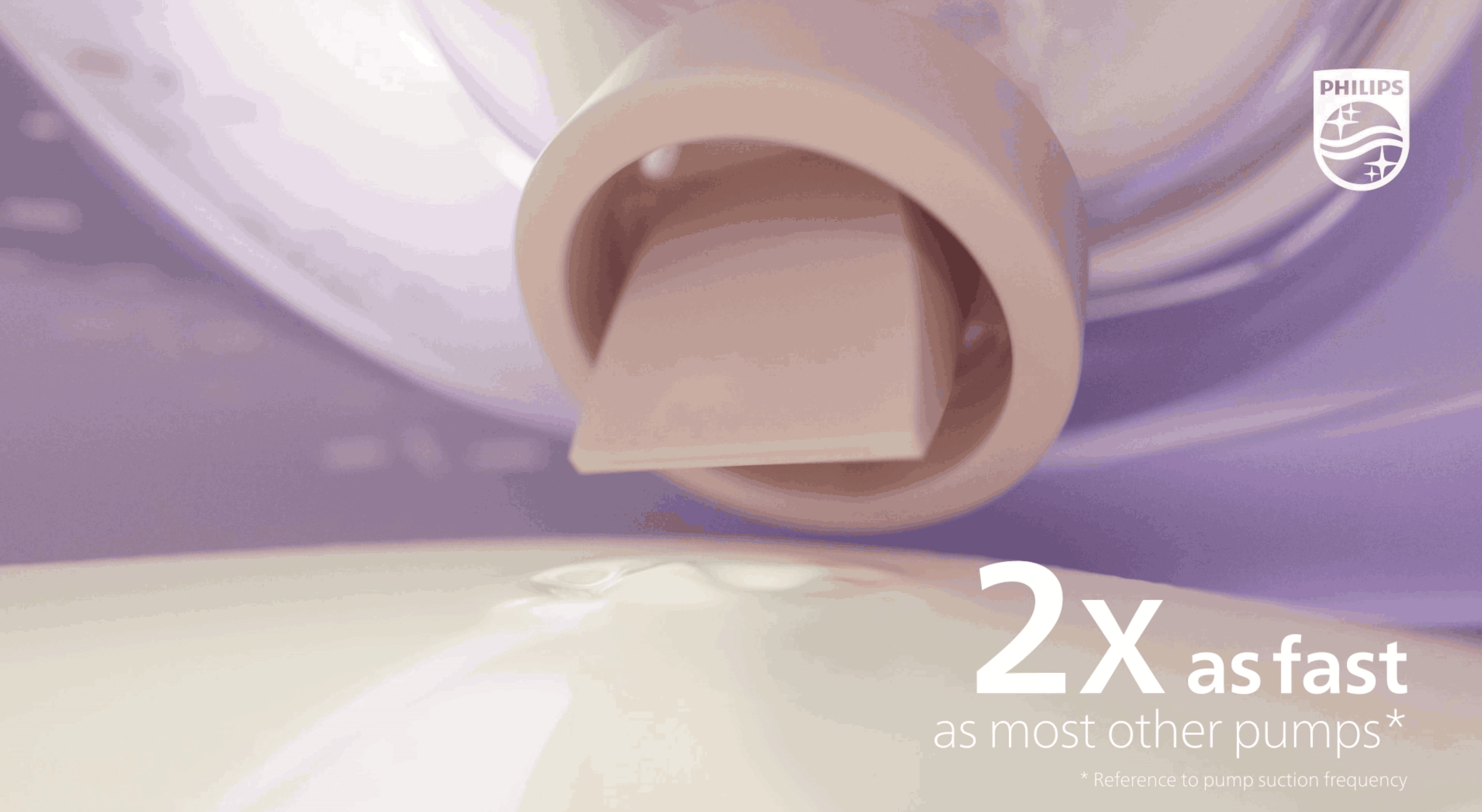
05
CGI - Efficiency pumping
Currently in development - releasing soon.
UNLOCK LIFE
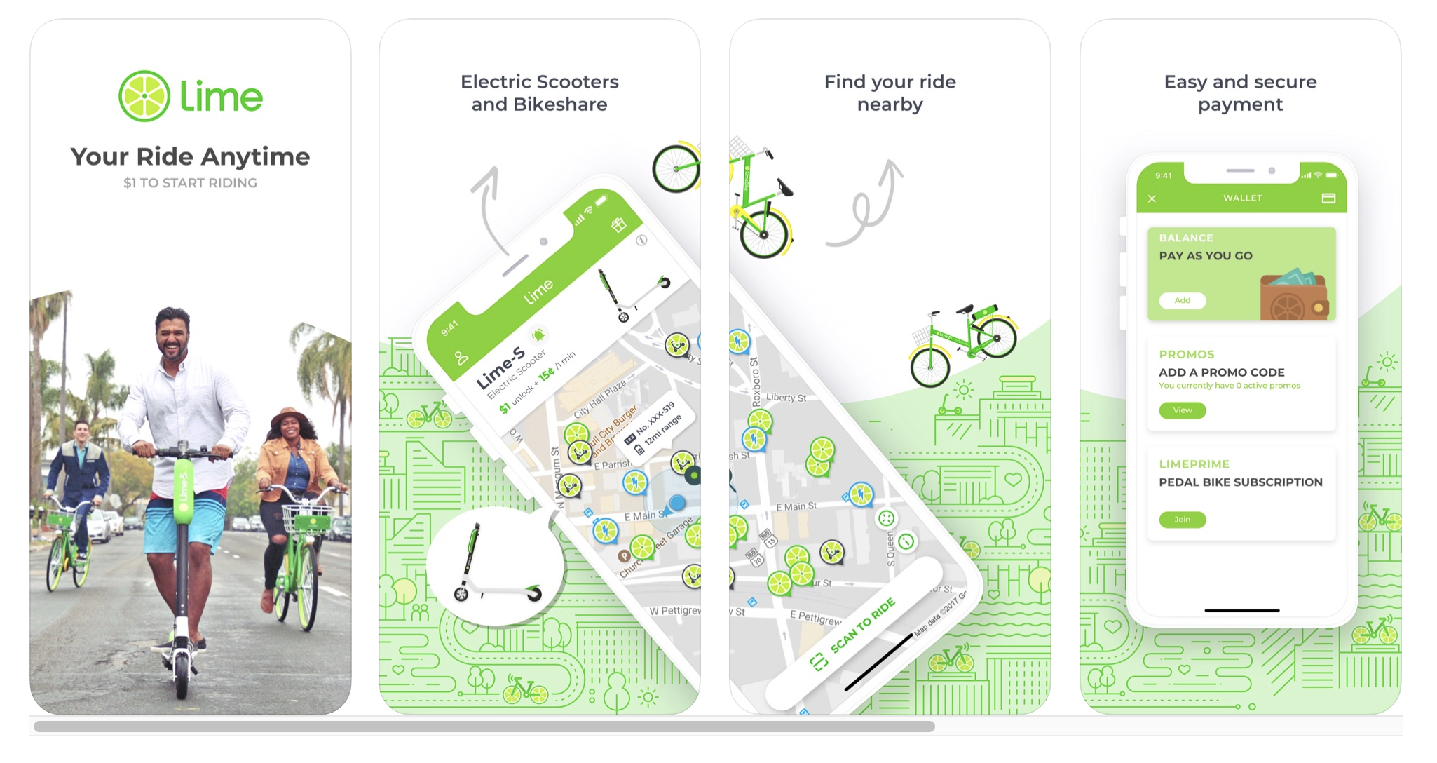
Lime | Rebranding
After changing their brand name from “Lime Bike” to “Lime”, Lime is looking for a brand revamp that excites grassroots people to explore their communities and cities freely.
Working with the strategy and design teams at Wolff Olins, we helped Lime define their promises, identified topics they would like to be involved and content they are going to bring to their users.
Working with the strategy and design teams at Wolff Olins, we helped Lime define their promises, identified topics they would like to be involved and content they are going to bring to their users.
01
Past Brand Style
02
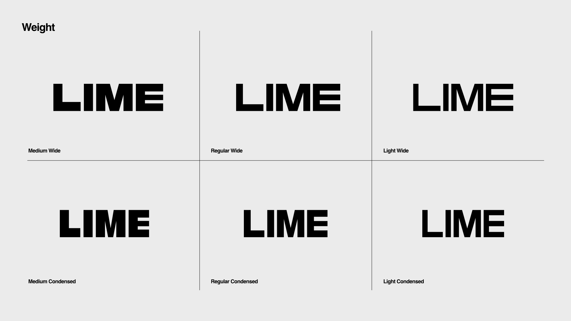
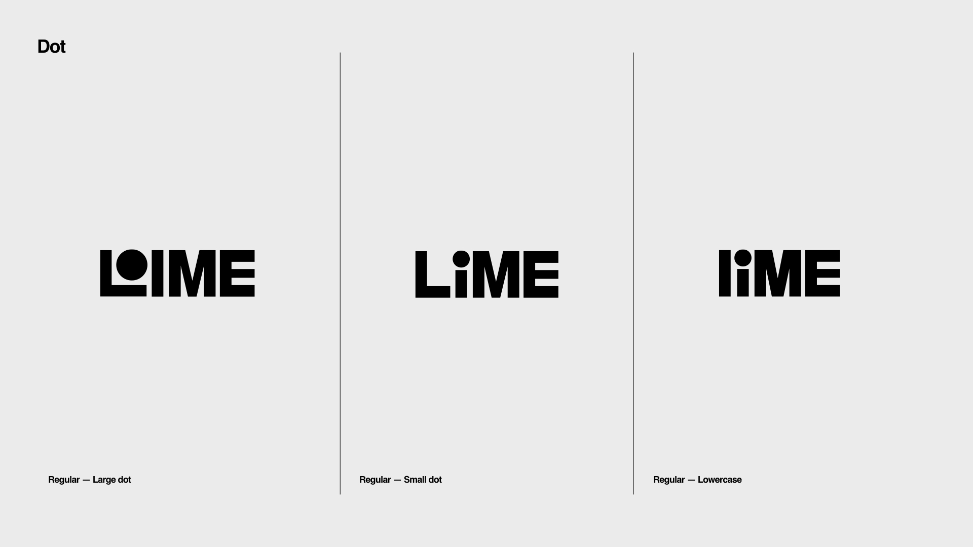
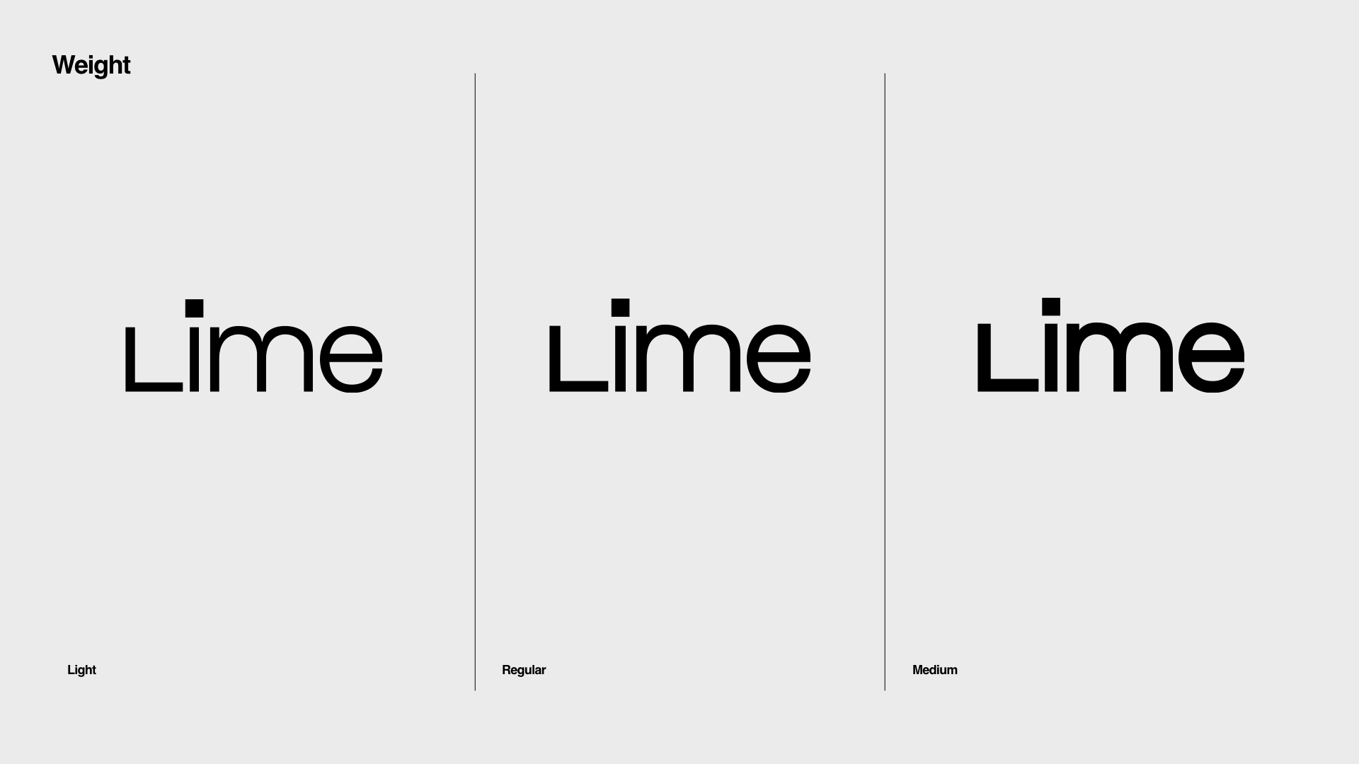
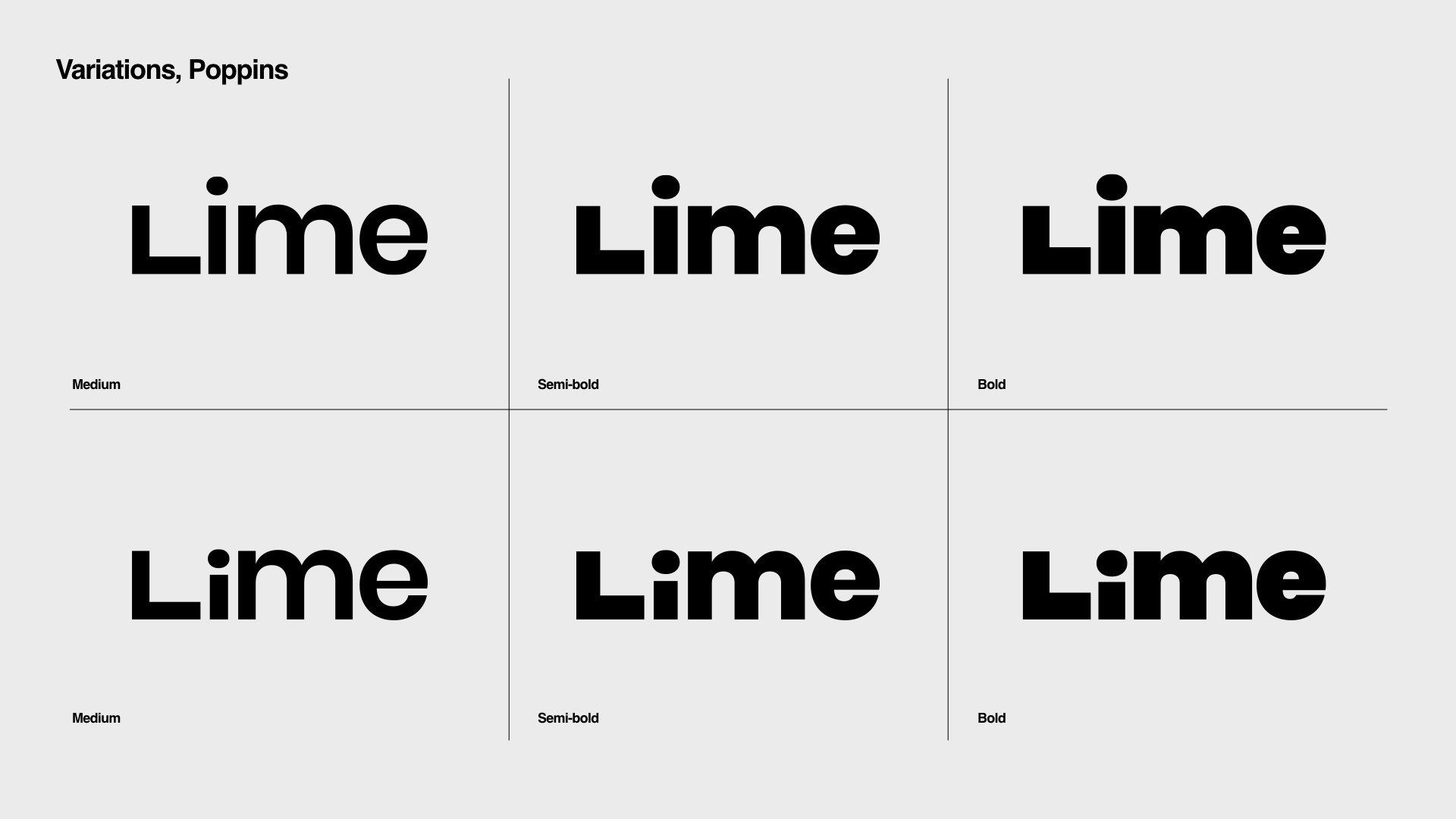
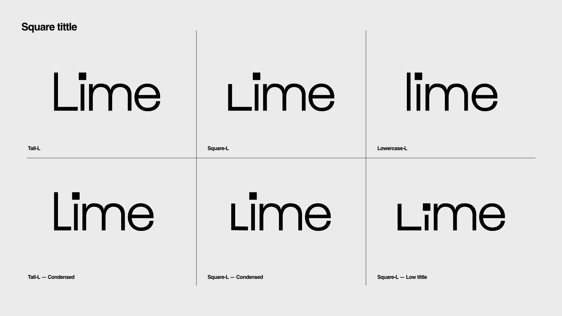
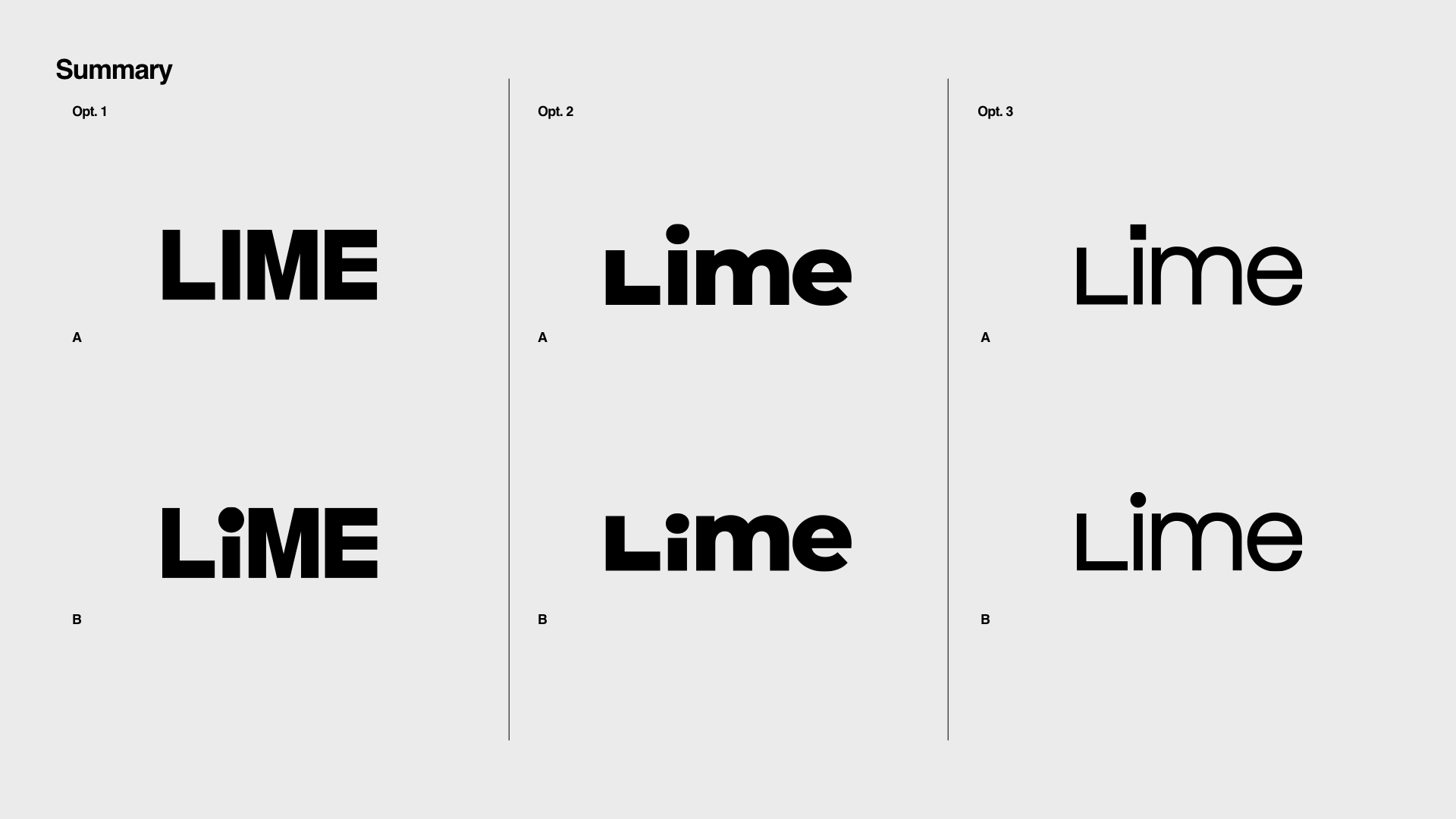
New Logo
Keep the legacy of Lime’s logo mark (both a wheel and a fruit) and transform the logo type with the essence of mobility

03


04
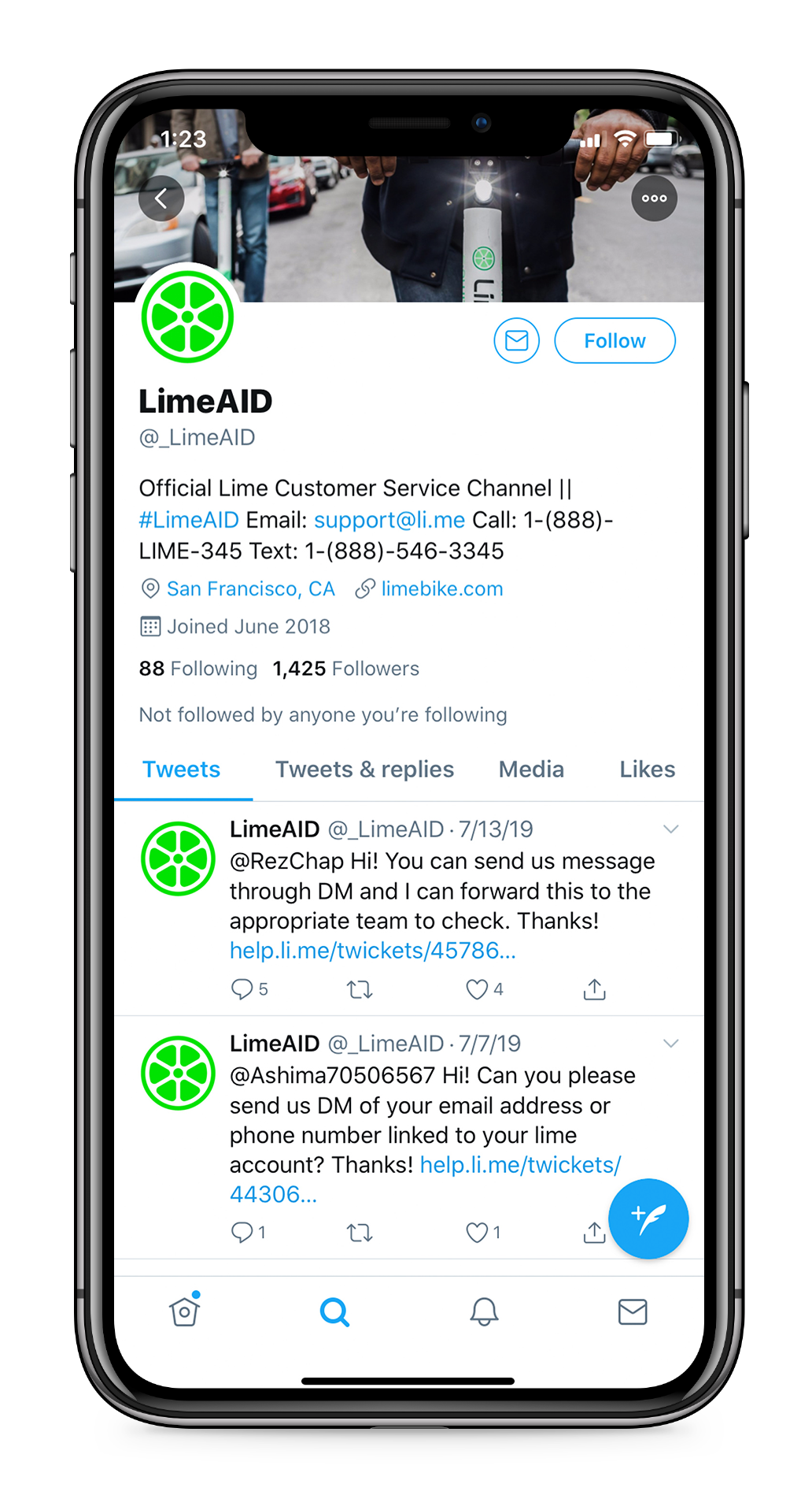
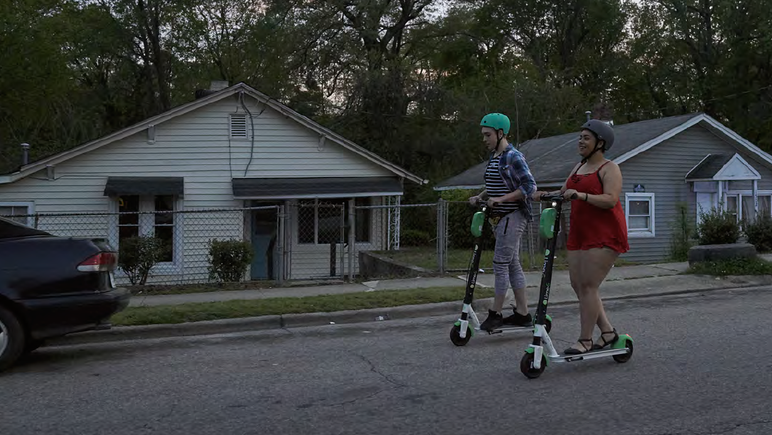
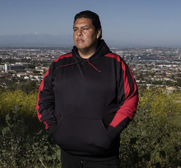
Branded Content
Collaborating with production company Anonymous, Lime launched its new brand with fresh photography and film depicting everyday city life.

05
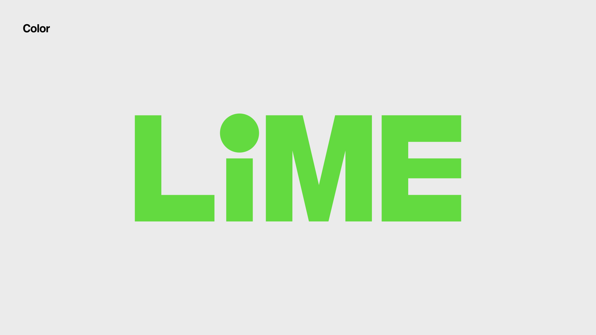
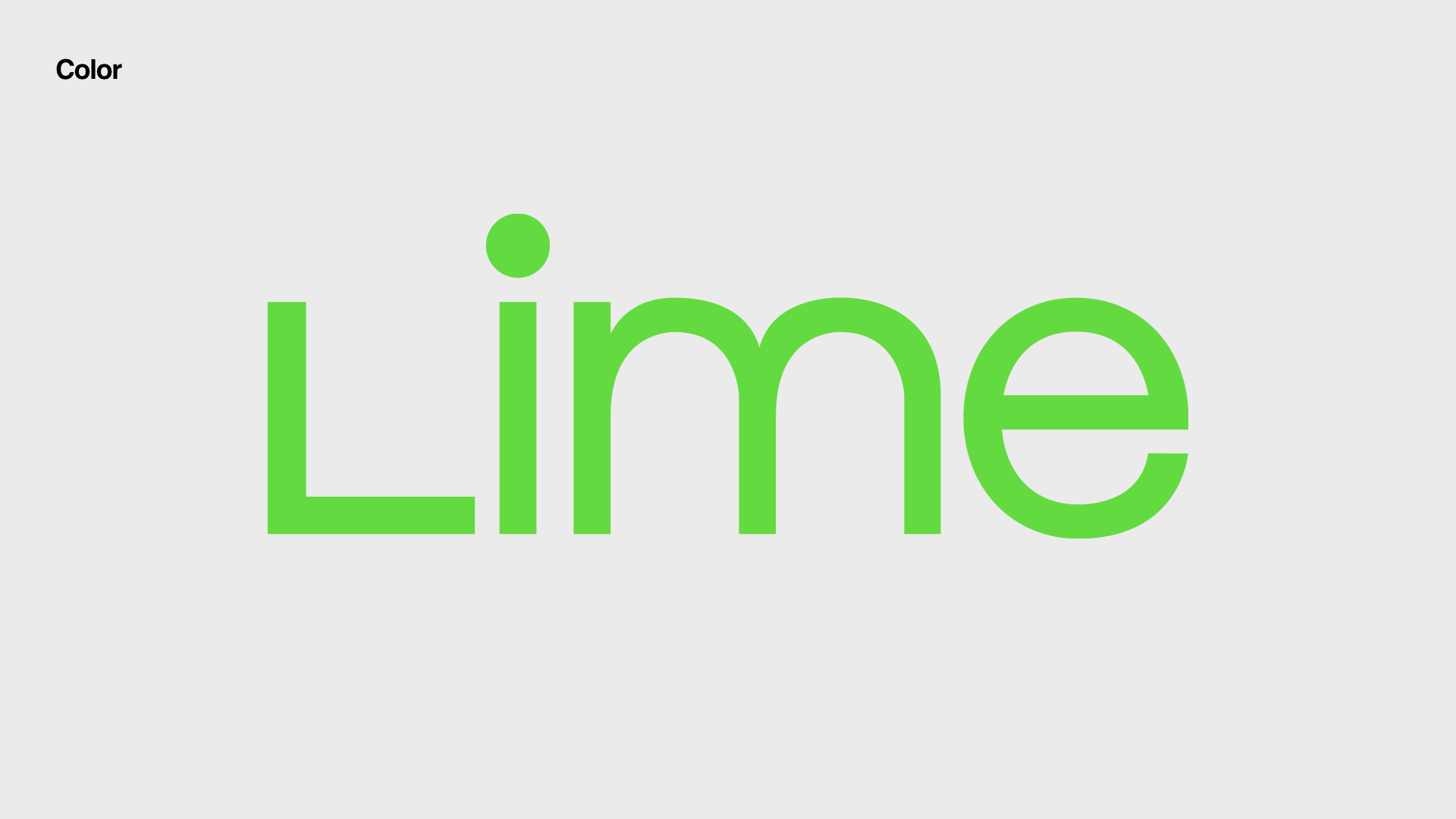
Lime Green
Inspired from their previous branding and bike lanes around cities, Lime is owning the bright green for communicating their contribution to sustainable micro-mobility.
Image source: NACTO, li.me


DIGITAL TRANSFORMATION
WITH A HUMAN TOUCH
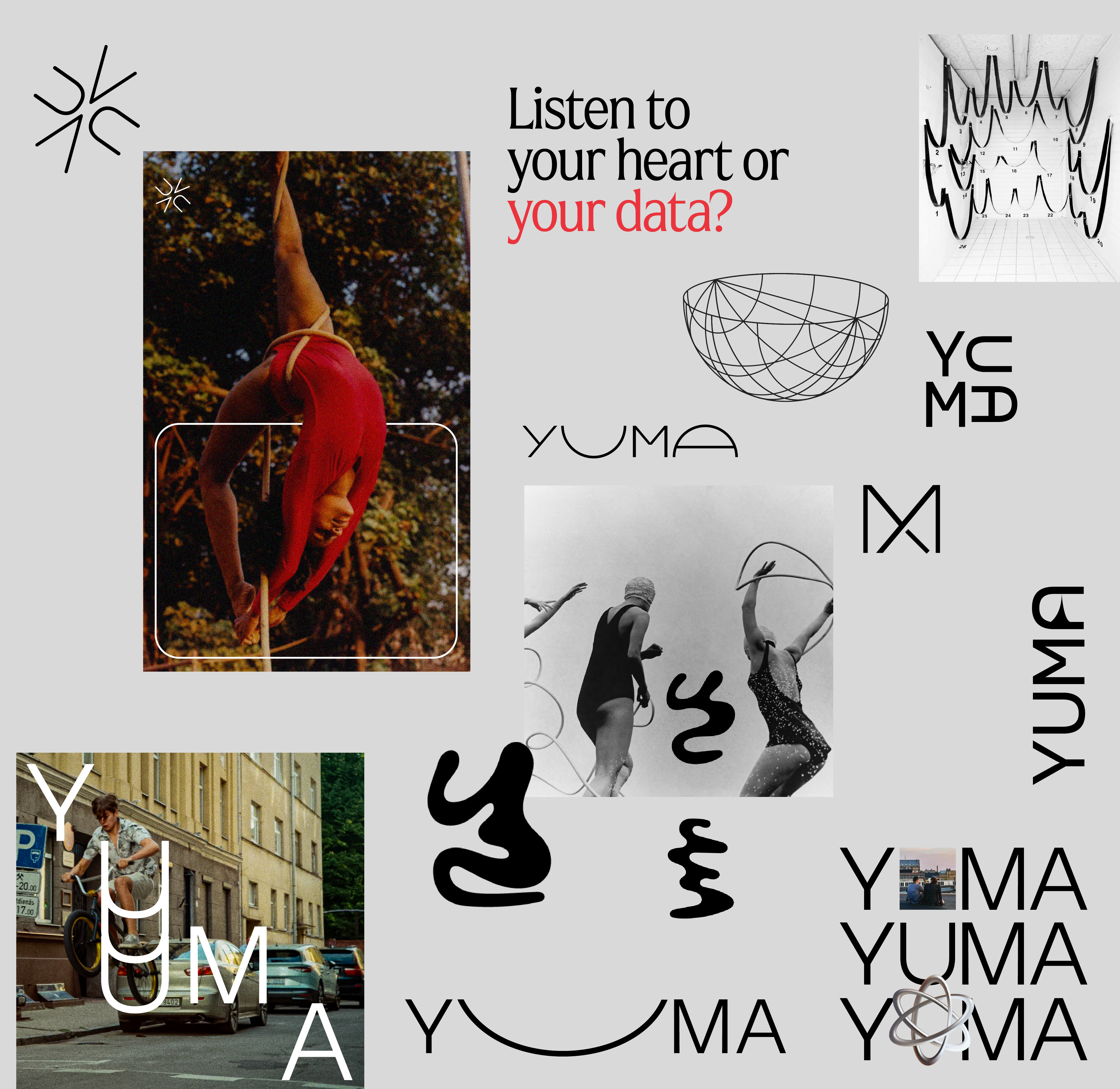
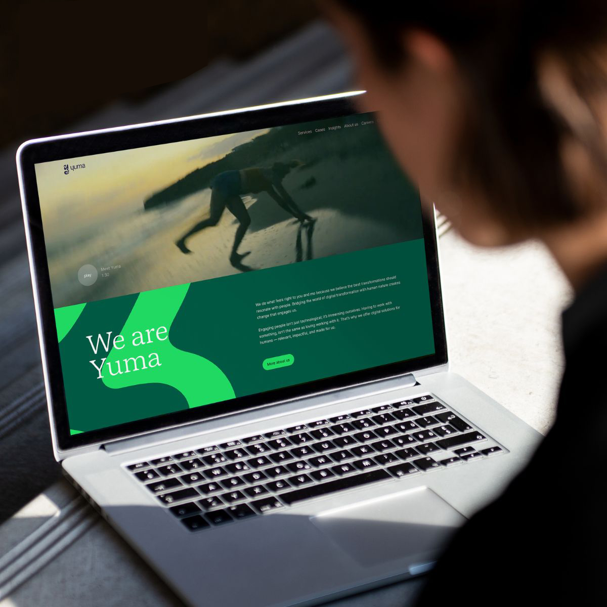
Yuma | Branding
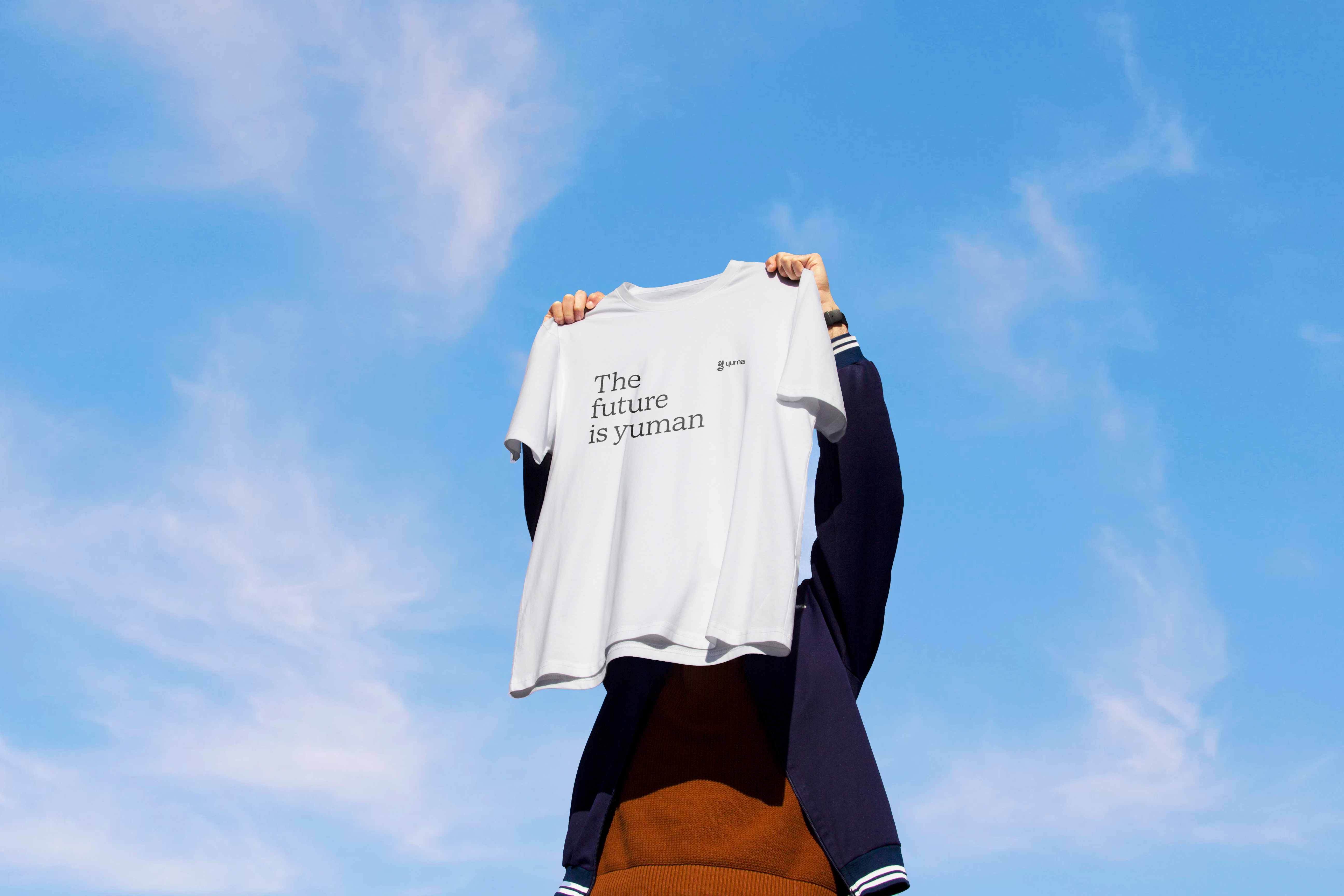
With a mission of creating digital transformations that genuinely resonate with people, Yuma is a business group with four companies in the Benelux.
The identity is inspired by the fluidity of transformations and the warmth of human touch.
The identity is inspired by the fluidity of transformations and the warmth of human touch.
My Role
Brand Design
Web Design
Design Team
Alicia Castro
Eddy Wegman
Robin Budy
Brand Design
Web Design
Design Team
Alicia Castro
Eddy Wegman
Robin Budy
01
Exploration
How much human element we’d like to include in the high fidelity digital world?
What other aspects we’d like to convey? Connection? Expression?
02
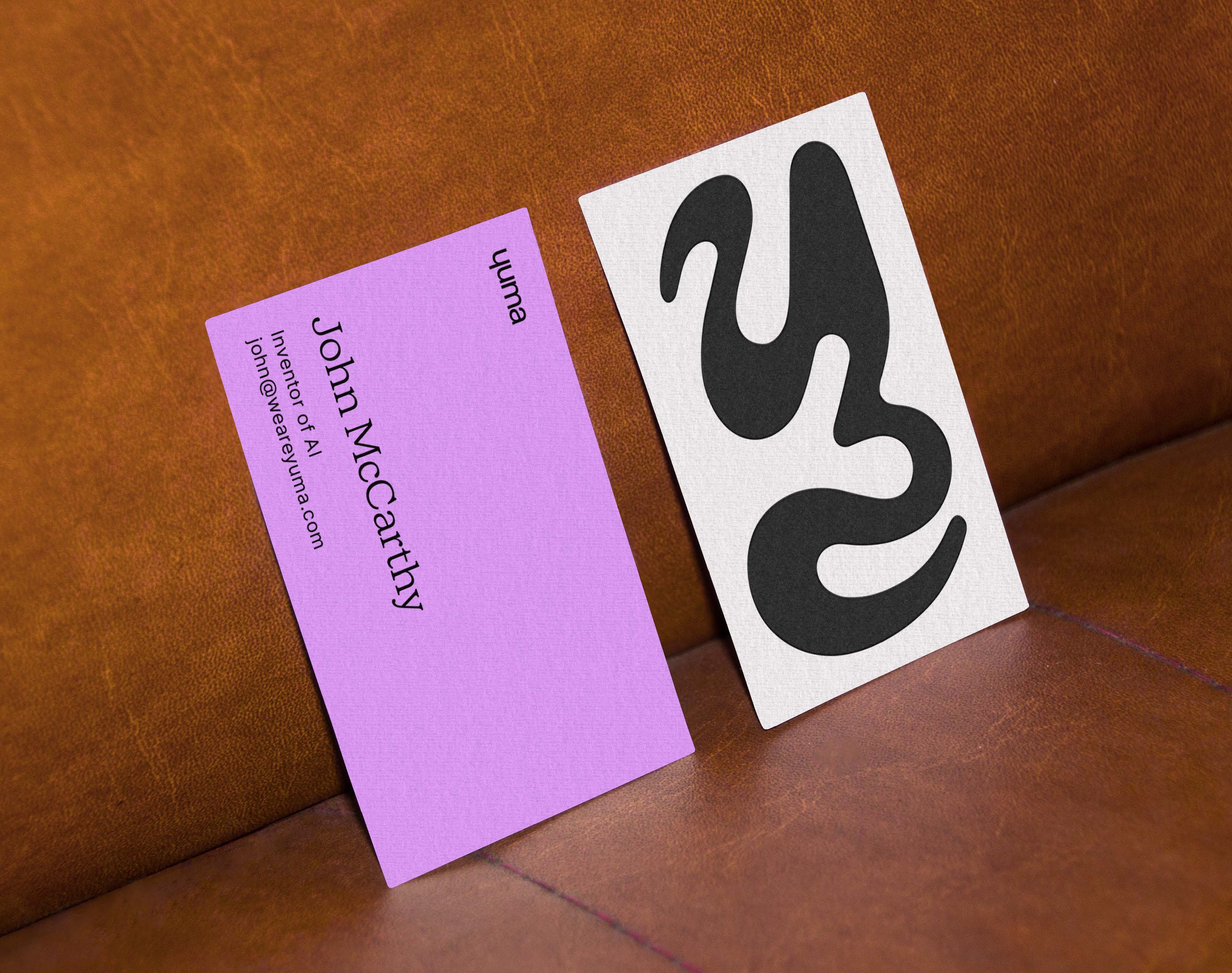
Logo
The fluid shape in the icon represents Yuma’s humanistic approach to transformation. The logotype is inspired by the word ‘human’ and responds to the curvy mark.
03
Typography
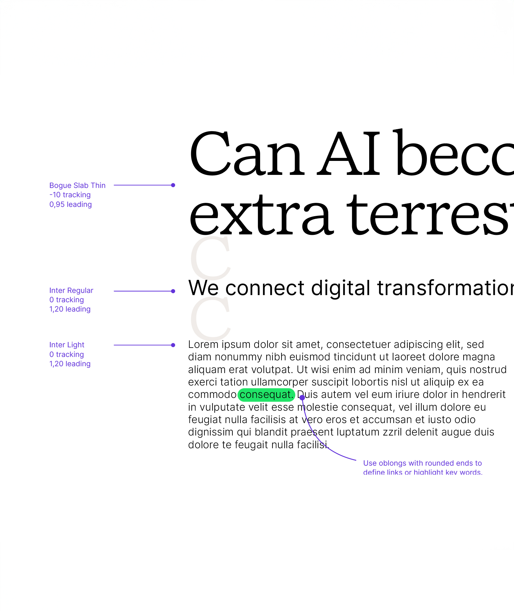
We chose Bogue Slab Thin for headlines. Designed by Melvastype, featuring many fine details, the soft forms gives it a friendly and approachable character with a hint of humanistic feeling. It’s the quiet confidence Yuma presents.
Our secondary typeface is Inter. It is used across all body copy when we need to be clearer and digestible versus expressive.
 .
. 
04
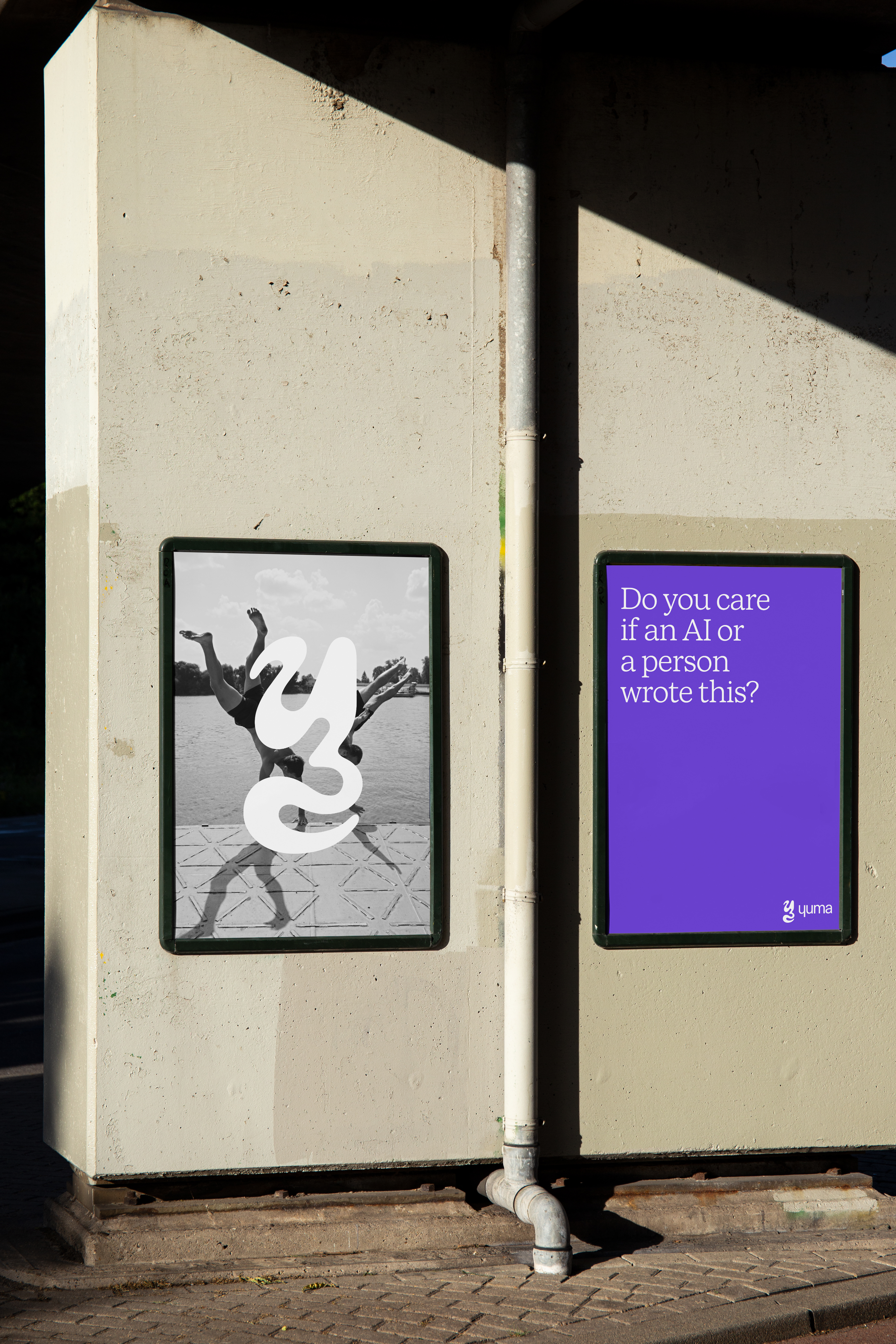
Photography
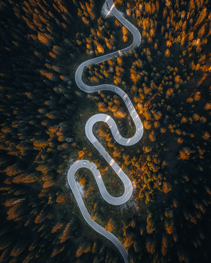
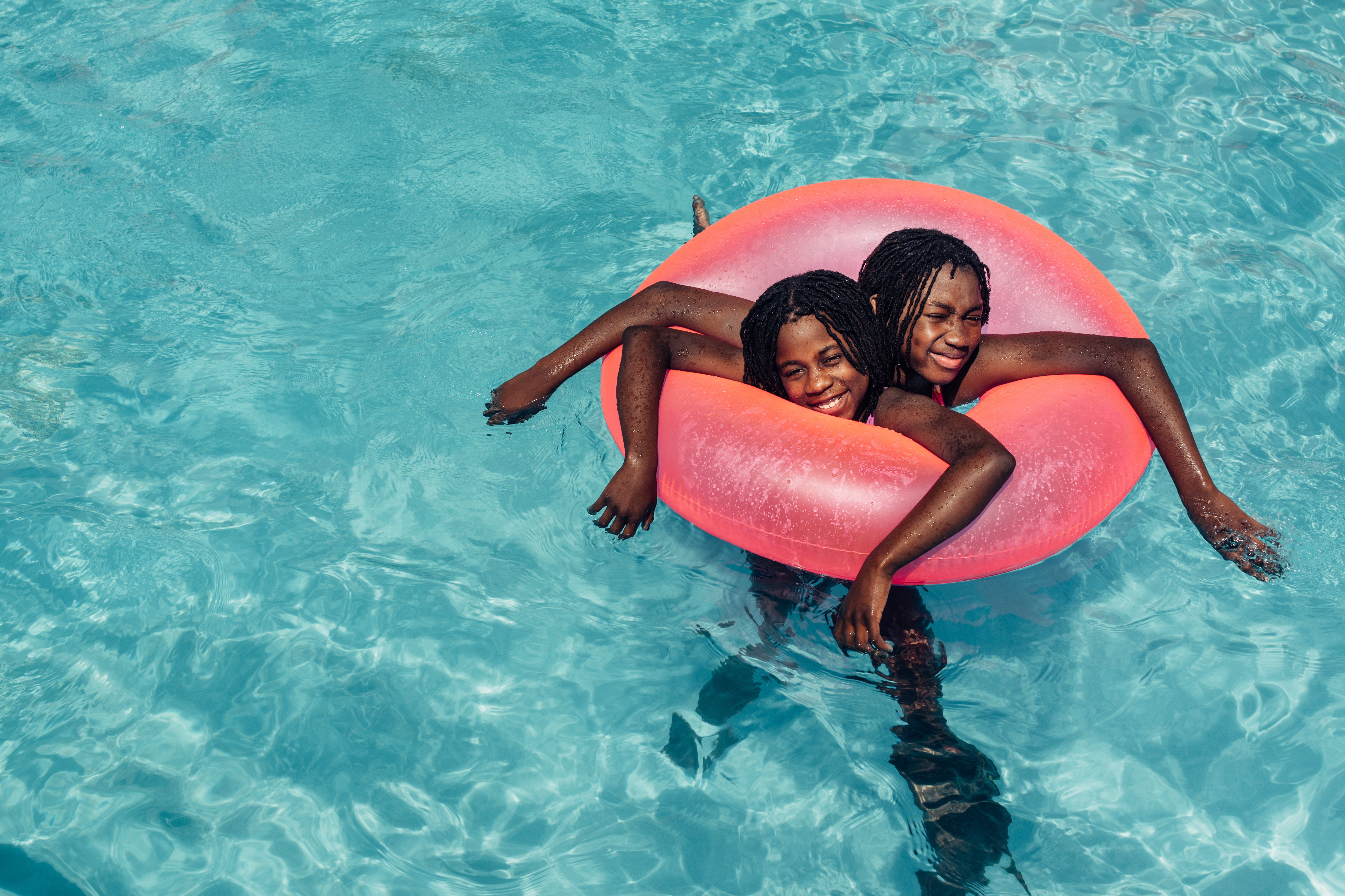
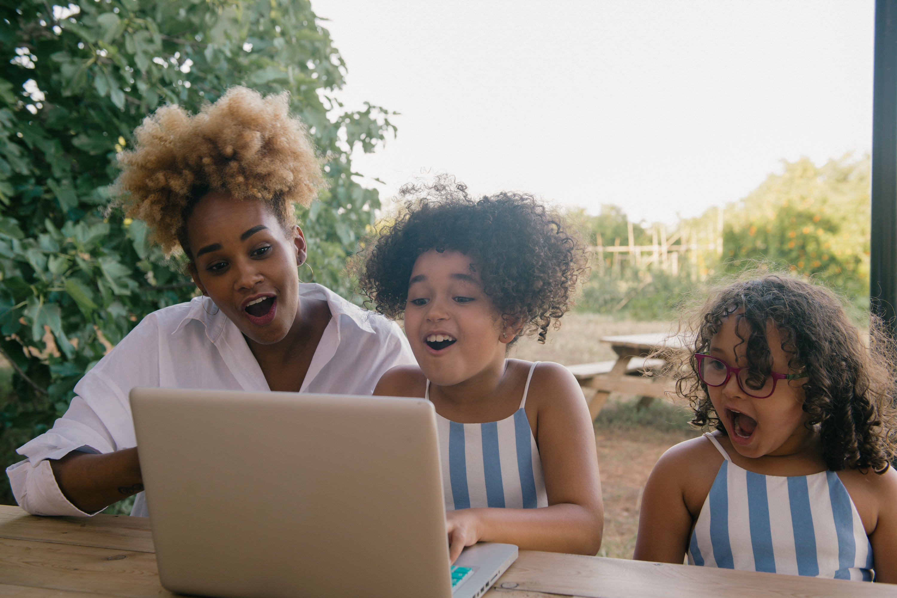
The style is genuine and profound. Drawing upon the raw, instantaneous essence of street photography. It possesses elements akin to photojournalism, seeking to encapsulate moments in their most authentic and human form.
Navigating between the micro and macro perspectives, our images seamlessly transitioning between intimate, small-scale scenes and sweeping, abstract overviews.

05


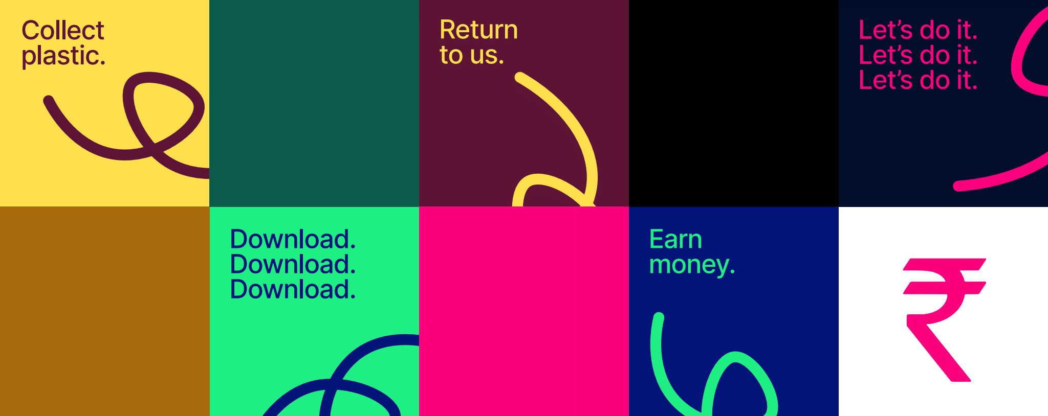
TURN WASTE
INTO MONEY
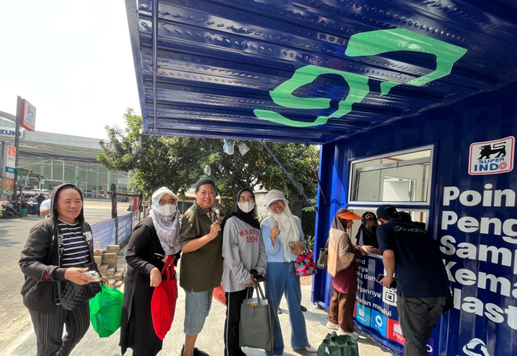
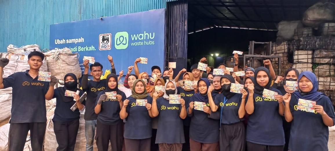
WAHU | Rebranding
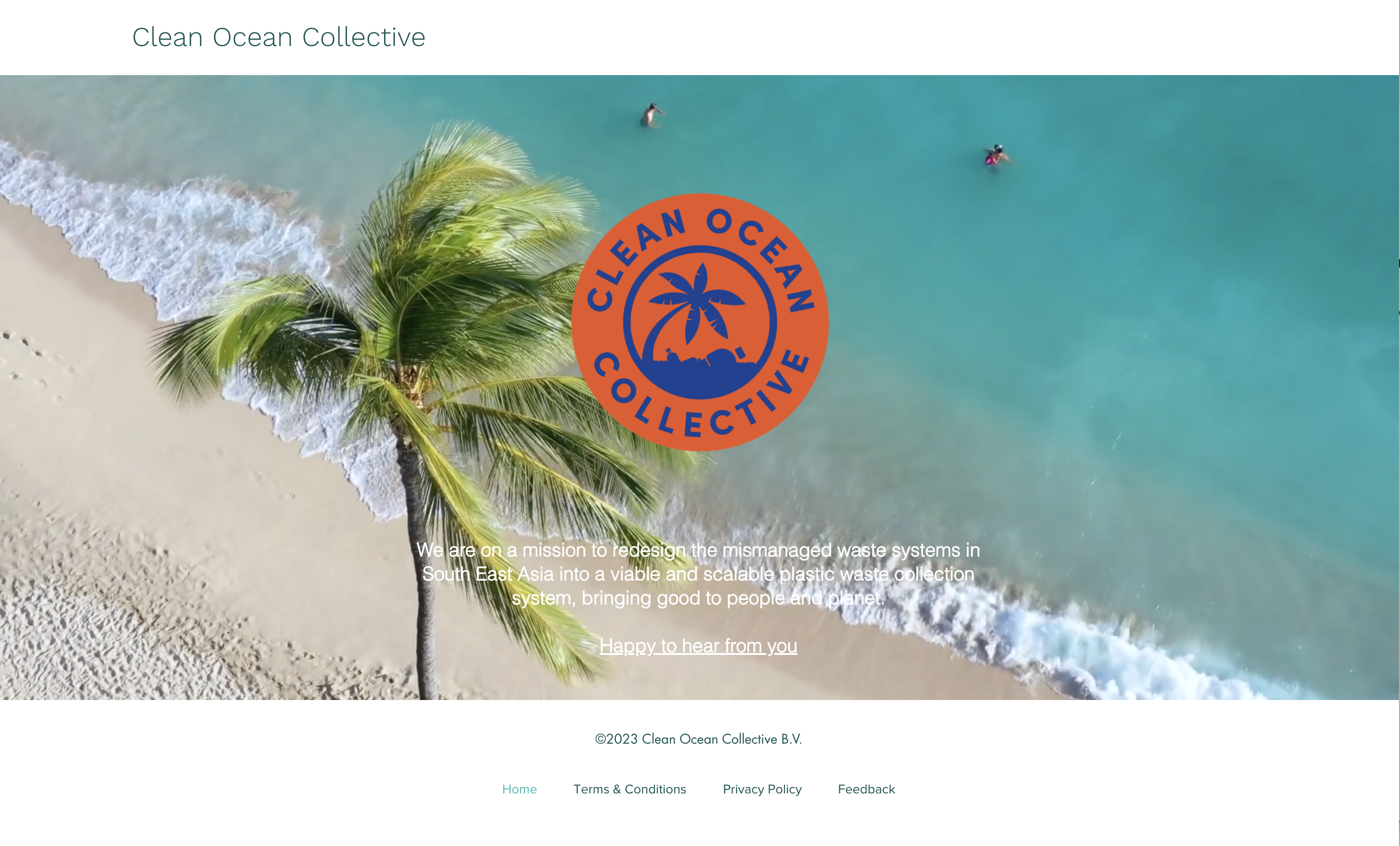
“Clean Ocean Collective” decided to change their name because the business is no longer centered on cleaning ocean, but improving the waste management system in Southeast Asia. So they changed to WAHU from waste hubs.
We helped them with creating a new identity to kick start a new identity system.
We helped them with creating a new identity to kick start a new identity system.
My Role
Brand Design
Creative Team
Eddy Wegman
Erwin van Ekeren
Giovanni Linzas
Merit
Internalitional Design Award 2024
Brand Design
Creative Team
Eddy Wegman
Erwin van Ekeren
Giovanni Linzas
Merit
Internalitional Design Award 2024
01
Past Brand Style
02
New Logo
We experimented with different approaches including connection, recycling, empowerment, exchanging and etc. The final direction WAHU chose is intented to emphasize community and encourage behavioral change.
03
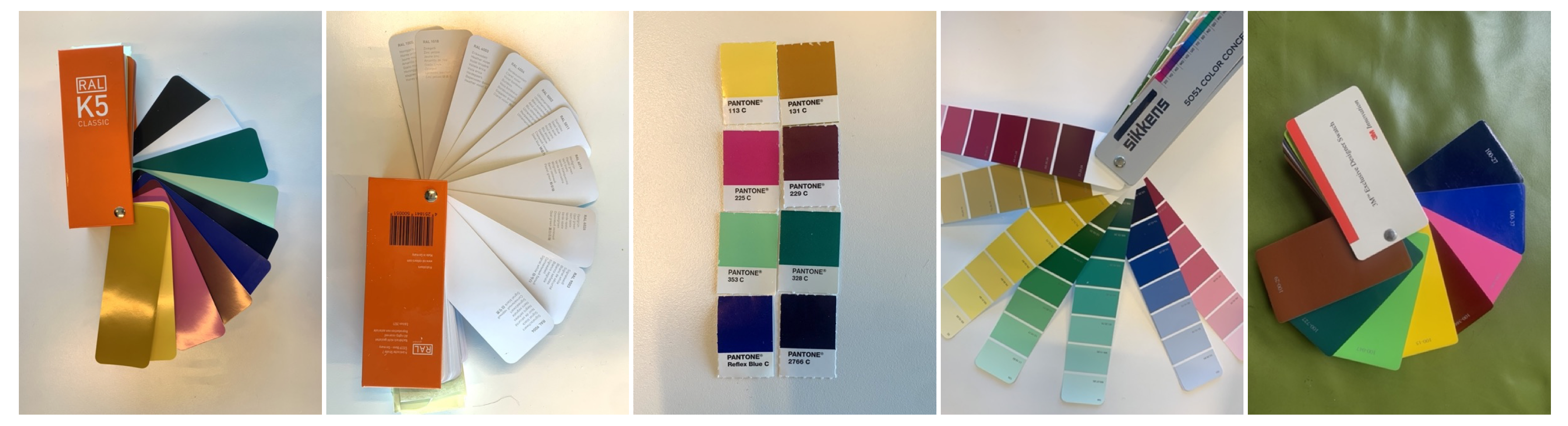
Color palette
We’d like to keep the energy of their previous palette and increase contrast for a wider usage. The palette shall be harmonious with the surroundings with a touch of energy to empower behavioural change.
04
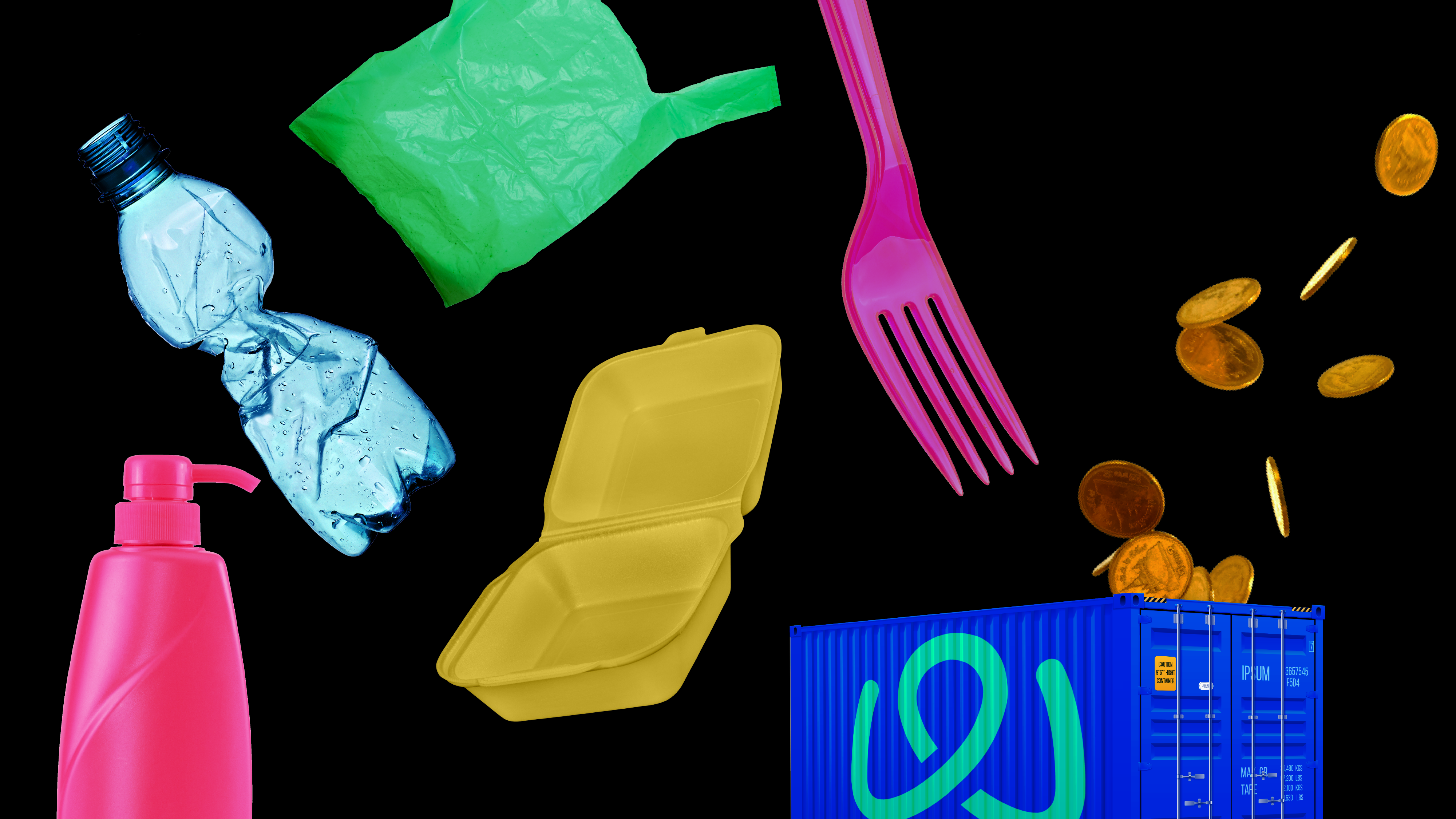
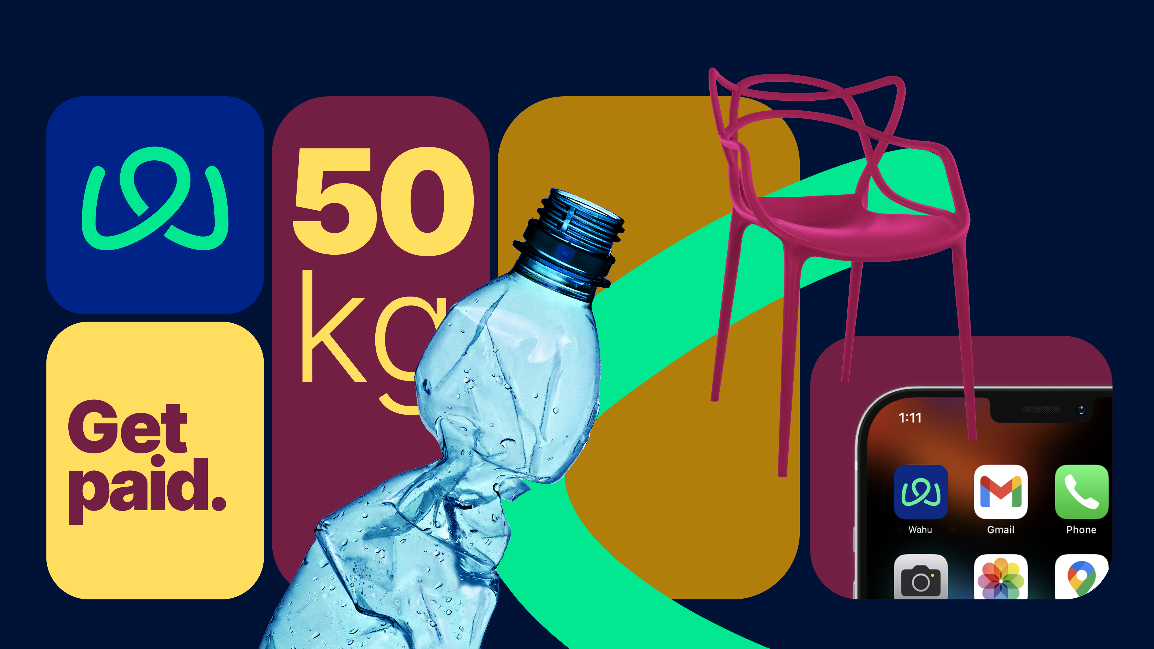
Photographic icon
Adjusting plastic elements to the new system
05

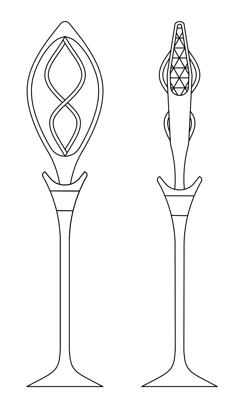
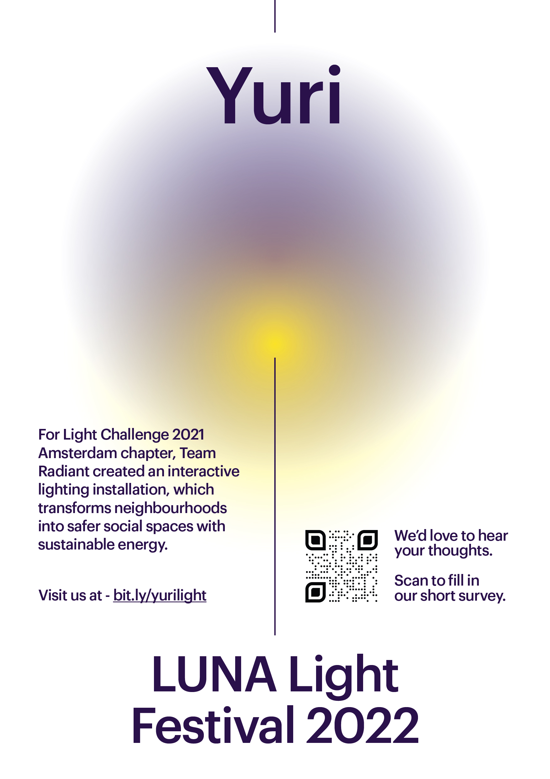
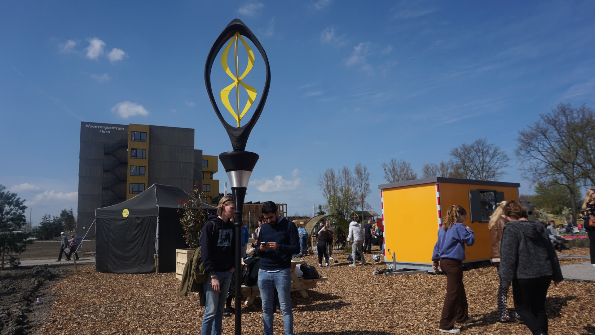
YURI LIGHT
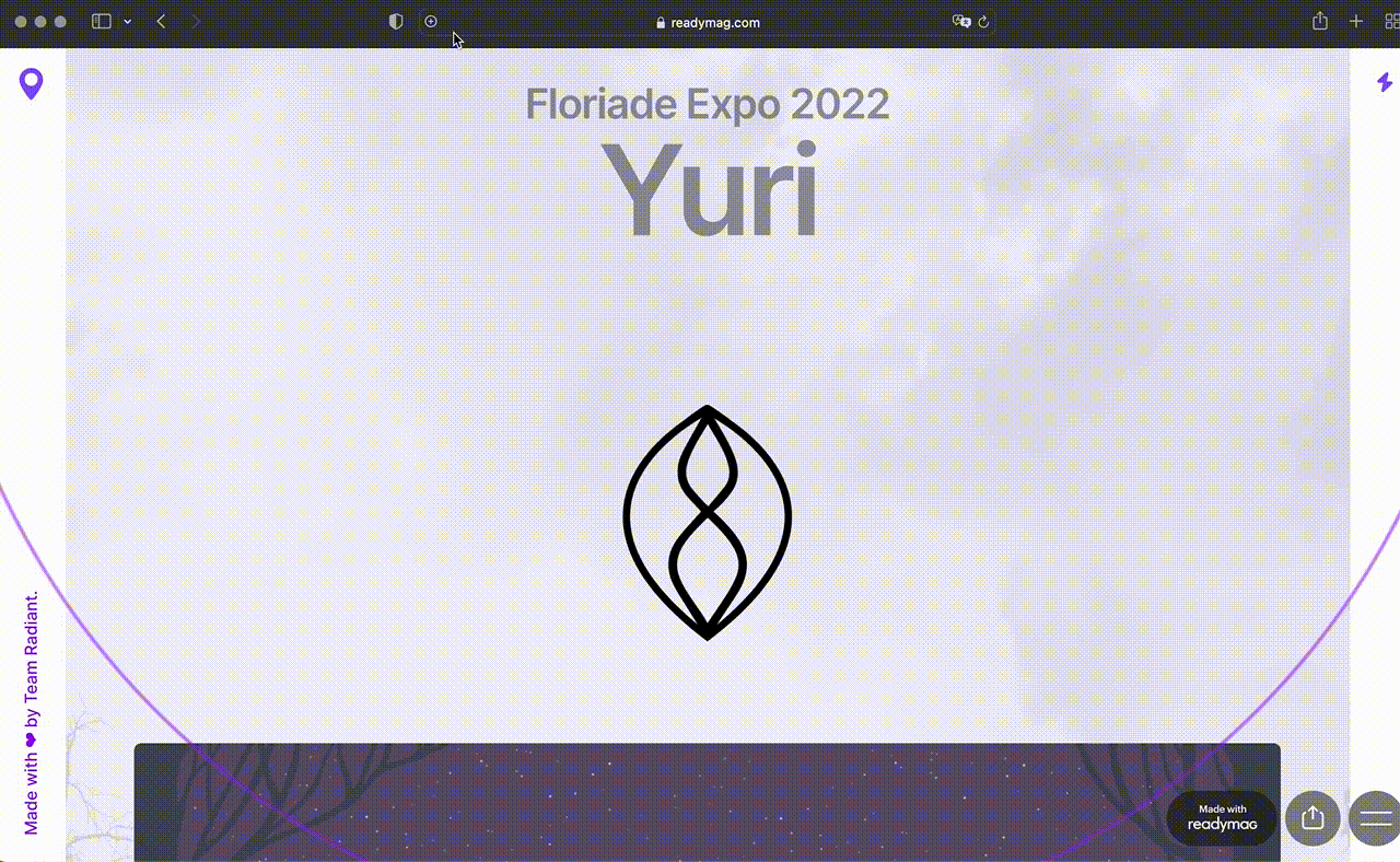
Municipality of Amsterdam | Speculative product
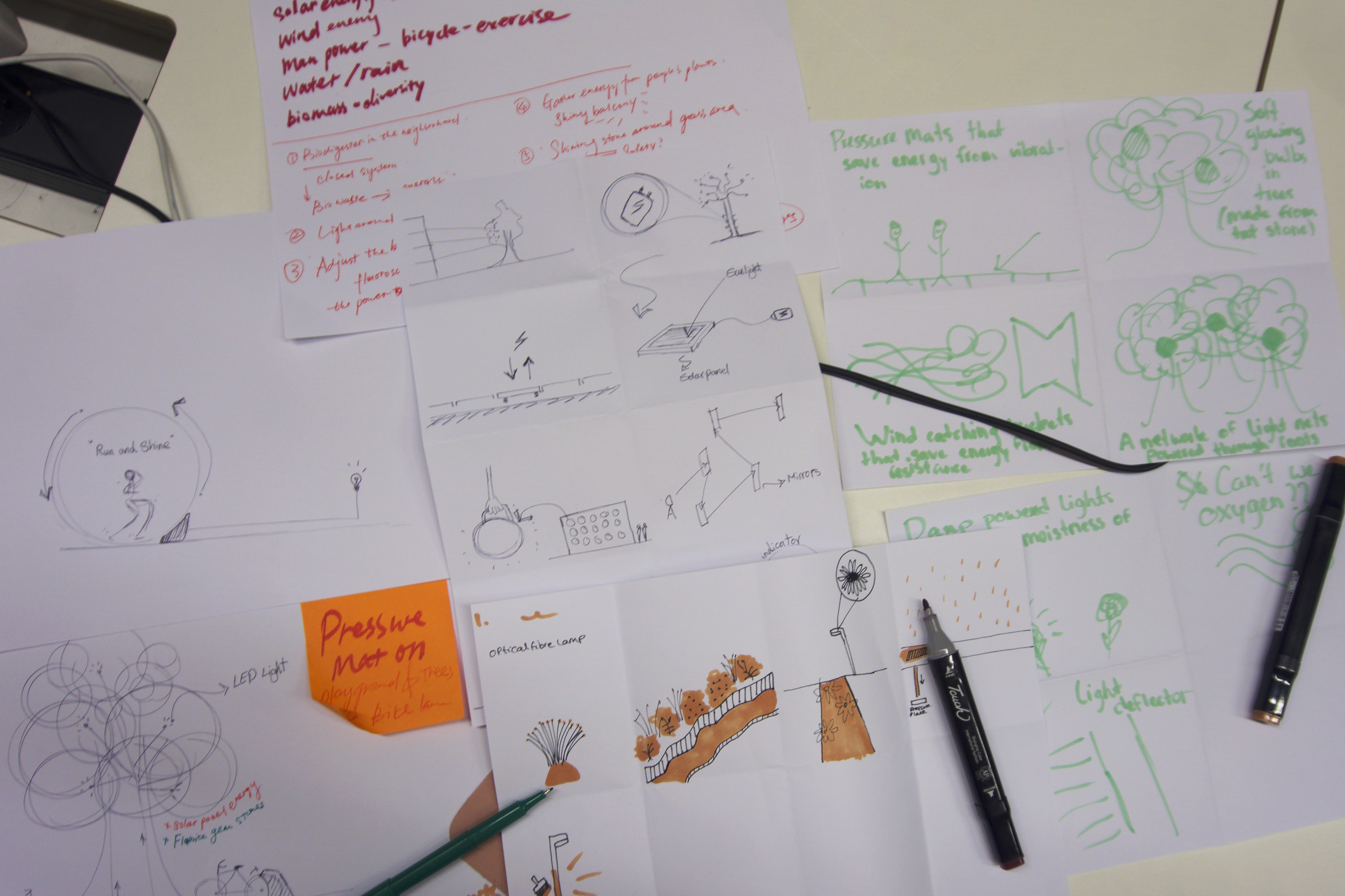
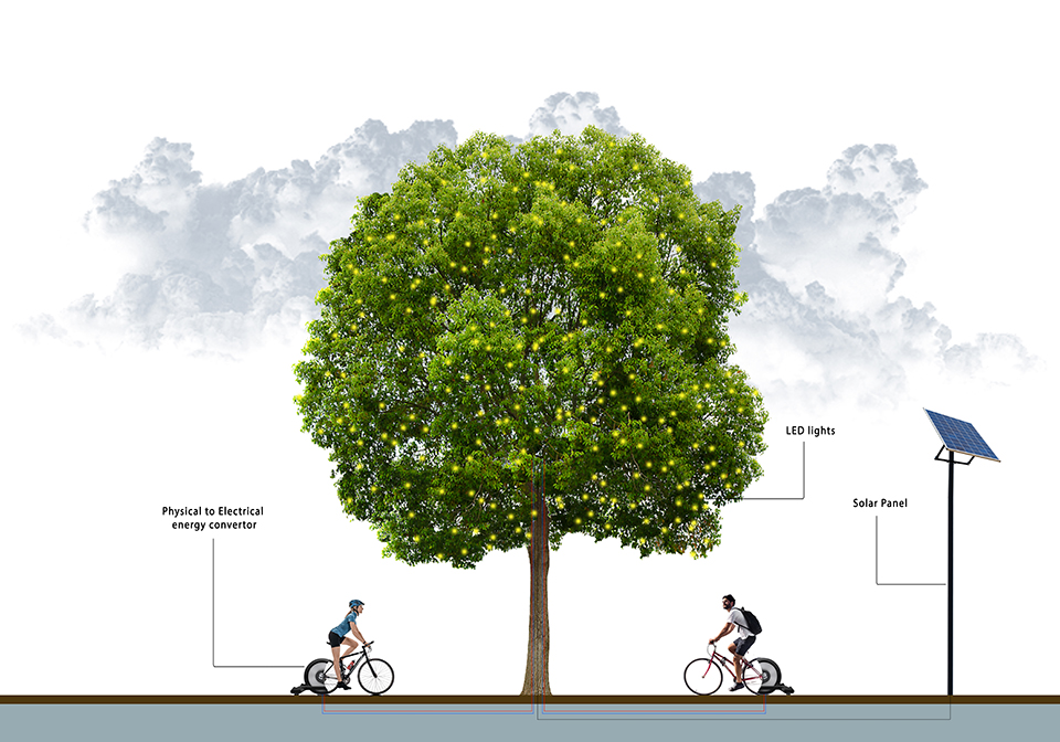
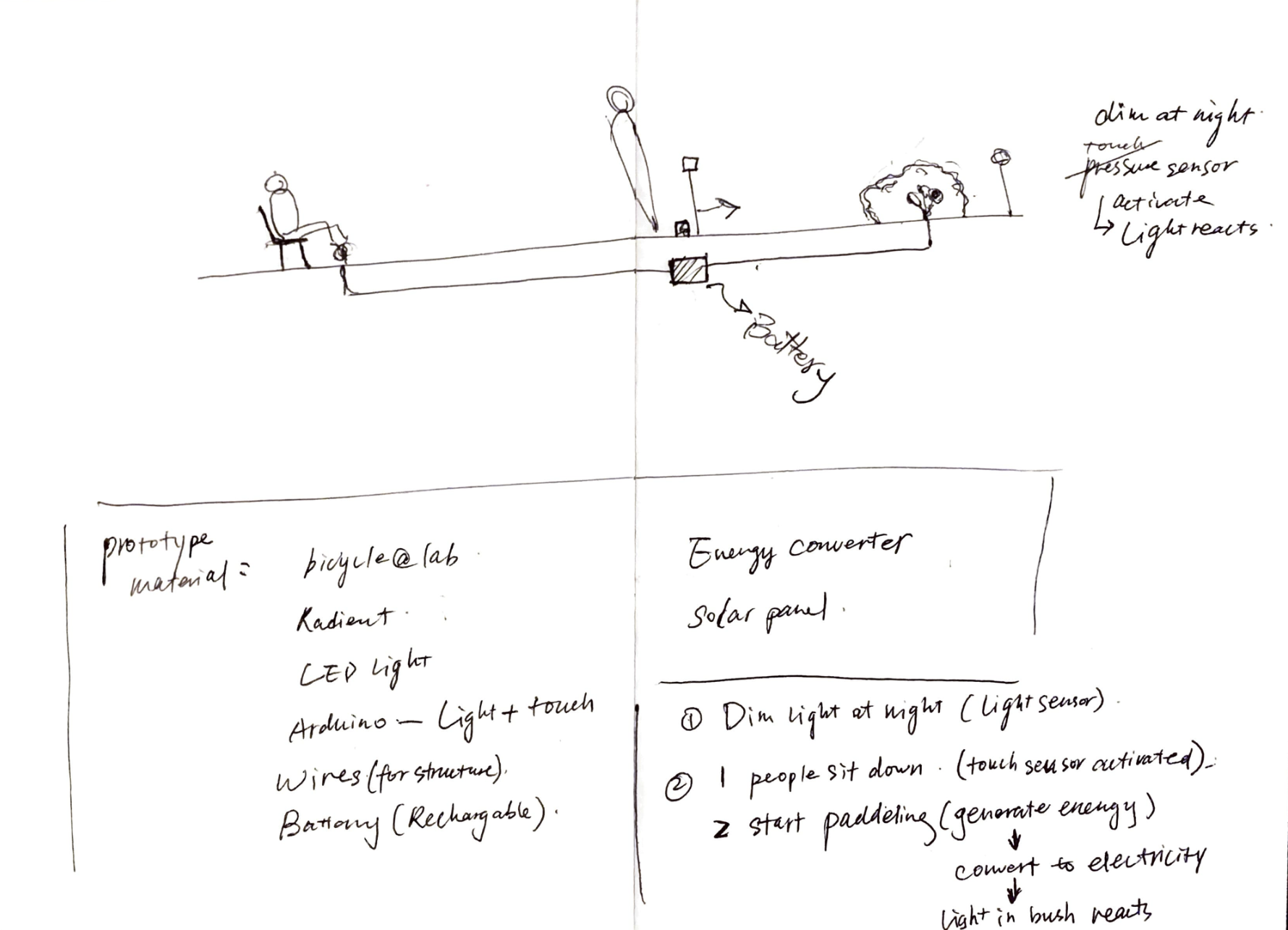
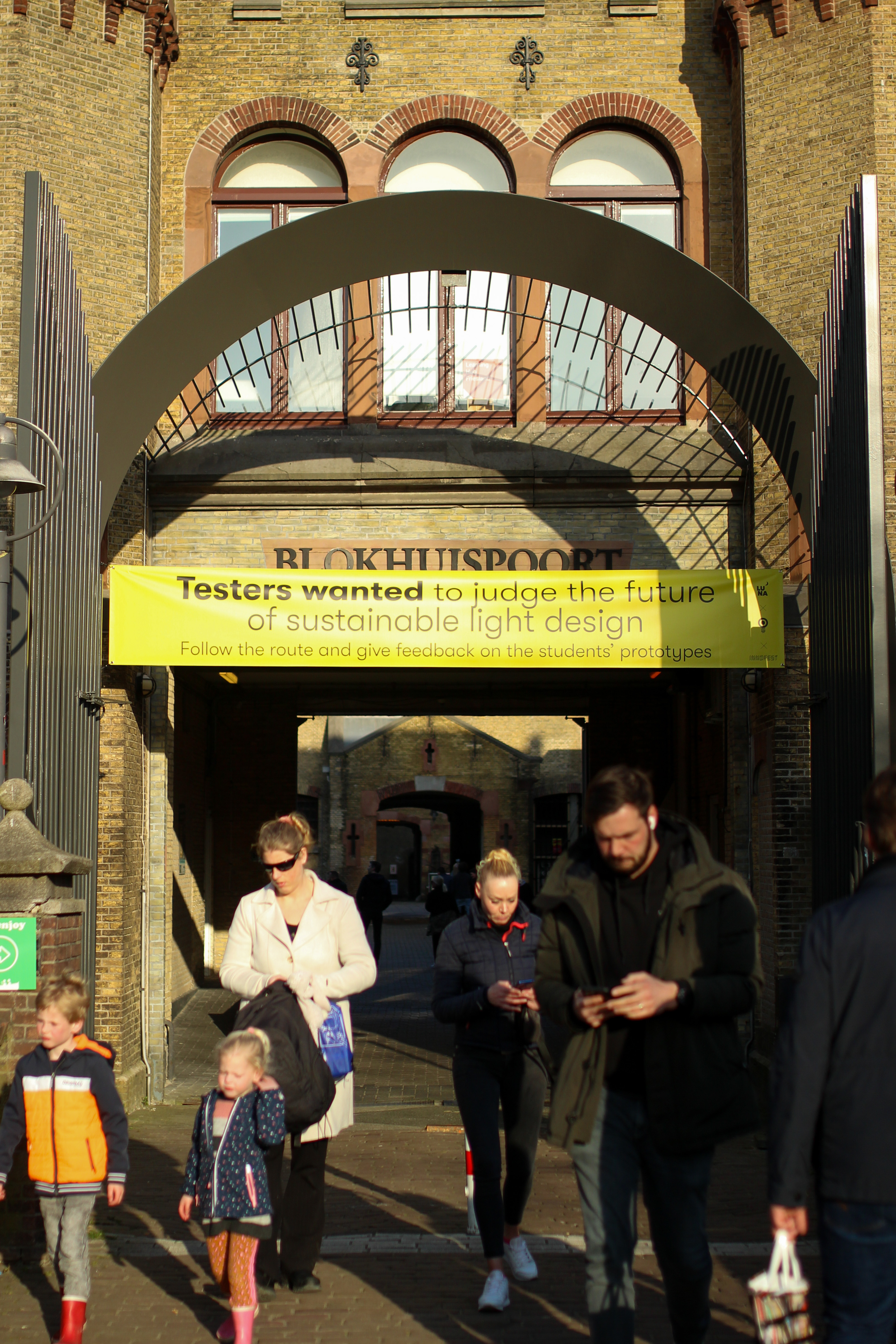
Working with the Municipality of Amsterdam, we designed an interactive xstreet lamp powered by solar and wind energy for a neighborhood at Amsterdam Noord. It detects the distance between people and responds with brightness levels. When more people approach, a series of light animations will be activated. When no one is present, it remains dim to conserve energy.
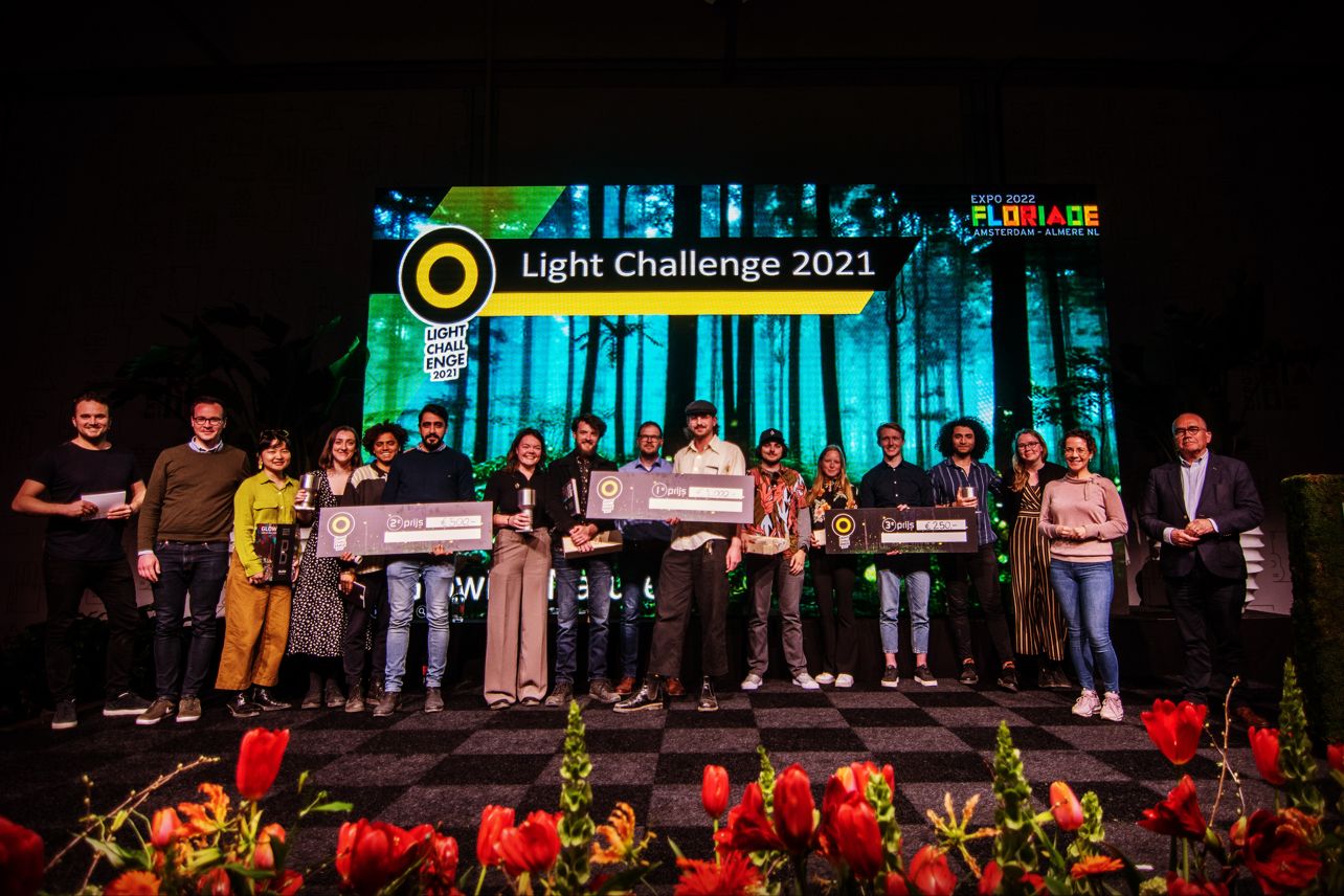
The design took the second place in the Light Challenge 2021 and exhibited at Floriade Expo 2022.
The design took the second place in the Light Challenge 2021 and exhibited at Floriade Expo 2022.
My Role
Concept Development
Experience Design
Creative Direction
Project Management
Team
Mohammad Afkhami
Michael Verdel
Paige Lucas-Dean
Tudor Cora
Concept Development
Experience Design
Creative Direction
Project Management
Team
Mohammad Afkhami
Michael Verdel
Paige Lucas-Dean
Tudor Cora
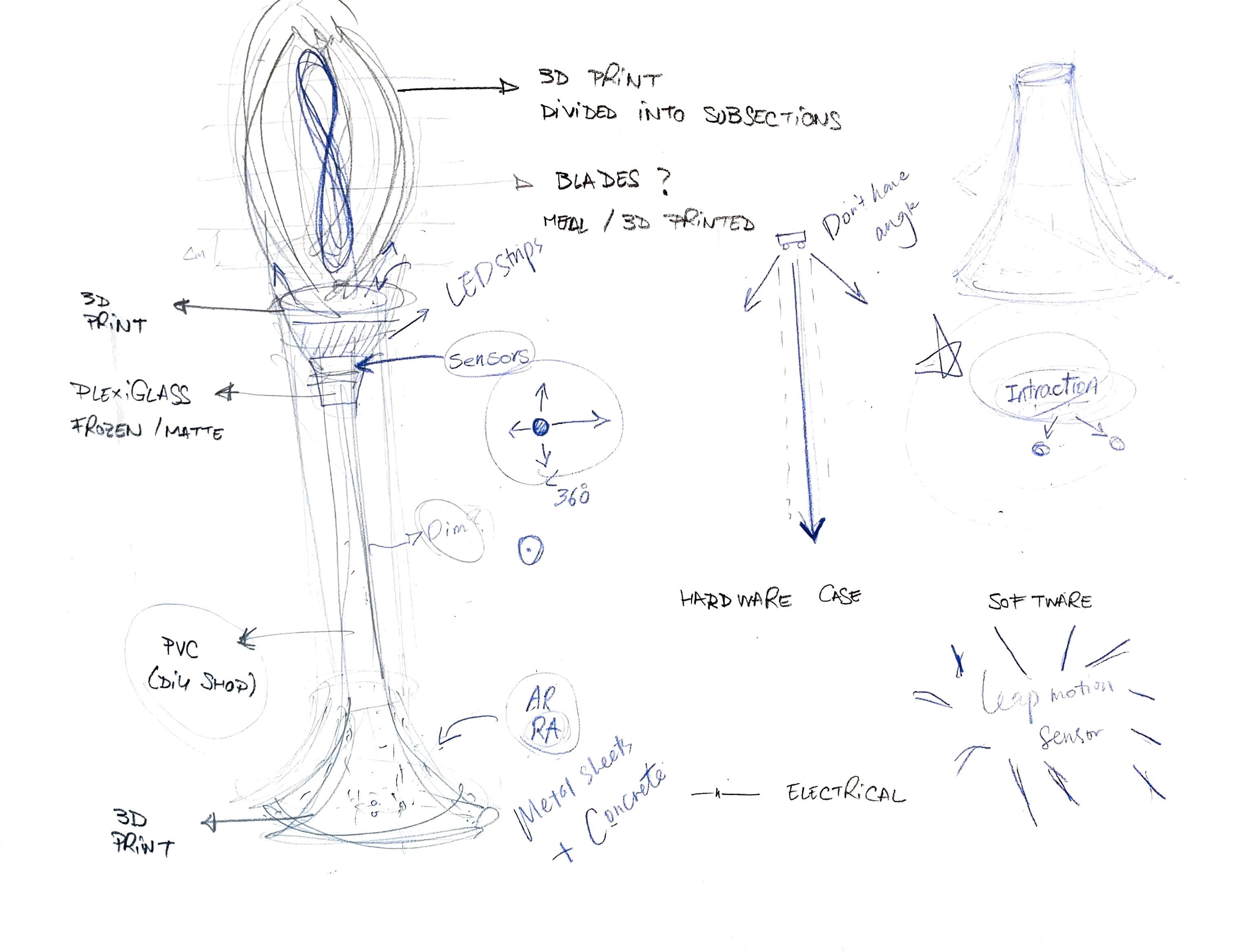
01
Process
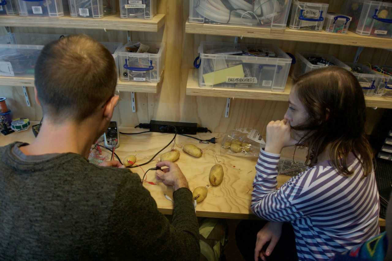
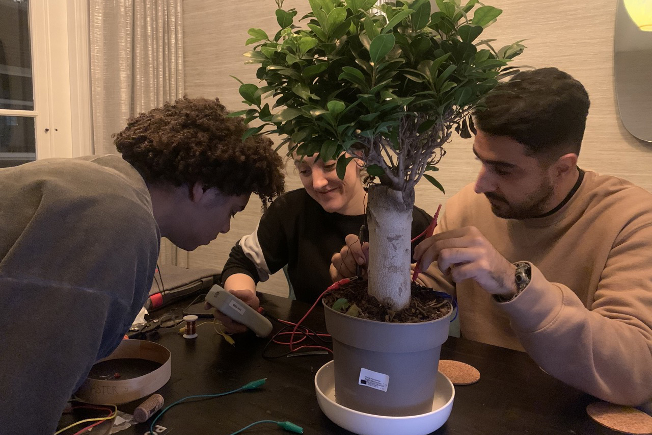
Buikslotermeerplein is a neighbourhood in Amsterdam Noord. After talking with current residents, we found that people do not feel safe socialising outside at night.
How can we work with nature to power LEDs with renewable energy? We presented three ideas and pursued one due to city regulations after two months of research and ideation.

Experiment
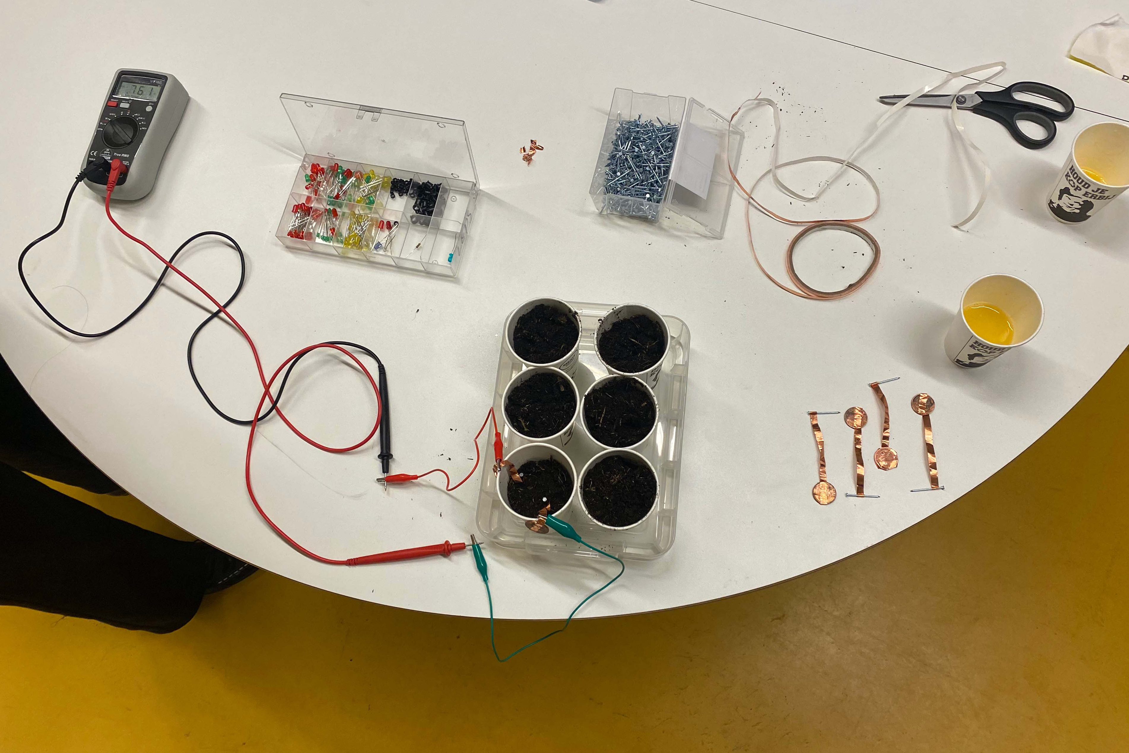
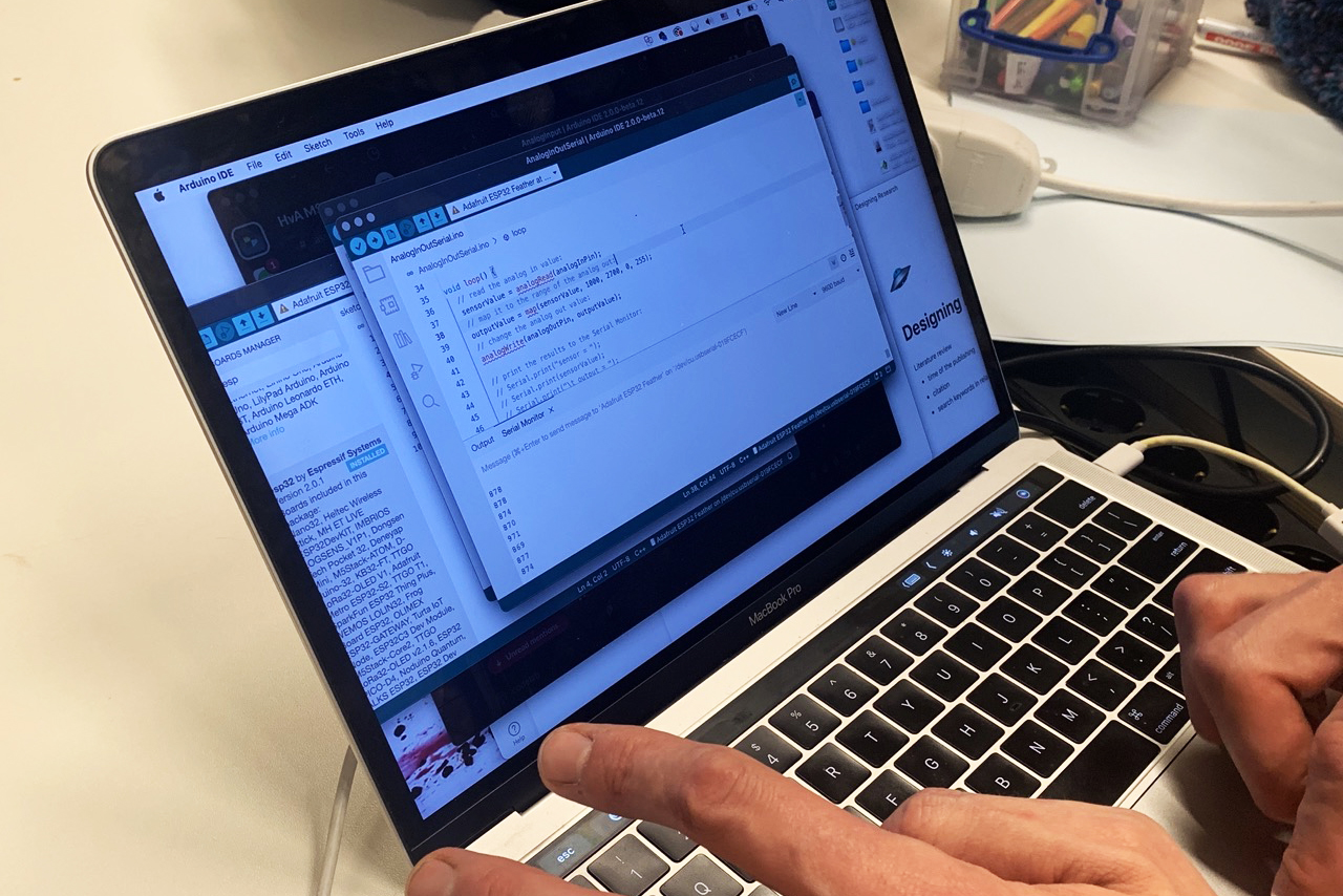
Our initial idea was generating electricity from plants and soil. Then we found out there was not enough ampere for the current so we started to find new ways.
02
Concept
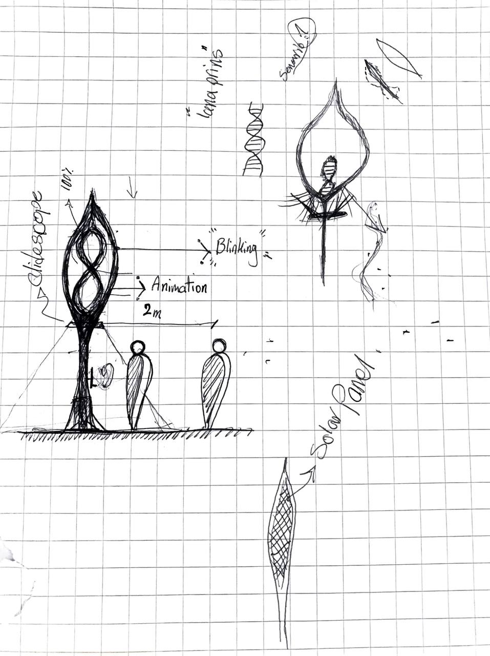
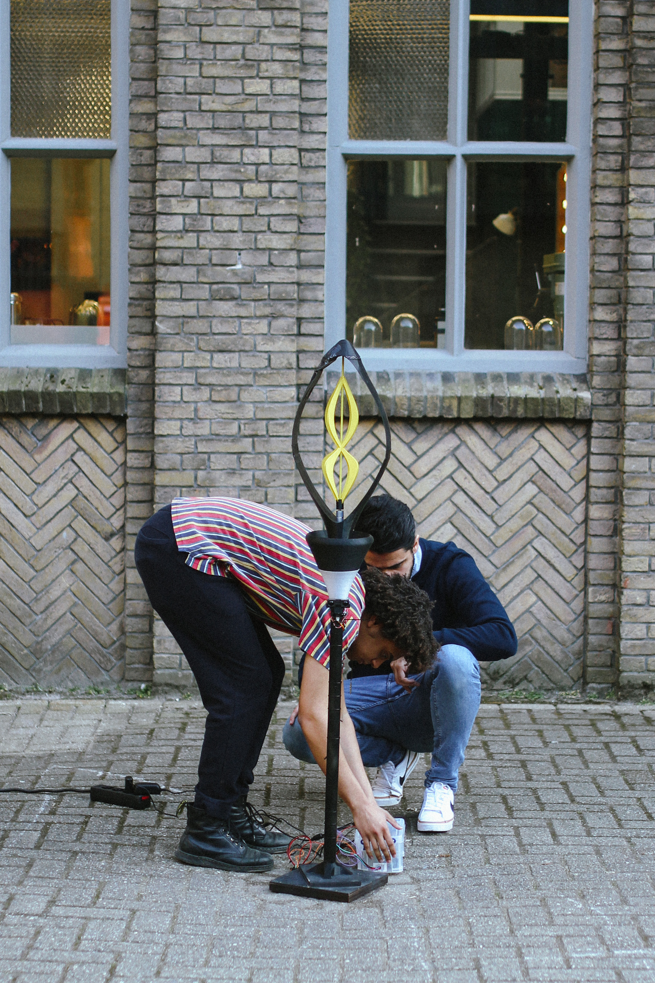
Inspried by nature
Keeping our goal in mind, we found that the structure of Japanese peace lily can be both beautiful and functional. After studying and dividing into sections, we created a design that satisfies our vision.

03
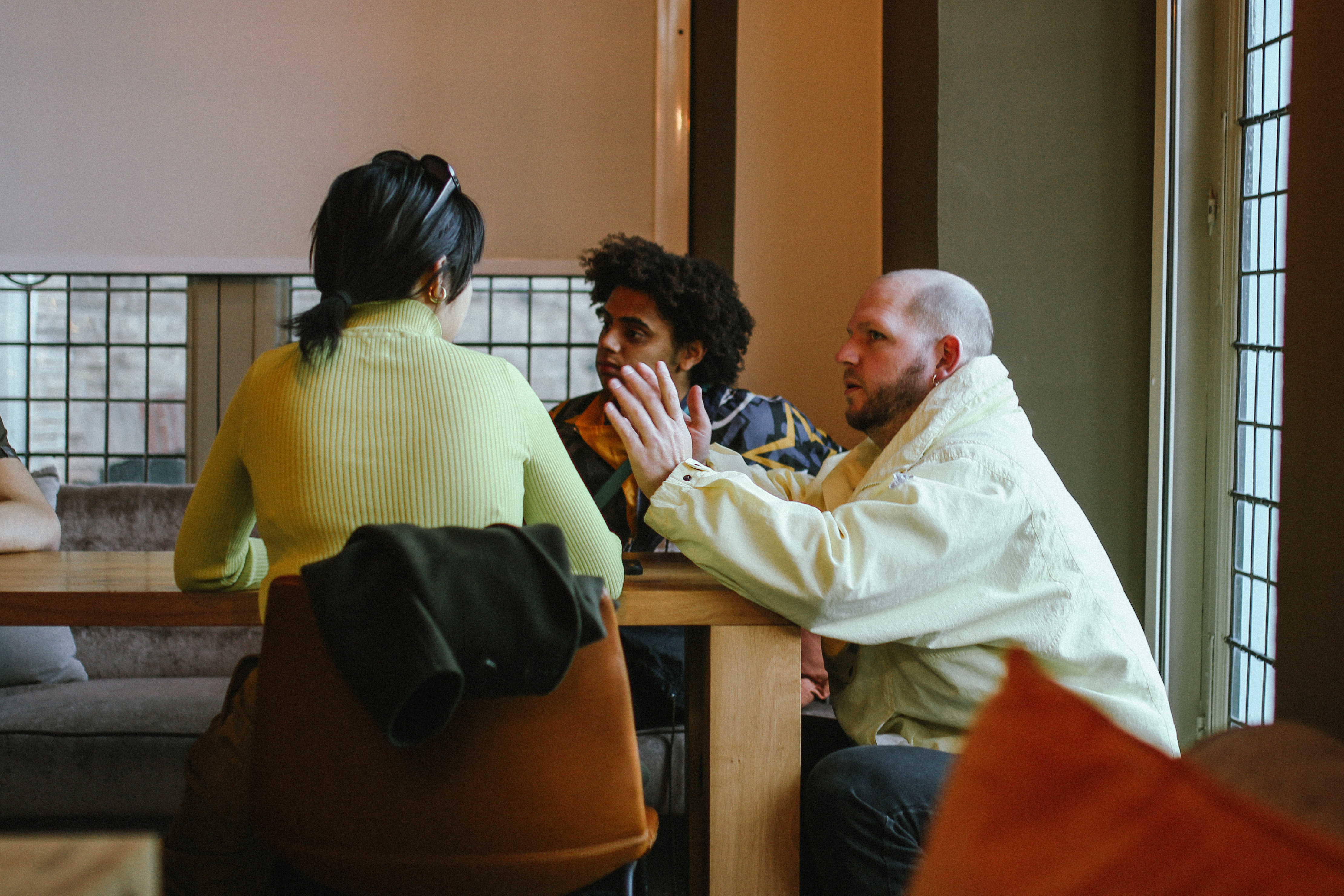
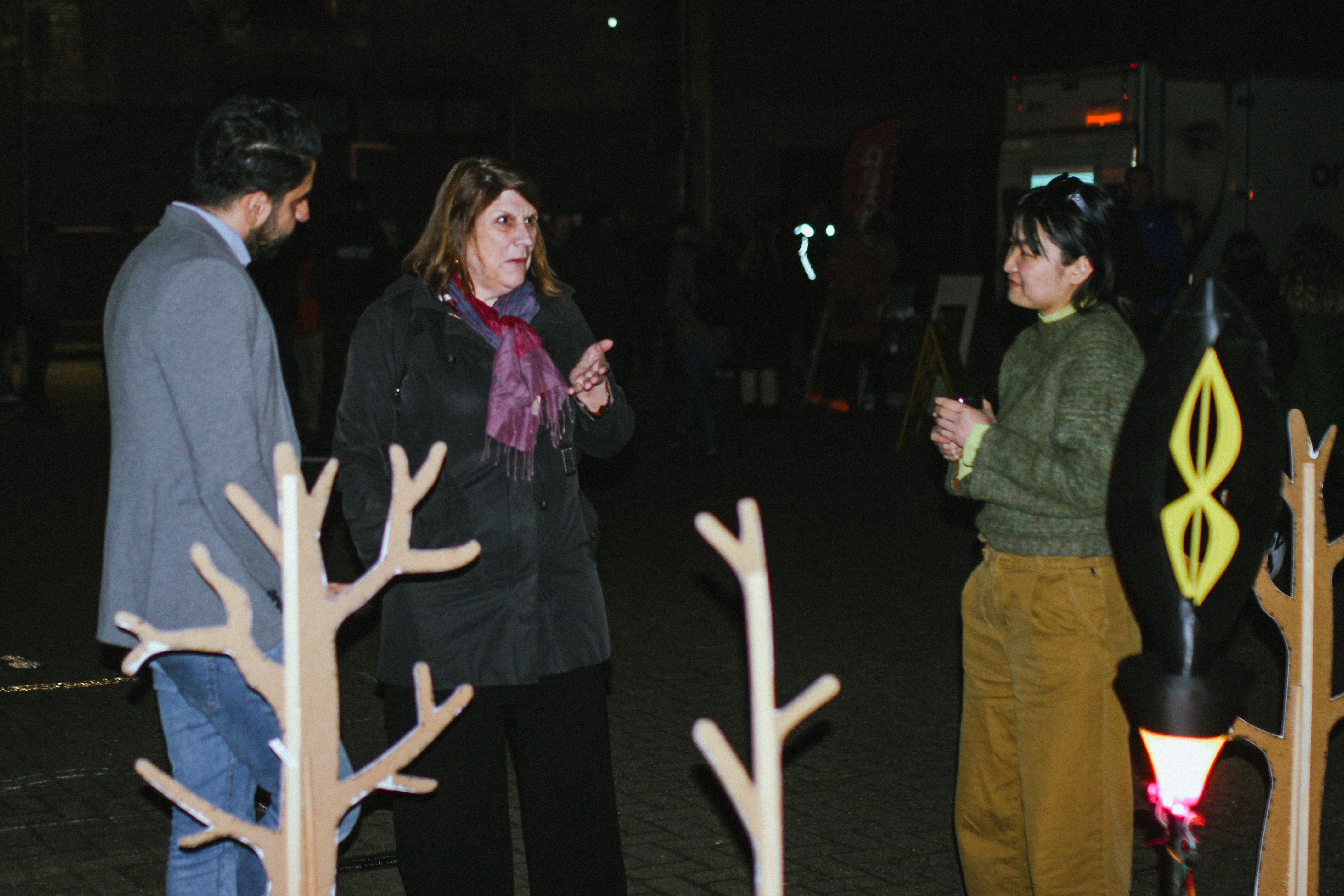
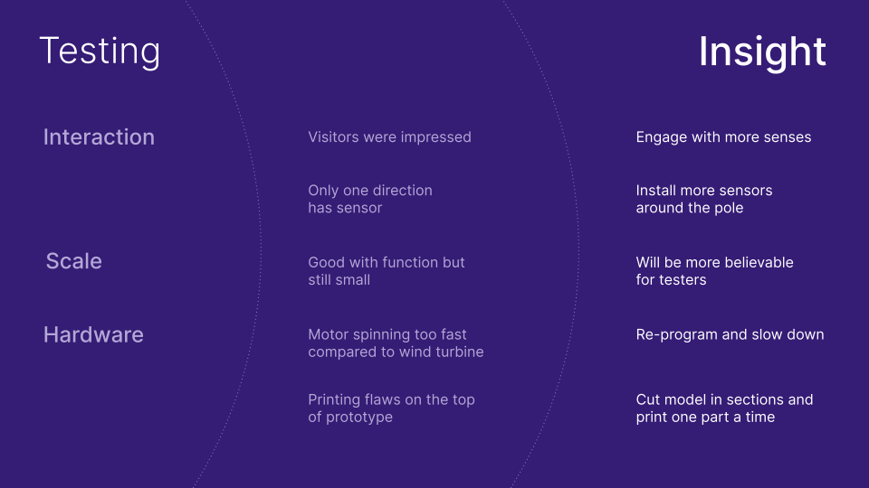
Test
We had the opportunity to test with over 200 visitors at the LUNA Light Festival in Leeuwarden and receive feedback. It was a huge help with our subsequent iterations.
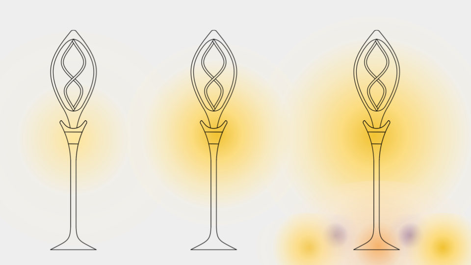
When there is no one around, Yuri remains dim to conserve energy; when people approach, it brightens; and when they are very close (within 50cm), it dances to connect.
 .
. 
04
Iterations
We built a new prototype (from 1.5m to 2.5m) in two weeks, with updates to the majority of the design. As part of our innovative lighting projects, we installed the light in Almere's Floriade Expo 2022. It will remain in place for six months. We are collecting responses from an online survey.
When there is no one around, Yuri remains dim to conserve energy; when one person approaches, it displays a single light animation; when two people approach, it adds more colour (four colours) and formsa new animation; and when three or more people approach from different directions, a rainbow appears in front of their eyes.

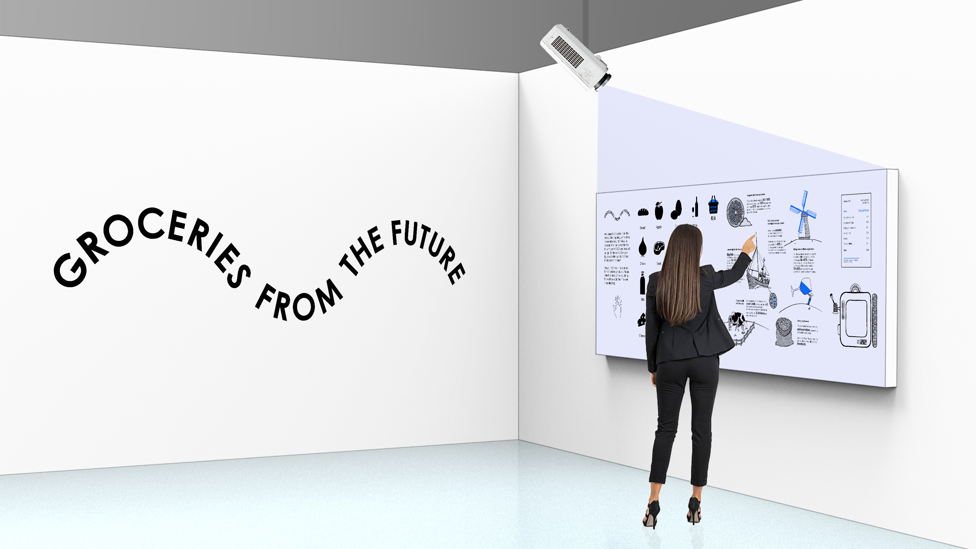
GROCERIES FROM THE FUTURE
Visual Methodologies | Interactive Experience
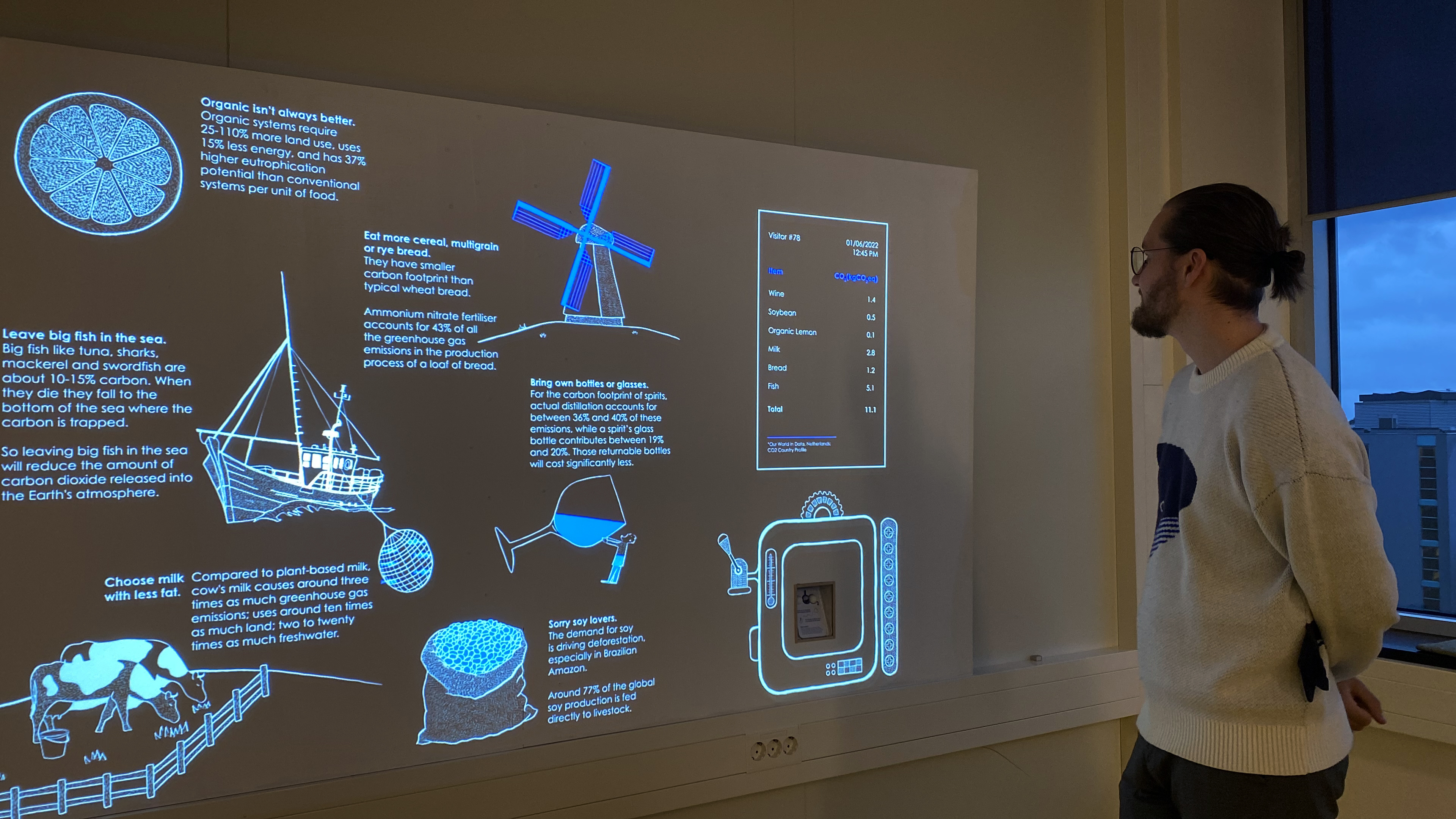
Our daily habits are filled with secret polluters. We shop as we wish, with a seemingly endless array of products on demand. All around us are small purchases with suprisingly large carbon emissions; like grapes imported from Chile.
We hope to bring these hidden emissions to light with Groceries from the Future. This shopping game is not about making money. In contrast, we charge the customer based on the amount of CO2 their product emits into the environment. With this, we hope to raise awareness about a product's impact on future generations.
We hope to bring these hidden emissions to light with Groceries from the Future. This shopping game is not about making money. In contrast, we charge the customer based on the amount of CO2 their product emits into the environment. With this, we hope to raise awareness about a product's impact on future generations.
My Role
Concept Development
Experience Design
Project Management
Team
Mohammad Afkhami
Michael Verdel
Paige Lucas-Dean
Concept Development
Experience Design
Project Management
Team
Mohammad Afkhami
Michael Verdel
Paige Lucas-Dean
01
Concept
Mapping experience with narrative
We began by conducting research on current retail trends, climate change efforts, serious games, sound design, and so on. We created a journey map that includes all types of interaction after crafting the narrative, and then iterated on this version.
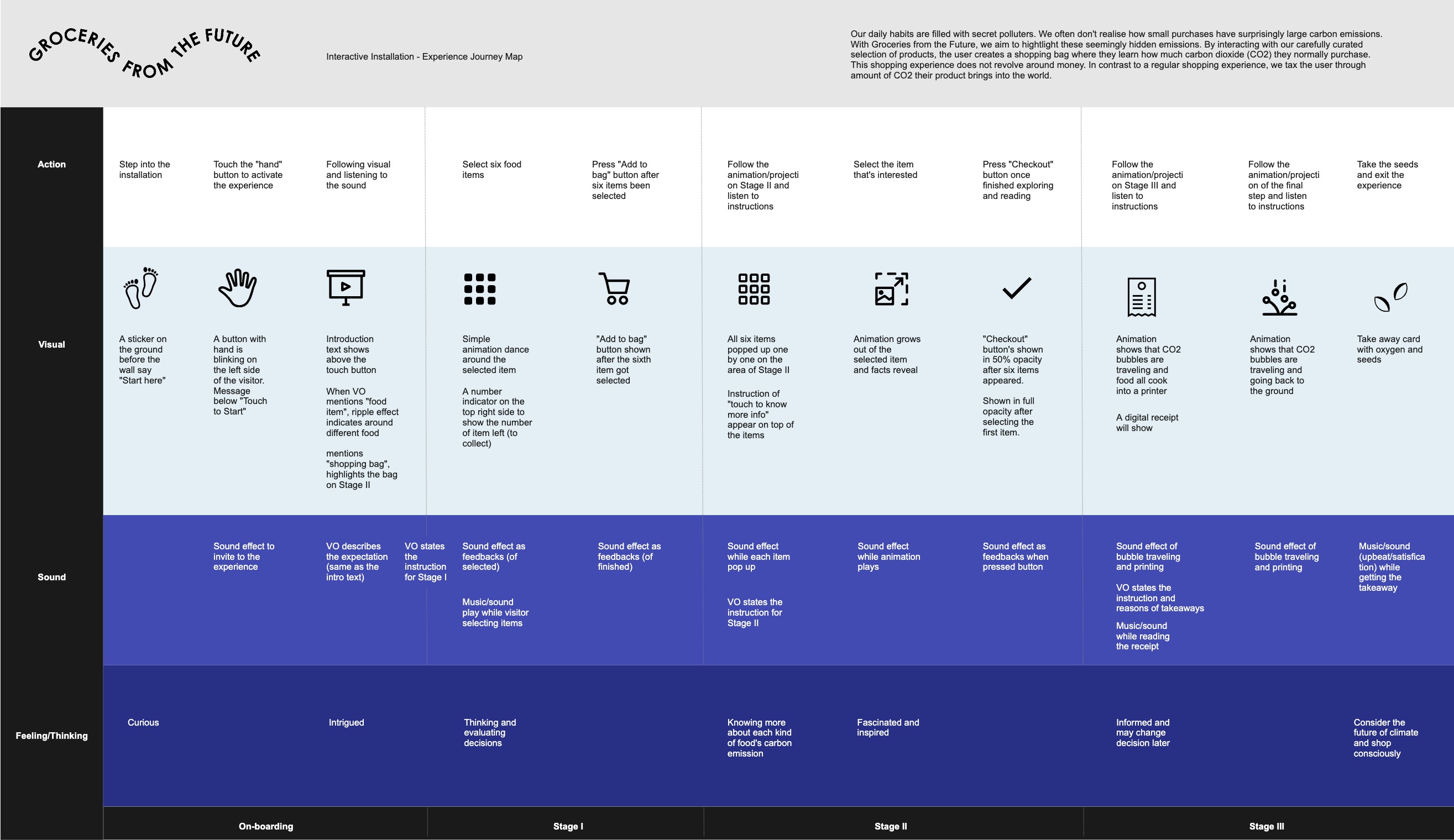
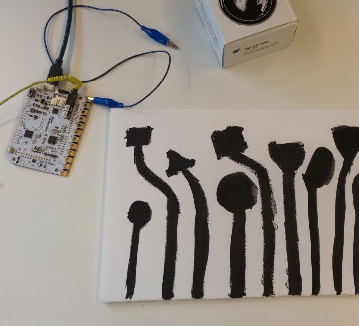
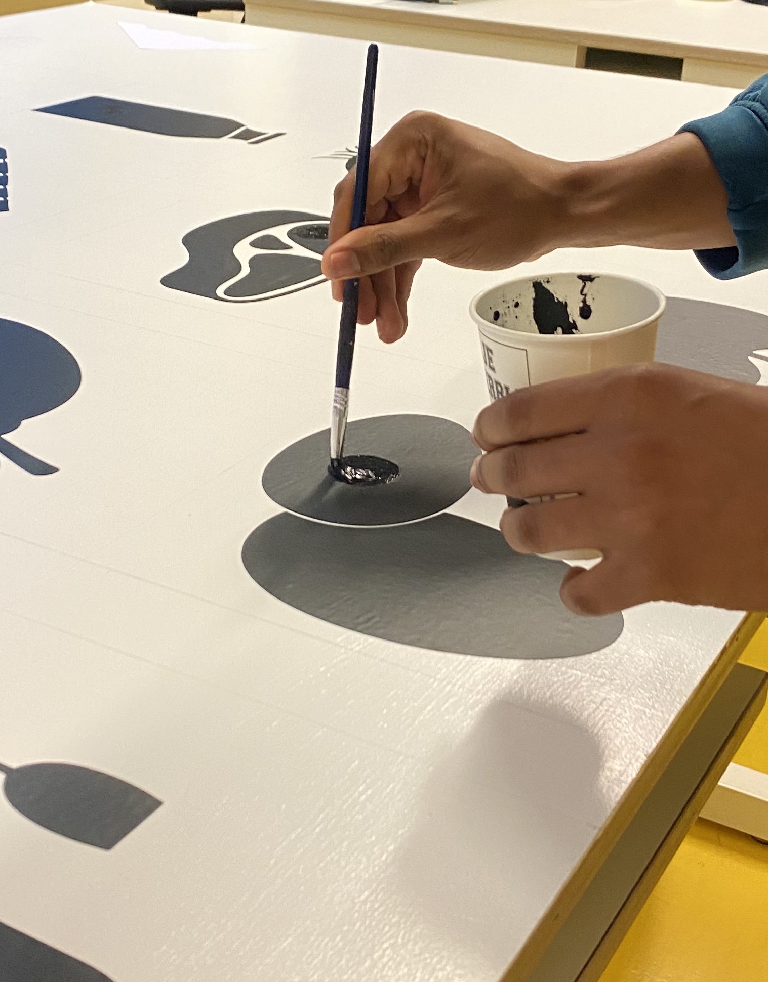
Exploring technological possibilities
We wanted to create an interactive wall with consistent visuals and a smooth user experience. Experiments with electronic paints, touch sensors, a CNC machine, and projection mapping all contributed to the final result.
We wanted to create an interactive wall with consistent visuals and a smooth user experience. Experiments with electronic paints, touch sensors, a CNC machine, and projection mapping all contributed to the final result.
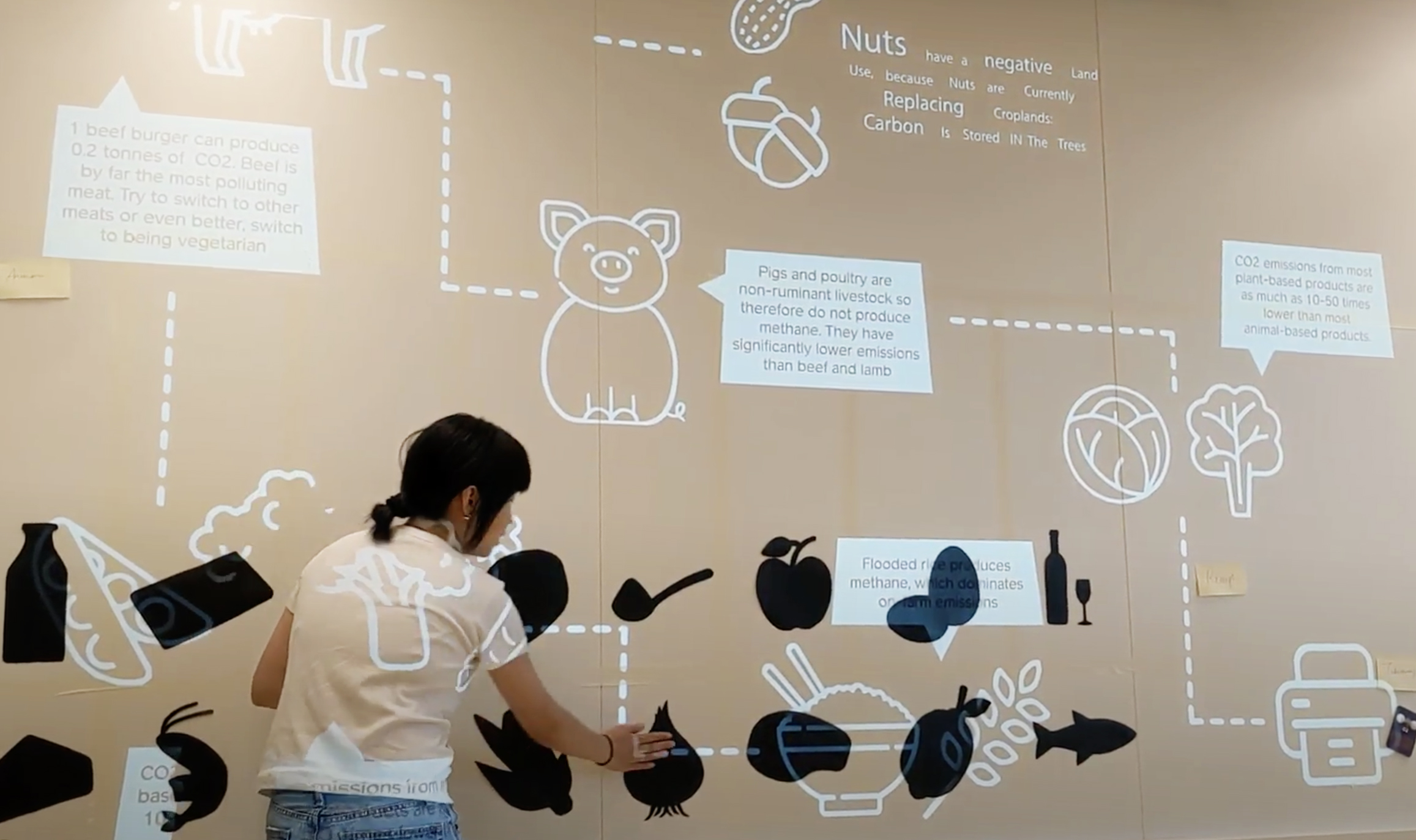
02
Prototype
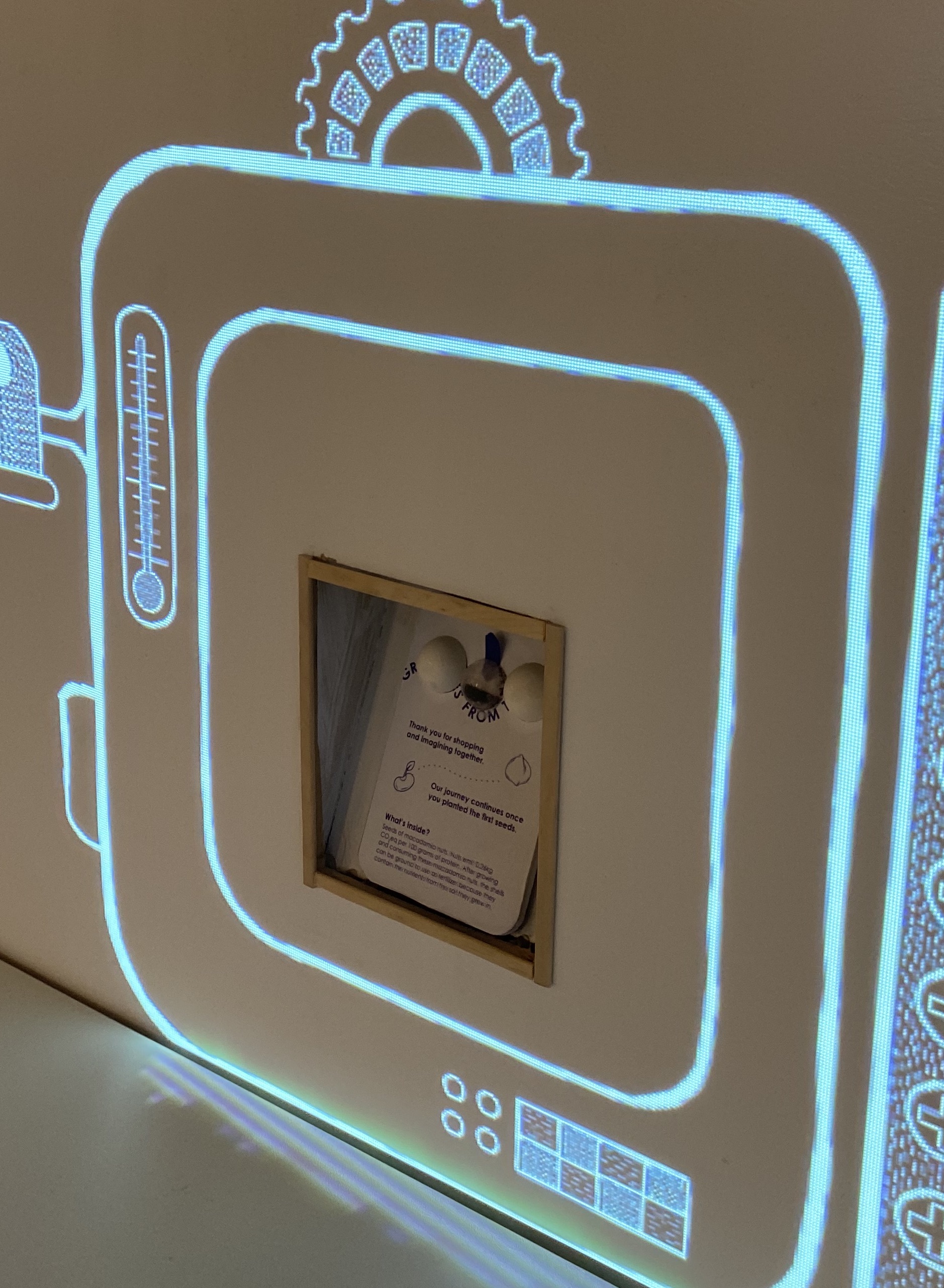
Participants begin the game with 5.5 carbon credits and attempt to fill a shopping bag with six products while staying under the spending limit. Moving on to the next stage, they can learn more about the carbon content of the food they chose.
If they fail the game after receiving a receipt, they can choose to play again or finish. If a participant wins the game, they will receive a takeaway.
03
Iteration
With user testing, we quickly modified the interface design and details like amount of food on the receipt.
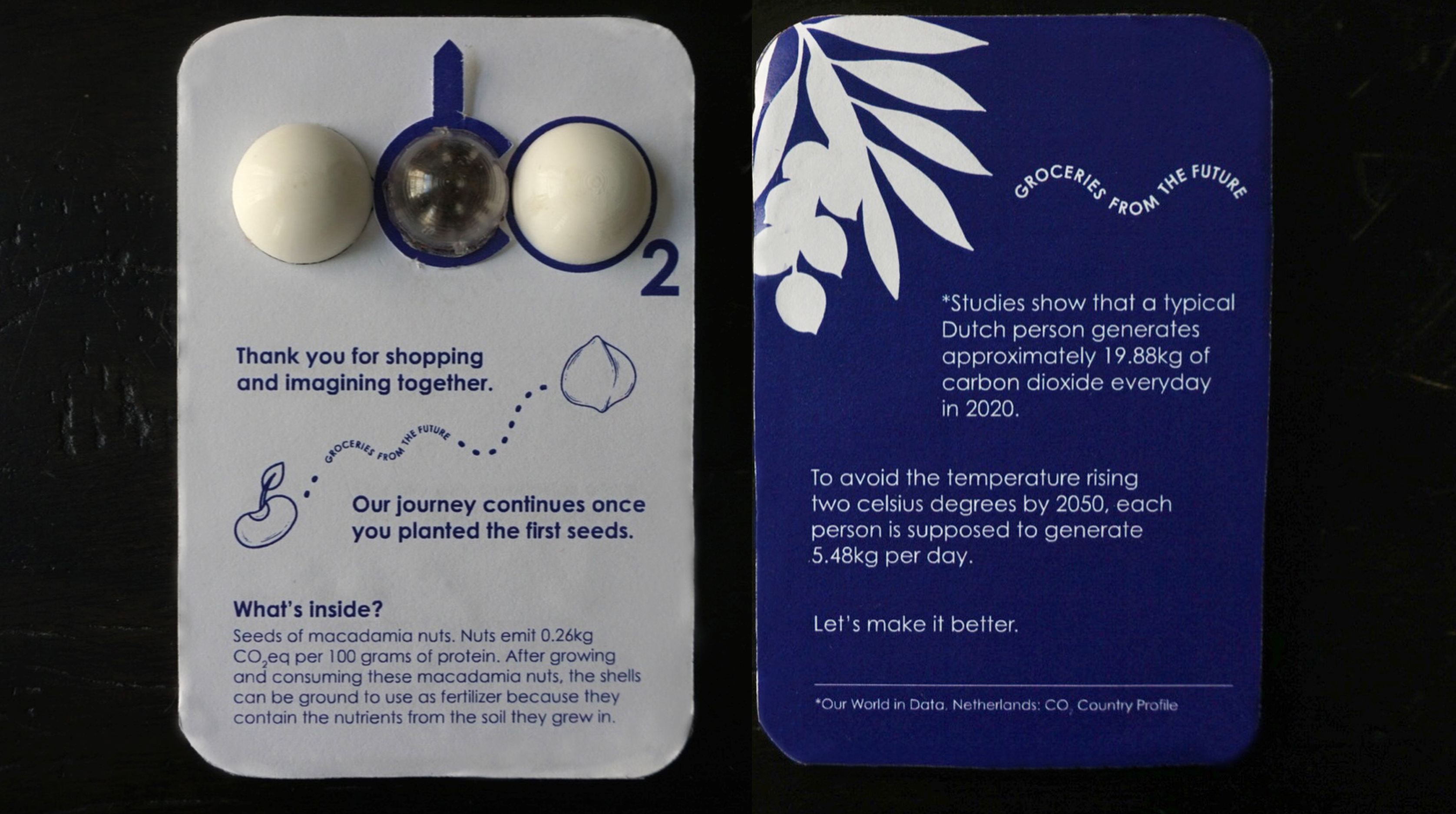
Because of their low carbon footprint, we chose macadamia nut seeds as a takeaway. Participants are seeding a better future by planting the shell later as fertiliser.
04
Experience
Here’s a demo of the interactive experience based on the story and visualization. As a team, we’d love to get feedbacks and search technical support to build this.